In this unit my aim is to go further than simply working through the technical aspects of study. In tandem I want to explore where possible how artists have approached appropriate tasks and what their process and thinking (ie their context ) was while working. I have discussed with my tutor ( as part of assessment 2 feedback) how important it is to take my research a stage further than simply investigating artist’s work. Now I would like to interpret their ideas and process into my own style and experiment with this. Therefore I have reviewed these sources in the reference section. As well as the personal selection that I am drawn to I will use tutor suggestions selected as being suited to support my artistic growth.
For the first exercises I will be using information researched from :
. Gerihart Reichter’s Atlas collection- a huge catalogue of the artists’s personal phitographs and cuttings which helped him to find inspiration and contextualise his work.
. Clare Shenstone- a contemporary portrait from her exhibition catalogue Personification.
Shenstone says that her motivation is to move on in her understanding of art and life through her work. She tries to do this by connecting with her subjects through biography and photographs that inform her understanding of a sitter. In a similar manner to Reichter. Of course face to face dialogue with models will not always be possible but I can apply any additional photos or facts to notice more about posture and visual traits.
Project 1 – observing the human form
looking at shapes, spaces and objects that locate the figure in space.
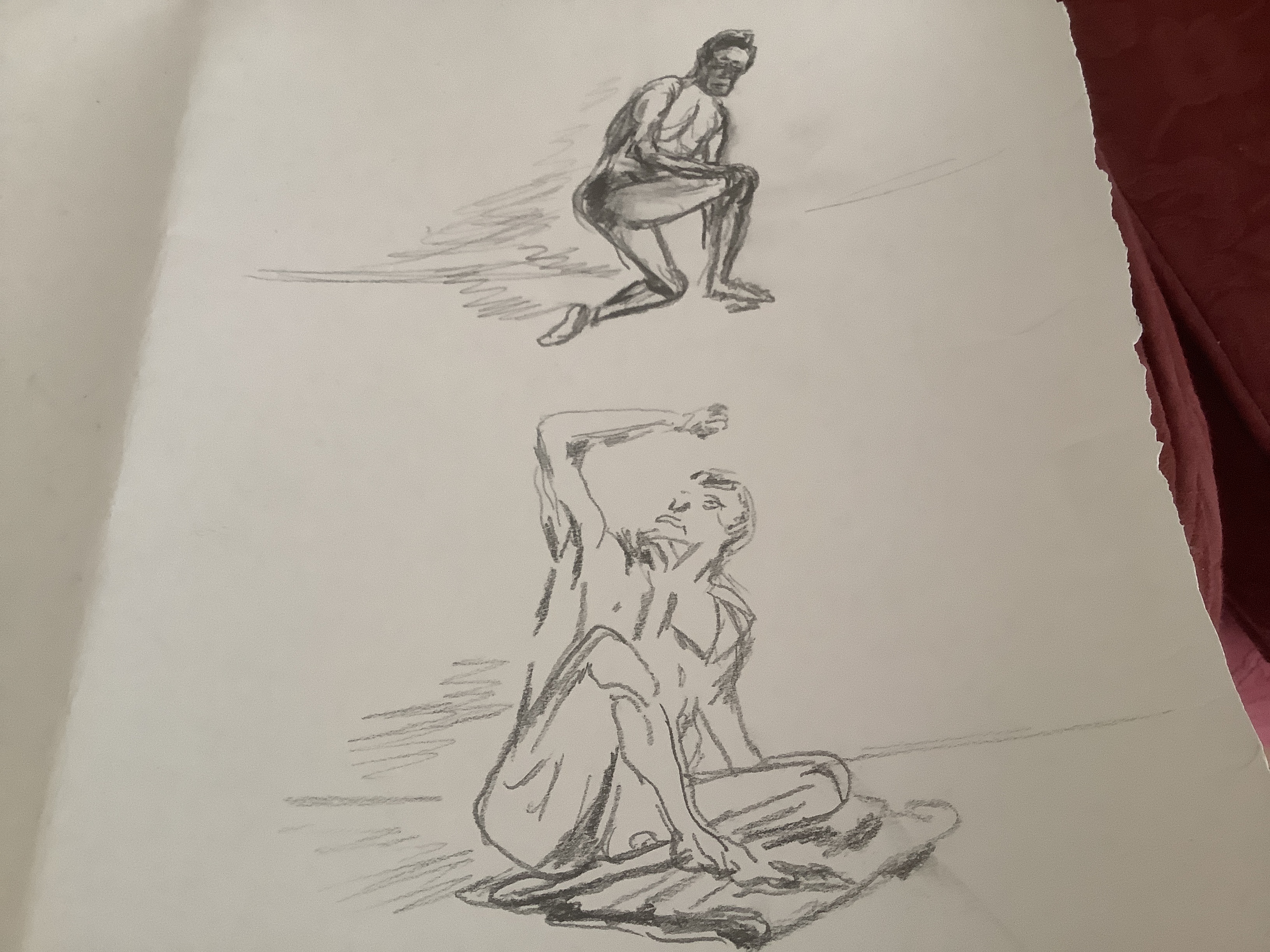
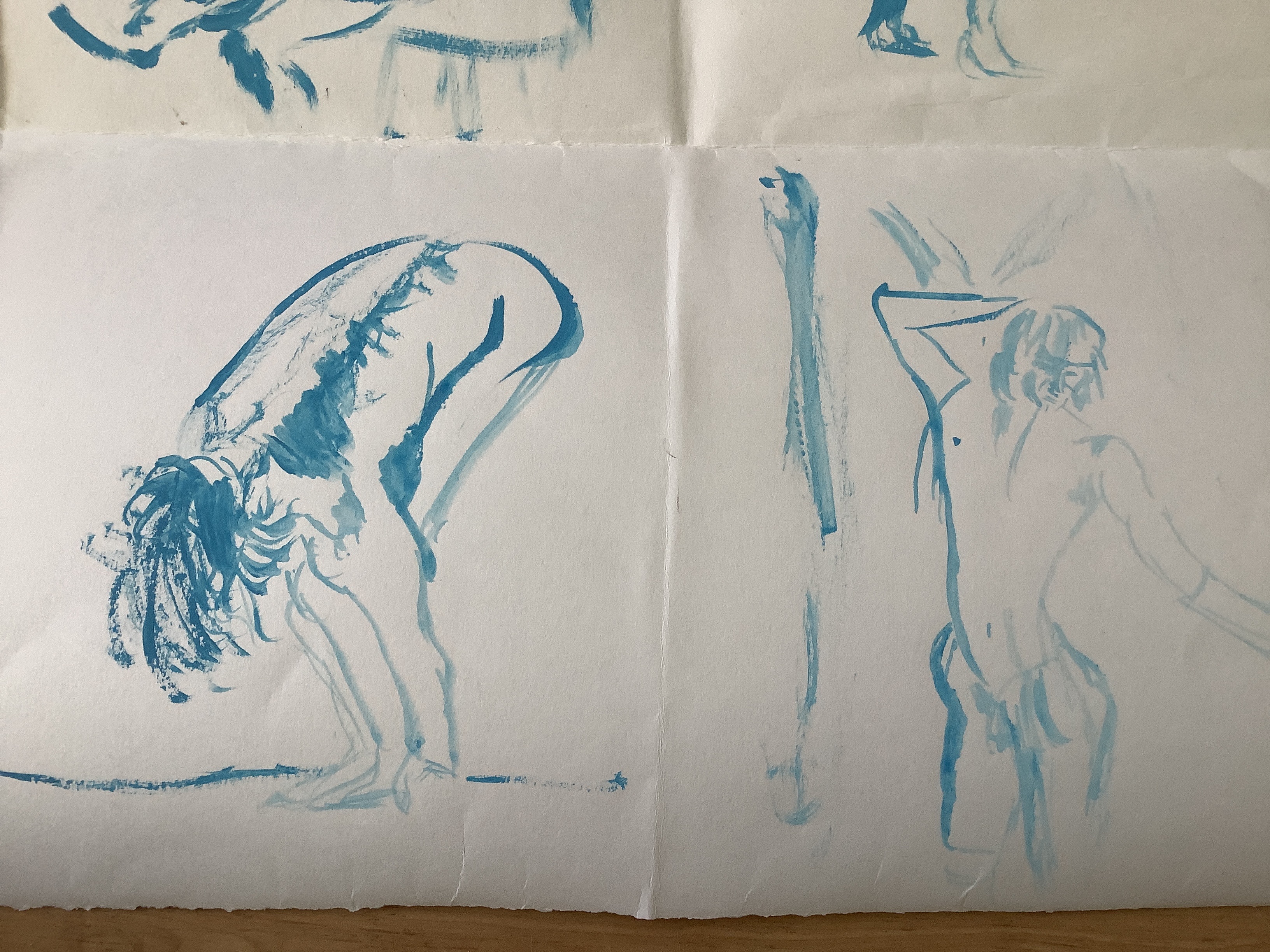
I used a series of 1minute, 2 minute and 5 min model poses from Croquis Cafe to practice initial anatomy. Then I used my husband as a model and other poses from Croquis Cafe which showed how props helped to support the model’s body. This was useful to see how posture and musculature changed between standing poses and poses supported by a prop eg dance bar or stool.
This model exhibits a ballet dancer’s posture in several of his poses for Croquis Cafe. I have tried to use sweeping strokes and curved musculature to suggest the movement of his body. The addition of a dance bar in this picture helps to anchor his limbs and gives credibility to the unusual angles of his body. Looking back at my drawing I feel that I have not been bold enough- I need to be confident to use looser strokes in my initial drawing as mine still appear too controlled and wooden. However – I have learned that it is important to anchor the figure by using appropriate props( less heads floating in the air that I am usually renowned for) .
The sitting figure again benefits from the stool to place it properly in into surroundings- this pose would look even more ridiculous without showing the prop! I cannot help feeling that my male figures require even more practice than my female ones. I realise that I have drawn women much more and need to redress the balance to improve .
Artist’s use of props
Shenstone uses chairs as a favourite prop. Looking at the following images it is obvious that she uses this prop in several ways: to emphasise poise or slouch in the sitter; to position arms to show them off better and to anchor the model realistically in the surroundings.


I am very drawn to the Francis Bacon portraits. Each are set in the same chair but look so different.The chair arm are perhaps like a prop within a prop: to control whether the sitter is slouching or sitting erect and then the arms- to support a pondering finger to the lips or a tight grip of fingers on the frame showing tension ?
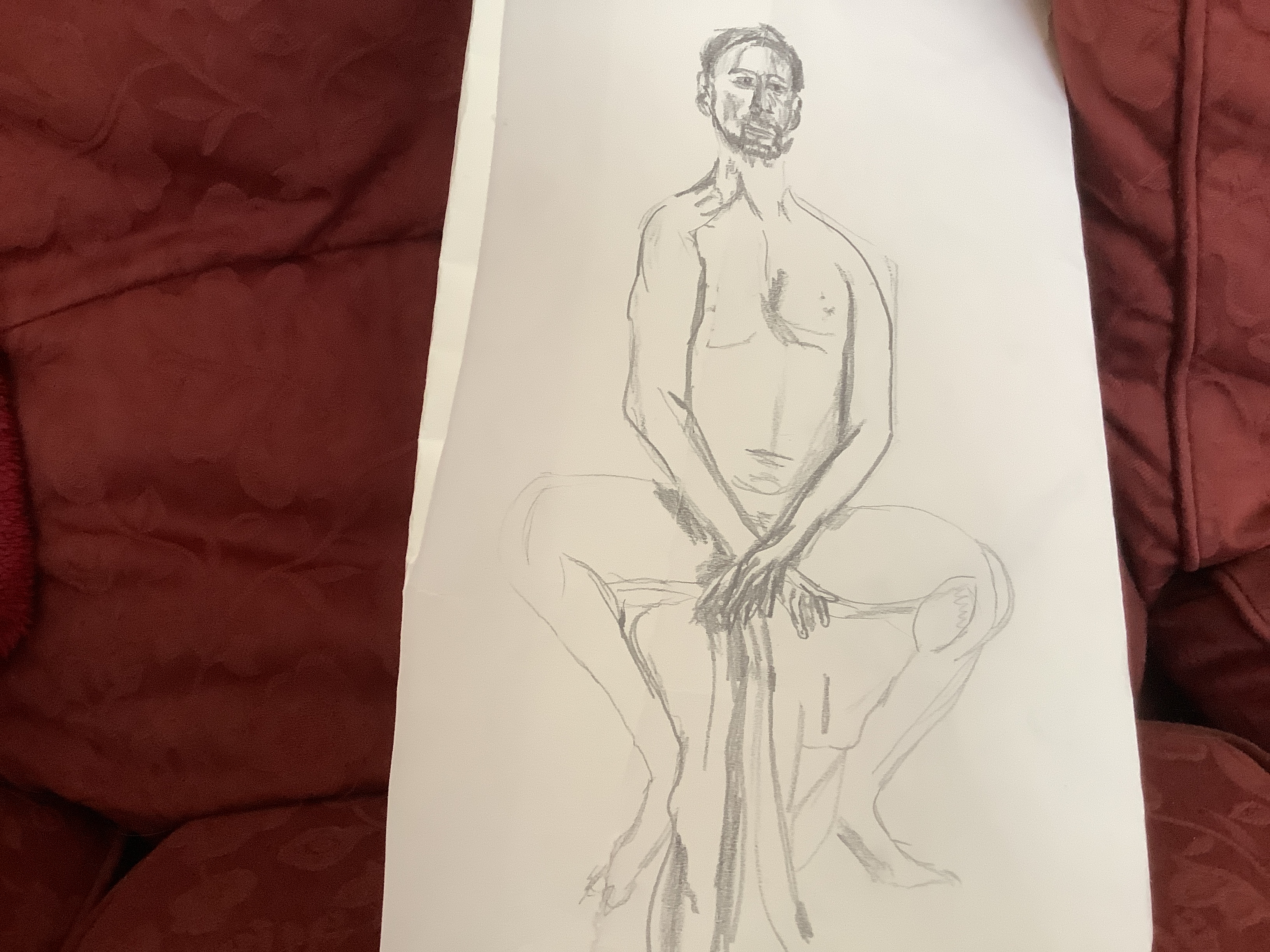
Exercise- painting the figure
I experimented with different brushes and varied paint consistencies to see which worked best for me. I was surprised to learn that the brush that I had most control using was a rigger ( below) . I also liked a watery acrylic burnt umber which allowed me to move from light to darker , thicker applications to indicate areas of shade and depth. The chair allow3£ me to practise foreshortening and turning of one knee on a chair. I had to observe this closely and it took several attempts to sort out how the leg turned and how to try to achieve perspective as the raised foot disappeared back into the chair. Accuracy and my ‘ memory muscle’ for figure drawing will only develop the more I practise. Therefore I have made lots of different drawings and painted figures which are shown in sketchbook 3.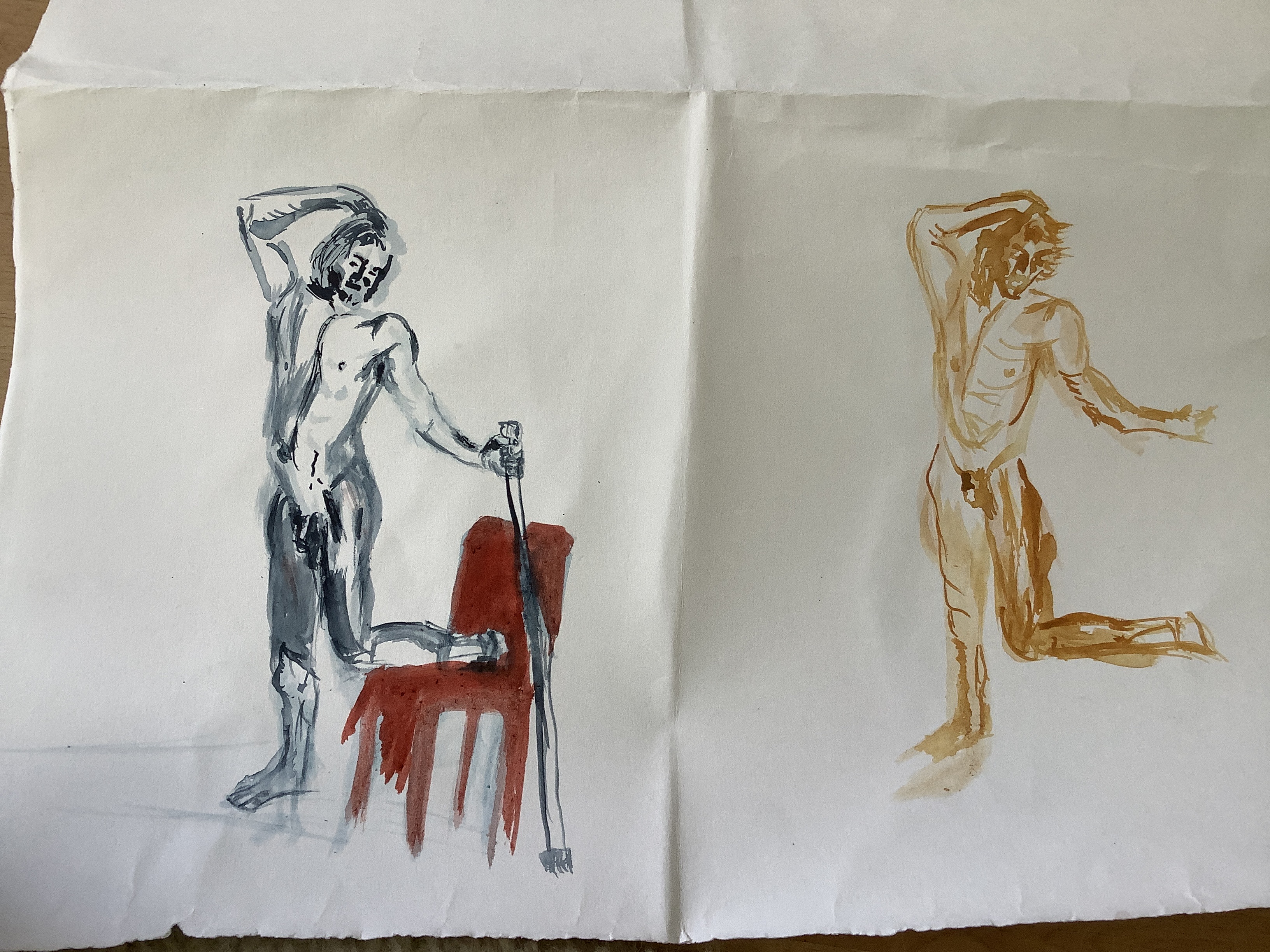
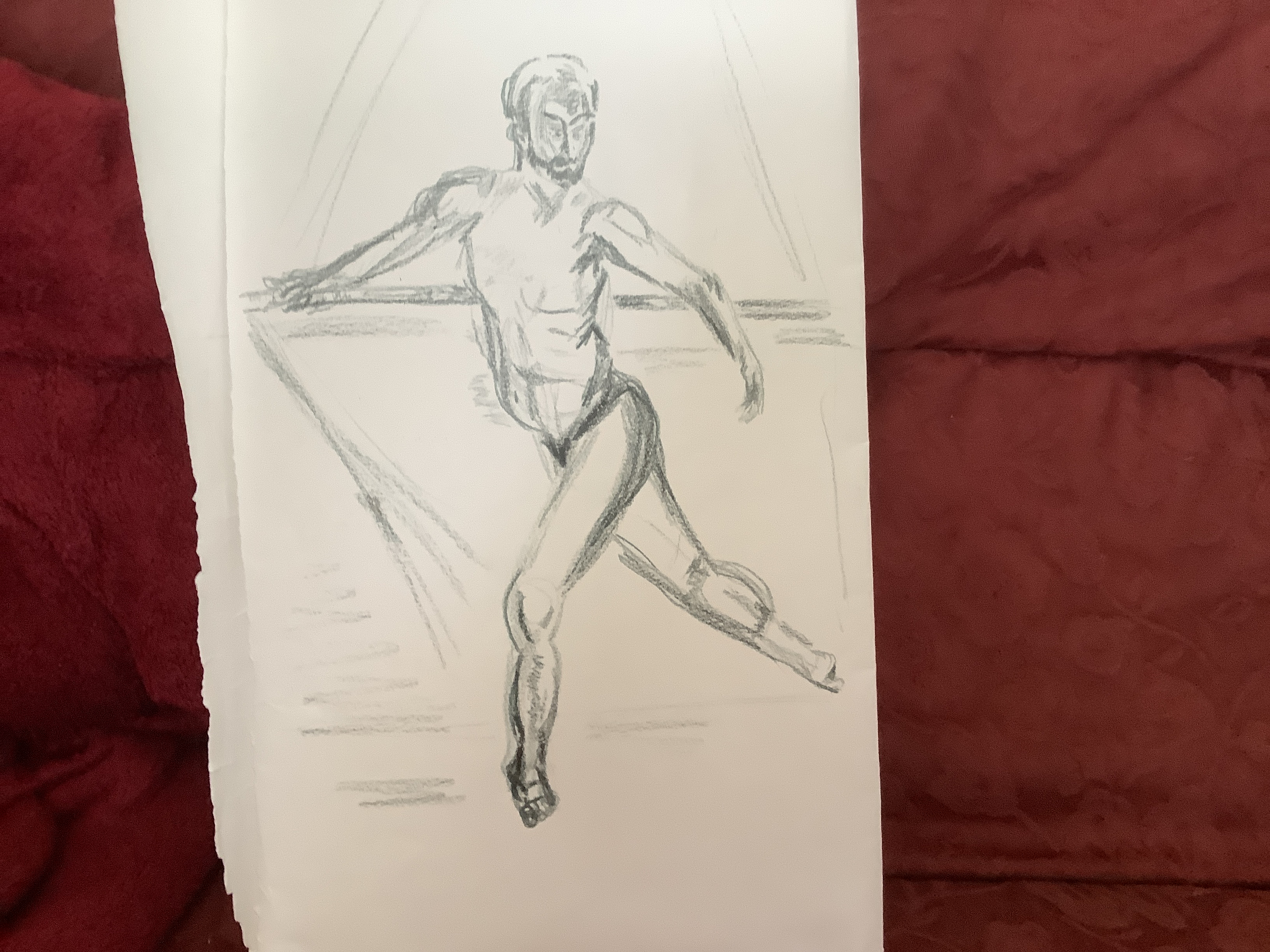
Looking at the background to develop perspective, the bent over figure above works quite well with just a single line to denote the background- is this because there is more tonal work on the the man’s back to show depth so it is less needed in shading work in the background.? I like the dry paint strokes as they help to convey movements in the random bushy hair strokes.
The pose to the right works less well proportionally. It has strong unconnected lines to represent the folds in the backdrop cloth. However this is not enough to distinguish the figure as being in front. I think it would have worked better on a faint backwash.
The two above show elements of tone and movement in the hair ( top right) but there is not enough to suggest a proper degree of depth. The proportions of the torso work better than the legs.
Tonal study exercise
The initial studies shown in sketch book 3 illustrate my initial attempts to complete a kneeling study. As I got more accustomed to the anatomy and perspective positioning I found it a little easier to imagine the piece in 3D as I worked and this helped me to add more layers of tonal colouring.
First attempt shows little tonal work- I think I was so focused on trying to produce a background I forgot about tone and proportion. This would have been a good time to look at the impasto techniques of Ernst Kirchner ( see research 3)
Next I moved to oils and although both of these pieces are small ( meaning I forgot about sweeping lines) I feel I achieved a greater variation in tones.
This feels more natural to me and the scratched areas in the hair add to depth and suggest movement in the face?

This one has lost definition in the face and needs more tonal values added. I did feel pleases with the layering to show shadow and fabric marks in the towel.
I used mixed media to creat texture and experimented with a black background to try to put a different atmosphere into the work.


I am pleased that I have managed to use some impasto techniques and some sgraffito to add depth to my painting. I think this has been of some effect and works better for me that linear perspective as a technique. Unlike Kirchner I have not been able to combine the mark making with large simple blocks of colour. Especially in the last painting above the effect is diluted as it is difficult to pick out the human form from the surroundings. Superimposing background colour blocks gives an indication of how to improve this.

Exercise – self portrait
Lighting- natural
Medium- liquid acrylic limited pallet: canary yellow; Bahama blue and cherry red. Thick Acrylic titanium white. Black biro pen. Medium Fishtail brush and small flat brush.
Background- mid blue to act as a contrast to the green and yellow hues in the portrait- darker layers of blue worked in behind me on the left hand side – the light source is coming from my right.
Positioning – mid paper with body at bottom to ground in space as if looking in the mirror
Mood- lighthearted- as a conscious counter to the unit advice about sitters becoming serious and sad while maintaining a pose. This is indeed true and has been helpful to be aware of in this work. As an smile self consciously I naturally have a thin to disappearing upper lip – it helps to reset myself to a more normal look. I am not going for shock value so it is important on this occasion to make the expression more normal and easily read for viewers. I am also aware that the corners of lips alter completely in frowns and smiles and this needs to be accurate as well to give a balanced look.
The work began as a second pencil sketch which I roughly blocked in with background and lights and darks. I began with loose sweeping outlines for the figure using a fishtail brush. Then I came back to the piece constantly over the next day to build up many layers; adding detail, correcting shape and tone, stepping back to view from a distance and then adding more detail.
Response of an observer- this was quite encouraging. My husband is extremely supportive but very honest so to hear him say that he liked this a lot was very encouraging. He felt that it was realistic and more dynamic than usual. I feel that it has been an important lesson for me to create a new working discipline around my painting using the feed back flow chart ideas that I described in feedback 2.
Observations- I am also quite pleased with the outcome.
- Using a fishtail brush and rough blocking enabled me to keep a free and sweeping shape to my outlines.
- The limited pallet reminded me to keep observing and trying to show tones of each hue.
- I stuck to loose shadow in the tee shirt and background which felt less restrictive and I think works better for me at this stage.
- Using repeated layers allowed me to review and refine tones

The most challenging issue for me has been obtaining a fair likeness. I feel that I have achieved this better in this piece as I have not lost the initial distinguishing marks but built on them through layering. I still feel that the proportional angles of the left hand eye and the lips are least convincing. I need to keep observing and reworking to improve this.


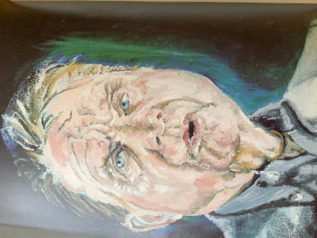
Exercise – head and shoulders portrait
Scale- A3 to try to practise larger sweeping initial mark making.
Position- face on to give power to the piece*
Background- experimental mid brown murrled- to add interest but can be easily altered to give a complimentary effect to lights and darks in the portrait outline.
Light – from the right
Observations- I have altered the pose* from front facing to a slight side view. This happened as the unit predicted- I forgot to mark the head position at the start and my model ‘ sagged’ a little!
Also I caught myself gradually altering the pose to suit the right hand side eye gaze which l liked. However I know from experience that this leads to problems with the angle and this is indeed what happened. The eyes are out of proportion and I have had to correct the head shape and lips- this has not been particularly successful especially for the top of the head. Consequently the piece looks flat.
I was quite pleased with the initial sweeps of the headband which seemed to suggest movement – this also had to be altered with the angle and became less successful.
The glasses were quite tricky to position to prevent them becoming like a barrier – the right hand side was looser and more successful than the left hand side.
At this stage I also experimented with oil and scratching into the surface to show texture in the beard. I used a plastic comb and was quite pleased to see the marks that can be achieved . I will incorporate more of this in future. The hues are wrong but I was using the odd colours of oil that I had to hand. Consequently the tonal values are also not representative as I did not have enough medium or white to add.


Exercise: Head and shoulders p88


I enjoyed painting this image of my sitter. Having painted my husband from this angle before , I felt that I would stick to the same light angles and profile. This time I tried to capture more of his character: by using moving brush strokes flicked around his head and sides to indicate a three dimensional aspect. The strokes seen in the close-up are more gestural than image perfect as I want the viewer to get caught up in the process of putting the pieces together around his beard and glasses. This gives a lighter feel which fits in with the sitter’s character. Again I tried to use a wider tonal pallet to show shadow and depth. Sadly the head shape is not quite right making the image unrealistic- I should have stepped back and observed more frequently- the misshapen aspect was a result of a last minute alteration of the head. While the hues were bolder and added to the cheerful mood that I was trying to achieve; I still did not achieve enough tonal variation making the work very flat and 2 D.
I also tried to use a colour contrast limited pallet, where I could matching light background to dark areas of hair etc. I feel that this works better than previous colour schemes. Using a limited pallet feels simple in the message and allows me to use white to indicate the more significant light patches as it is not too busy with many colours. I like this colour selection and would like to work it into further pieces.
I am more pleased than usual with the glasses lenses – this usually looks artificial but here works fairly well and allows me to show a bit of twinkle in the eyes. I was conscious of the unit advice that sitters can become artificially serious after sitting for a while.
My model did not see it as a brilliant likeness but did seem fairly pleased with it. Maybe I have gone too far with the looseness – does it appear cartoon – like?
Thinking about artists head and shoulder portraits:
Claire Shenstone paints Francis Bacon in a frontal pose and thus achieves an engaging view which she uses to good effect. Taking up my last point of producing a cartoon like effect; this artist manages to use the natural curves of Bacon’s face as a feature- even to the extent of shapes in his wrinkles! Perhaps the reason that her piece works is the experience with which she has learned to interpret in the right balance. The lines are shaped but broken and the colour is delicate. Therefore is is the suggestion of lines and the colour employed in negative areas creates the illusion that is read by the eye. My curves were accentuated and full therefore probably too emphasised and so unreal to the eye?
The head-on face looks sincere and thoughtful due to the upwards glance of the eyes and the expression on the lips. Although the pupils of the eyes look slightly up , they are central enough to make the observer feel that Bacon is looking out towards or just past them. This captures the attention.The background is very dark suggesting darkness to the right and light coming from the left. The face in general is much lighter in hues than the background giving good contrast and definition. I like the green and light blue layers around the face- somehow these appear like an aura and although they are not realistic it works well by giving added definition.
Exercise: conveying character p 91
I was captivated by this little boy’s face with his tongue out- showing concentration and a cheeky smile. However I learned one of the downfalls of painting friends. I didn’t think it would be appreciated by the family if I painted him with his tongue out , especially as the boy wanted to keep the painting. Also it is not fair to expect young models to sit still for more than a few minutes so I worked mainly from a photo. The pressure to produce a likeness for the boy and to change the pose that I had captured proved too complex for me at this stage and I forgot to employ loose sweeping strokes in the paint- it became tight and lost perspective. Of course the more I tried to fix this the less of a likeness it became. Sadly I also became attached to my drawing which was not really like him but I liked the strokes and patterns which were what I was trying to achieve. I know that an artist should not get too attached to marks that they cannot be flexible to improve however I wonder if for the purpose of this exercise I should have stuck to my original Mark work to see what I could produce from this?


Part way through I stopped to draw another practice piece( wearing life jacket below) to try and reconnect with the initial marks that I made. However any natural loose marks that I had made were lost by this time . One of the things that strikes me is the hard rigid look to the eyes. The child naturally had quite small eyes but I am naturally drawn to making eyes big and overemphasised. ( As I write this it occurs to me that this perhaps also causes problems with my work. I am not aware that I am cartoonifying all of my figures with oversized eyes. This error obviously causes a problem with likeness! The expression of cheekiness disappears from my painting as I rework it. I know from feedback and practice that when I become tight and lose confidence my image suffers. This definitely happened here with the final painted image.


As I struggle with the eyes being smaller and nearly closed and not having a mouth photo to work from , the cheeky smile which was supposed to convey character to my work- disappears! This is a very good learning experience.
I am happy with the contrast colours in the picture, I took time to think about this and deviated from the real background to achieve a better stand- out image. I also reworked layers of the background once I had finished applying tones to the skin, hat and tee- shirt to make sure that lighter toned skin was next to darkened sky areas and darkened areas on the child to a cloud in the sky to emphasise the contrast. I am beginning to realise that it is not good enough to treat the background and figure hues as one shade only. I also managed to add some shading to the tee- shirt but need to notice more about where the darker crease lines sit. I tried to use the lettering to emphasise that there were creases in the shirt.
Exercise:Mood and atmosphere

Mood and atmosphere exercise
I tried to use an image of a little boy sitting in the dusk huddled up in a chair with the only light source coming from his iPad. The image is dark but not meant to be sinister, the cheeks and facial hi lights remind me of candle light so should be endearing and the dark is dusky rather than enveloping blackness.
Sadly Looking back at this work I can see that the colour choice is wrong and the darkness was painted in too quick and too thickly ( ie in one block rather than leaving time for several layers to dry and . This would have given me the opportunity to introduce tones in the darkness . As so thick it makes the atmosphere sinister rather than endearing. Probably I could have changed the tones to yellow instead of harsh whitish for the light and grey/brown for the dark. I could have softened the dusk by using a dry brush technique.

Exercise:conveying character


Time to compare my work with the assessment advice from my tutor:
I have chosen to use the last child in image for the comparison as I feel that it’s the more successful of the two-it looks a bit less stiff as I have allowed myself to relax. I also spent more time concentrating* on layers of paint to give perspective and detail.
mark making to suggest form: I have begun to use this in the foot esp left tankless and toes
colour giving dramatic effect: I attempted to use complimentary colours orange and blue as main colours
take time to observe shape and tone: I examined the face and looked for curves in the face. Unfortunately the curve on the left cheek may be a bit too pronounced? Also I have spoken about the difficulty I had drawing the eyes- I wanted to show a curve in the eyelids and pupil but this was not a likeness as the boy actually had narrow eyes -almost closed.
using curves to tell a story: I tried to use the curves around the cheeks to show his mischievous look. However the dimple look of the muscles being pulled in a strange way did not look correct and the more I tried to refine this the further I got from the original intention!
Using different tools: Biro to show shading
observe perspective in a way that I can show it: I have shown a background requiring linear perspective – it would have been better to make this an Ariel perspective somehow. Not quite sure about this yet? However I did try to add more layers of tone in the intersections between figure and background.
come back to create further layers: I painted this over many sittings and made lots of tonal variety especially in the nose area.
textures to accentuate feel: A little on the surf in the sea but I could include more.
study othe artist’s work: I have made comparison with the work of Claire Shenstone using suggested lines in the body. I need to use this more in prep for pictures.
use rawness and fluidity in my style: I have tried to stay looser than in the first picture of the boy witch was overworked and tight.
work quickly to maintain fluidity: I worked quickly to make initial colour layers containing fluid curves.
use negative space: used especially in the arm areas and round rather outside of the body
People in context
Exercise :people in an interior
See my research page looking at E. Kirchner’s clever use of colour and shape to set his figures into space. His ingenious effects do not simply act as an anchor: they give suggestion and context to the story ( the work place of the street girls ).
https://wordpress.com/block-editor/post/maggi518697painting1.art.blog/992
I would like to use similar methods in some of my work.
I also like the background techniques employed by a Peter Doig.
An article on the MOMA website accessed at https://www.moma.org/artists/8087
describeS how the places that Doig has lived in have influenced his work; especially Trinidad and Canada. Doig states that he sees his paintings as ‘ filmic’ allowing the viewer to capture part of a story narrative taking place in front of them.

The effect that I want to achieve and introducing new elements into a familiar setting– the background is the brick wall in the conservatory of a friend who has a life changing illness and who is not able to go out. I wanted to convey the irony that she is trapped but really cheerful. It struck me that her home sadly was like a prison. Perhaps instead of simplifying the brick pattern too much , I could use it to suggest a prison walled-in effect? There is also a bit of a joke in the stripy jumper. I emphasised the lines by thickening them to portray prison film like garbe? Both the wall and stripes could be used to show perspective by using fading tonal valueS, change in size and direction.
exploiting skin tones:
the hair and skin tones could be light to contrast with the relatively darker walls and jumper.
Simplifying the background – see above. I also cut down the amount of room and table decor shown and cut rows of bricks after a few to suggest a fading out of the image
locating the figure in space and suggesting depth – I tried to use the table as a marker in space for the figure sitting behind it. The table curve and markings at the edge closest to the viewer were disproportionately large to suggest depth.This looming infront of her also suggested that she was stuck- in the interior behind the table.
Eye level – after a while I decided that looking slightly up at the figure allowed me to emphasise that she was stuck behind the table.
I simplified the face as it was in the mid ground but managed to show as smile and I feel this helped to put over the right message. From the head and shoulders picture I realise that emphasising the curve and proportion in the cheek helps to suggest a better smiling mouth.
I enjoyed the free and varied mark making in the plant closest to the viewer and hope it gives a sense of proportion to the work?
Figure in an interior exercise and Research 3 : compare two works
Telling a story exercises:
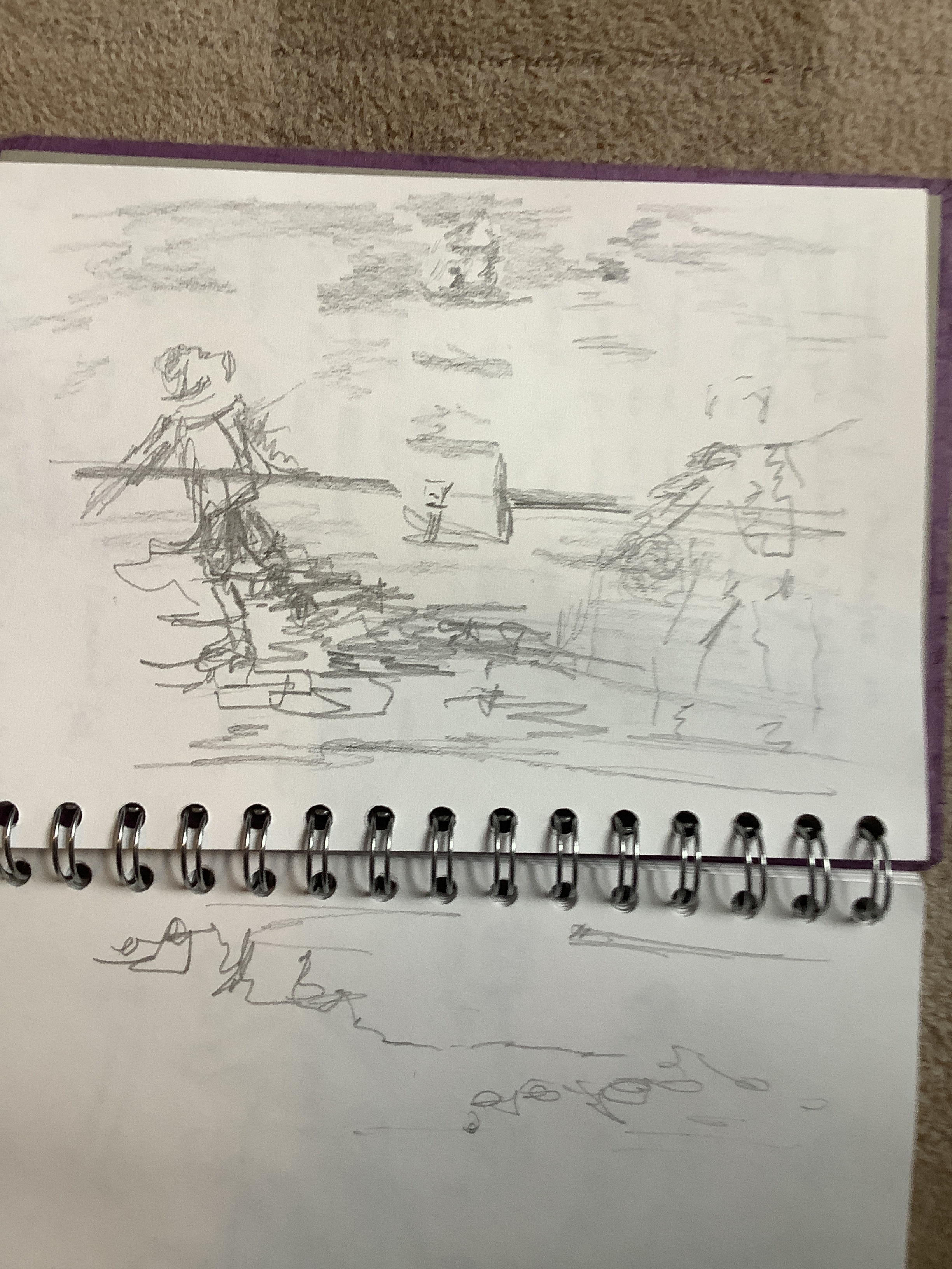
As I have been living away from home it was not simple for me to get two models. Therefore I spent quite a few afternoons on the beach studying and drawing figures of passers by. I have done this before and of course learn something new each time. This time I learned more about the need to speed draw as people change position quickly. I also spent much more tome observing how limb anatomy works in several people before trying to draw a certain pose. The hope being that I would be better placed to draw a pose like walking down a set of steps more naturally. I also found that clothing and hair could be used to indicate movement – eg the wind billowing out a coat or washing blowing in one direction and puffing up clothes on a washing line in the background.
I felt much more confident after this.
it was by watching families moving around that I became attracted to how each posed for a photograph to be taken. This became the subject for this exercise and I drew a bunch of studies of a mother and two children. The mother was looking protectively down at her family while almost scooping them up in her arms. As suggested in the pink notes I felt I could emphasise this grouping and oneness by making wind marks tones and blowing fly away hair strands in the background around the group.
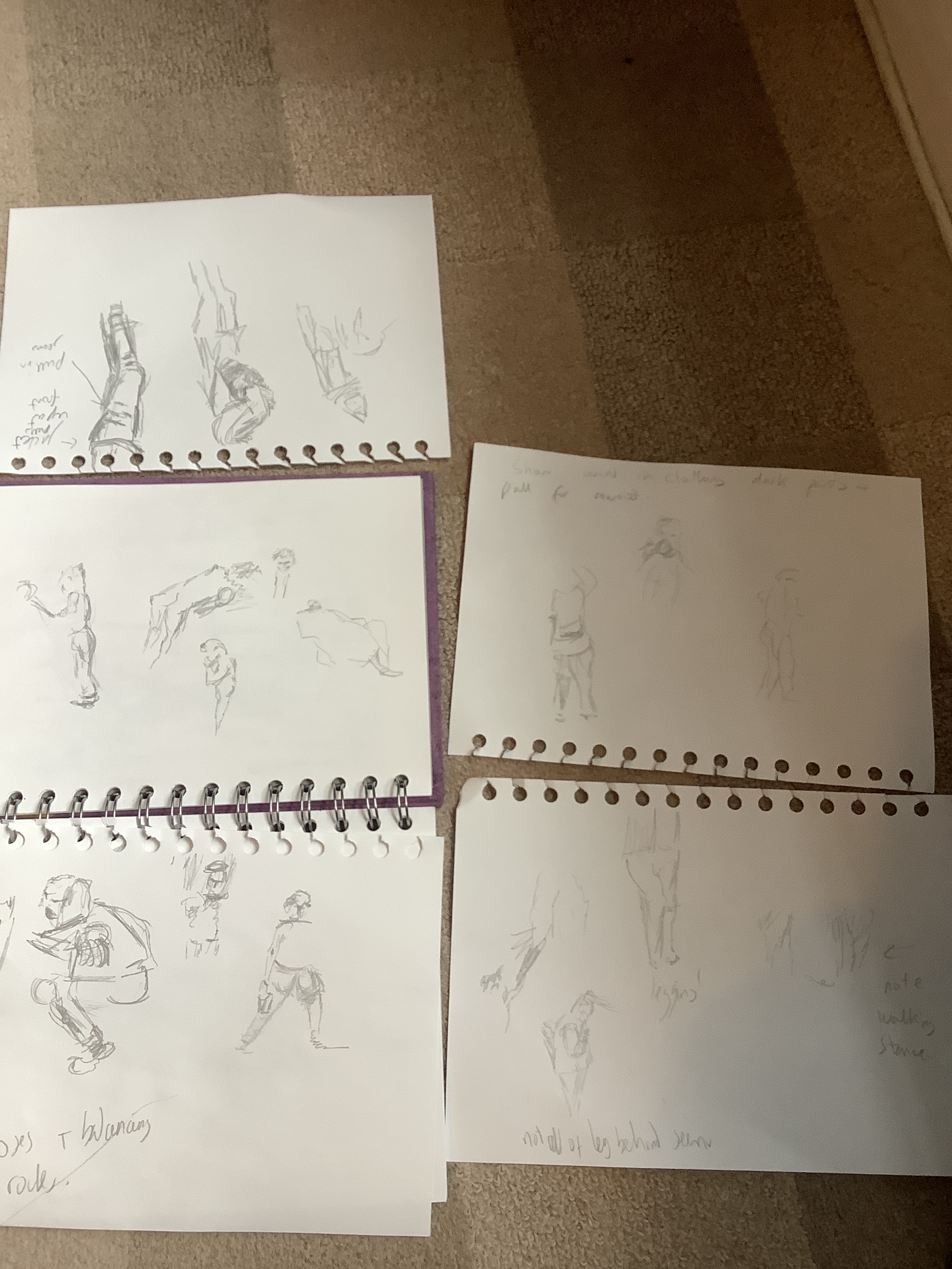
The girl in the group was leaning back very heavily on mum so much so that her stomach was arched out in front of her. This seemed unusual and quite sweet so I was keen to use this pose. I tried to paint in negative shadow tone between the mum’s coat and the arched back of the child. This gave a crispness to the colour of the child’s coat and emphasised the arch in her back. I had to notice carefully how her head was positioned looking up and back.
The boy plumped out his cheeks in a cheesy grin and straightened up for the picture and again I had to look carefully how to position his head and hair again.
I tried to change the clothes to contrast against the background and identify each person against the shadow.
One thing that did not seem quite right was the simplified beach background. I imitated Krichner’s street women painting using two contrasting colours in a Simple shape. I used the blue sea and added white for the waves. Instead of parallel lines I made an Apple core shaped sand for the group to stand in. It kind of works but not quite. Maybe as I am not as skilled as the artist I cannot get away with the oversimplification and need some tonal depth?

