Assignment 3
Assignment 3
Listing of the development aims and criteria that I will follow in this assignment.
Repetitive engagement with learning objectives has been integral to my development during Unit 3 . As I have has lists of general and personal objectives it has been challenging to keep all fresh in my mind. Therefore I feel that it is right to list them and record my responses to each.
A. General aims and objectives
Assignment instructions P 97
show how skills in handling paint have developed
- [the skills that I currently want to demonstrate development in are: applying more layers of paint to increase detail and perspective; using a variety of brush marks and tools to suggest texture and movement and using inspiration from suitable artists. I have enjoyed researching recommended artists ‘s work more than ever this time, possibly because the more that I am immersed in the painting process the more I can begin to appreciate about individual style and technique and also how the social history and knowledge of the time informed artistic creation. Freud in his portraits used a lot of impasto texture which seemed to record his rapid brush work permanently on the canvas, adding a sense of urgency and intensity. I like this technique and wish record the speed and excitement which I feel when painting. As I am working in acrylics I feel that I can best do this by applying fast loose strokes in a variety of ways. For this painting I have been practising with different sizes of brushes and using both wet and dry brushes. I have noticed that the manner of application and the unique characteristics of each type of paint can be exploited to produce different effects.I also want to use thinner paint application to allow more tones and detail by working in many layers.]
–
show development in interpreting the subject
- [Earlier in the unit I observed families on a beach and drew a selection of family groups. I learned to observe the quickly,watching each how each gesture or change in posture affected the whole body and the dynamics and positioning of the rest of the family. I reused a selection of these sketches to work out the best pose for my model and how to notice the effect her grin had on all of her body.]
- Consider and explain lighting, sitter consideration, medium selected and landscape positioning of my paper instead of the more conventional portrait.
[I have begun to notice how artists use aesthetic as well as technical skills. For example; interior, background and colour can be used interpret the subject by suggesting emotions such as warmth in Van Gough’s sunflowers or the melancholy of Picasso’s blue period. My tutor has recommended the work of E Kirchner as an artist who uses colour and sweeping shapes to give a particular look to his subjects. I particularly like his simplified moody dark backgrounds which pop with what appears often to be distorted suggestions of pavements and buildings in complimentary bright hues. I admire his figure work which is sweeping and elongated giving an unsettling allure to the street girls in his Berlin 1910-13 series. His paintings appear simplistic but are hugely illustrative . I tried ,with partial success, to employ his thinking to a background in the ‘ telling a story’ exercise in unit 3 to suggest the close bond of a family grouping. However for my assignment piece I drew back a little as I didn’t have the confidence to go completely into blocks of colour background and elongated shapes. I did feel able though to attempt his uncomplicated colourful palette. One more artist whose paintings I used as comparisons throughout the unit was the contemporary oil artist Clare Shenstone . Her version of simplified backgrounds are monochrome spaces that are given depth by tonal variation which seems to both anchor and hilight the subject on the canvas. Initially I hoped to work more towards this style in my work. I intended to show dark water stretching out to the suggestion of branches on a far off river bank .]
make preliminary studiesshow how skills in interpreting the subject have developed
[
I decided on an outdoor theme knowing that I am more able to work with this than interior scenes. Observations of my model were made around noon on a dullish day so the light direction was straight downward on to the face and meaning shadows would fall up and down rather than to one side. The choice of media was one of practicality rather than taste. I have been away from home so acrylic was better for it’s shorter layer drying time. The portrait would be a close-up face looking back over a shoulder from a river background , so I felt that a landscape format was best for spacing. My idea was that the close up & eye -level line could be used to make the viewer feel that they are in the boat behind the model. Also I reasoned that it would allow me to show a story narrative of and movement through wind blowing in the hair and background trees.
- Demonstrate practice handling of paint and choice of skin tones-
[I spent
quite some time practising paint application, transparency of paint layers and mark making to understand what would suit my purposes best. The acrylic paint brands that I had were of different textures so I used these sessions to find what spread best and flowed well off the brush. I got a better coverage and flow using Artiste brand liquid acrylic brand while my abstract brand 200ml sachets that I had previously favoured were thicker, more buttery and therefore more difficult to use on a brush without dilution. I was surprised that although cheap and not intended for studio use, my liquid brand gave intense even coverage and flowed well without diluting intensity.]
I learned during these practices to slow down my painting speed a little and make a better attempt to cover an area evenly. This enhanced the intensity and smoothness of the surface. I had one pearlescent blue which gave a depth and shine to the sea.
Module assessment criteria :
Unit aims and objectives
⁃ to use drawing and painting for investigation, generating ideas and recording and selecting visual information
⁃ to make skilful use of a range of media
⁃ to demonstrate knowledge and understanding of the work of some important artists and movements in painting
⁃ to reflect perceptively upon personal learning experience
B. Personal aims and objectives
Tutor feedback outcomes that I have tried to carry through my learning in this unit :
–markmaking to suggest form
-colour giving dramatic effect
-take time to observe shape and tone
⁃ using curves to tell a story
⁃ using different tools
⁃ observing perspective in a way that I can show it–layering
⁃ textures to accentuate feel
⁃ study artist’s work
⁃ Use rawness and fluidity in my styleSee coursework three


Materials used:
Liquid acrylic: red hot and cool hue; primary yellow; iridescent blue.
Soft acrylic abstract dark brown; white and blue. Thinning medium for acrylics.
Large flat brush; medium filbert and round brushes;a medium fishtail brush; pencil and rubber pointed pastel blending tool.Multimedia A3 paper 200g
Preliminary studies


These are some of the sketches that I made while people watching on a beach for my ‘telling a story exercise’. I found this extremely beneficial in training me to observe the body posture of each pose my model made in terms of how it attested the whole body. For example when told to smile a child often tilts the head back and tenses up the whole body to appear taller as well as stretching wide mouth musculature! I was able to look at my model with greater awareness of how she held her head looking back over her shoulder and how her eye brow , mouth and even the angle of her shoulders and crown changed as she widened her grin. Over time working out correct anatomy for each part of the body has become more like imagined -sculpture , by this I mean that I think about how muscles and skin must flow and connect to each joint in the body rather than just copying a mark as if isolated in space.
From a group of different positional drawings I decided on the background and how the face should fit in to it- ie to the right third rather than in the middle to invite the viewer to look into the painting. I also wanted a simple colour block of background with a few clearer tree branch marks made using different brushes and strokes.

I experimented on scrap paper to select best leaf marks that were not too distinct and distracting from the subject.


The initial pencil sketch is not a flattering drawing of the model but allowed me to loosely explore the curves that flowed across her face eg the natural line expanding across her face curving round the nose, mouth and cheeks and creating her broad grin of enjoyment. Movement was to be suggested by the curling strands of hair flying out behind her and by tree branches.Next I tried several outline drawings in yellow to check positioning of the person,explore the connection between marks across the page and to indicate negative spaces and shade. One of the yellow outlines was far too close to the right hand edge . I also found it useful to use a mini post-it to mark things that I liked or wanted to avoid as a reminder to myself.


I also spent a lot of time painting colour blocks to learn how the two types of acrylic acted on the paper. The fluid colours are for me much easier to use when making loose marks. The soft abstract brand are less mailable and therefore I wanted to use them more for texture. They also didn’t mix well with thinning medium.
I also worked out which colours would give translucent layering.

Next I worked on skin tones to find the best balance of tones that worked well to give depth. Then I checked this by painting a practice face.
Stages of painting and Influence of artists
One of the main skills that I have taken onboard is about looking deeper at subjects. What are the stand out features of this person I am . Looking at portraiture I have begun to observe the importance of this. rying to depict? It is not just simply trying to get eyes right or the shape of the nose.
In order to bring a narrative to a portrait physical features are important.Looking at my model and a photo of her canoeing, the thing that really stood out was her cheeky smile. Trying to capture this would add realism to the likeness and would suggest enjoyment. Kirchner was able to stretch the proportions of his figures making the a little grotesque and surreal. As an inexperienced artist I am finding that this is not something that I get away with as my skills are not developed enough. For this reason once again my practice head looks a little cartoonish as I have enlarged the eyes and accentuated the curves of the cheeks and eye brow. I known from earlier exercises that this is a tendency that I repeat and to minimise this I must keep standing back and take time to observe what has happened with each layer. Have I used too heavy a line, does in need to be faded or broken up? Is the tone to different, do I need to mix a closer match? I found a useful tool for this. A flat plastic food tray allowed me to place my mixes over the top of my work to see exactly how the new tone will look.
One of the technical aspects that I am not good at is linear perspective. While I will benefit from practicing this, I have also had a discussion with my tutor about trying to pick up on other perspective techniques that I am currently better at to achieve the best that I currently can. The human smile is created by the entire muscle as it tightens across the face and cheeks and therefore correctly positioning the tonal shadows cast by stretched muscles would help to show perspective round the mouthfeels my model.
I also practiced mark making for the sea using the soft creamy thickness of the darker near blue, the blended turquoise pearlescent of the shallows of waves and the dotted thicker application of white foam ( using a pastel blender and cloth) contributed to give definition.This tonal practice was trial and error. As I gain more experience I hope to use this skill in planning. Eg as I learn what is translucent and produces a good effect on top of another layer I can use this to my benefit rather than losing effects and having to redo layering !
Maintaining significant features:
As the layers advanced I had to keep the curved lines visible but not too emphatic. As I discovered in my previous exercises, the suggestion of a line or form or the painting in of negative space works better than creating a bold unbroken mark. Eg on the cheeks , nose and eyebrows. I notices the features that were most striking about my model were her beautiful wide grin and the cheeky looking line of her raised eyebrows. I spent a lot of time lightening and darkening and trying to break up some of the solid lines by adding tonal difference.

I also used the thicker quality of the white paint to create textural ridges that I could build up tonal wrinkles near her eyes. I feel that this helped to give definition and show that the head was turned slightly so that the side of the head was seen as a darker tone. I also tried to give less definition to the ears to help with proportion.Dry brush strokes:
I also overpainted broken dry hair marks on the side of the head to help with proportion.The background:
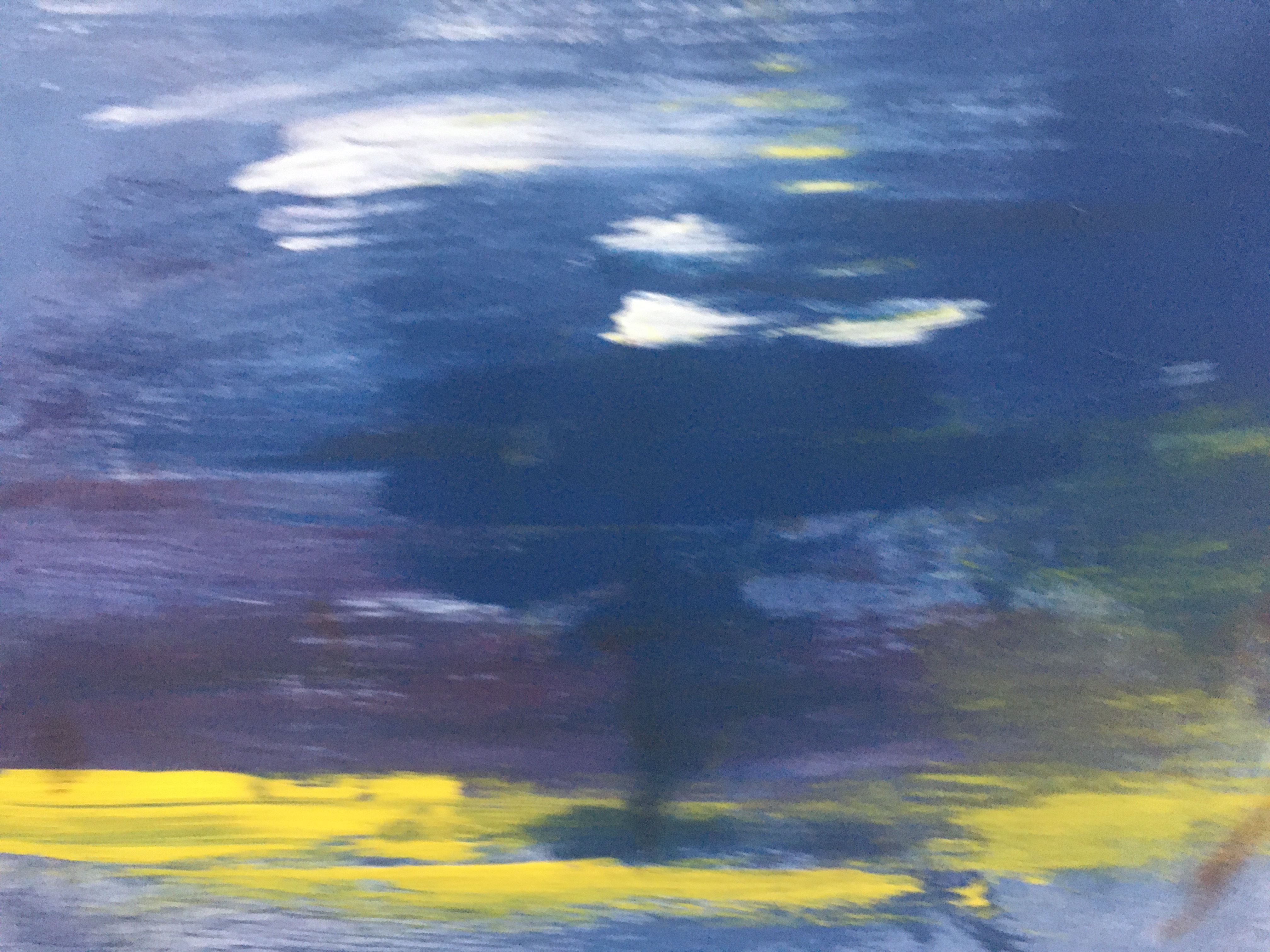
As I worked in the different layers I found that I was moving away from my original plan. The formal banks and green abstract of trees seemed to be drawing attention away from the subject. The green was out-of -step with the other blending tones and caused disharmony. Therefore I decided to cover it over with a layer of blue to tone it down. Michael Raederich and Peter Doig were recommenced artists in my feed back from assessment 1. So I decided at this stage in my painting to go back and research their work to find some influences that would help me to add markmaking in further layers that connected the work up and improved the narrative. I reread my thoughts on Doig and how his colour choice and markmaking in the background awakened in me an intrigued and sometimes uneasy feeling . I wanted my work to create drama and movement to add to the river sailing narrative. Looking further I found this account of Doig talking about a fellow artist, Sigman Polke who had influenced him. He felt that Polke did not produce photographic images but took pleasure in markmaking that he had ‘discovered ‘ in his practice. This is inspiring and opens up a whole new line of thought for me. Further Doig talked about how Polke had developed a way to make his painted markmaking into a language and even though he broke normal rules of positioning and form he did it in a way that ended up looking authentic . I have read in the past that when we let our drawn ideas emerge without concentrating on what we want to produce, the result can be surprising but beautiful ( reference for this quote is unknown). Perhaps by relaxing I could learn to adapt this more into my work in the future? The background that emerged is still rather stiff because it was a first experiment and I was not sure about following my idea to start. However for me it represents the future of a new technique in painting for me to produce a more connected wholistic piece.


https://www.tate.org.uk/tate-etc/issue-32-autumn-2014/contemporary-visionary-part-ii
This gradually evolved into a different story for the painting. I enjoyed the depth of the darkening sky and found myself getting connected to a new narrative: a dusk river trip. I was reminded of Michael Raederich’s dark blue/grey atmospheric work which pops due to the embroidered white, yellow and pink abstract forms. I added yellow in various layers to look like the start of a sunset. While the positioning of the yellow in the darkening sky was not naturally accurate it felt more pleasing than the harshness of the river scene. I have learned to have more courage to go with changes in my work and am glad that I did so here. Eventually I wanted to pull things together and added some red as pink and a suggestion of purple in the sky. This abstraction evolved and I have to admit that my inexperience allowed me to play too far. I wonder if a bit of restraint ( as exercised by Raederich) would have produced a simpler and more effective message? This was a good learning and excites me for further experiments in the future.
Lastly I turned to the question connecting up the parts of my painting. Without the river bank where was my model? I gradually evolved a new narrative by adding in a horizon and tonal alteration to show where the sea and sky met. However this would have been more effective if there had been more room to develop it’s change slowly. Next I felt that as the paddle board that I decided she was on could not be seen clearly I could add a small silluette to give authenticity to her positioning in relation to the sea and sky. Finally I thought that instead of a white tee shirt it would be better to make this darker to suggest depth as the rest of the painting was also fairly dark. I added final fine shading around the eye and a little very dry red brush to some area to pull it all together tonally
Analysis of what has worked and what I want to improve
In most portraits that I have worked on background has been an afterthought for me and I always feels that it sits uneasily with the figure. While I need to have more courage to take the background further into my imagination it feels like a technique that could improve the spontaneity and flow of my painting in future. As I described the background evolved and possibly I could have made the whole painting bigger or decreased the size of the subject to allow the proper space to develop the change from sky to sea, to show the waves in proportion and to make the silluette more realistic. However I do feel that my process is evolving.
I feel that as I described in my comments agains the assignment aims, I started out with ideas to demonstrate my deepening understanding of technical skill, context and creativity. I am especially pleased that took time and discipline to make many more layers with a much larger variety of tones and to observe and correct as much as I could at each stage. Looking at the final image, I can see that in order to ensure that the raised brow stayed as the predominant feature, I lost some of the looseness. However I am confident that I am more confident to explore and find ways to develop my range of techniques.


After writing up this assignment, I thought again about one of my personal learning aims: to use a variety of mark making. i have made three further alterations:

I used the spine of a feather to add fine detail to the eyes and to make smaller hair details. Then I used the long flat side of the spine to make a dragged hair mark to add contrast and bring the darker hair out in front of the wave. I also worked on the waves to add a blue green before the white surf ( the green was added using scrunched cling film for texture and the white was blended in and stippled using the end of a flat brush. I also took some of the darkened area out of the eyebrow to make the gesture more subtle ( as I observed in my analysis) .it occurred to me that I could blend in skin colour again stippling with the end of a flat brush. I feel that these additions improve my painting.


Submitted image.
