Perspective exercises

I enjoyed exploring how artists have approached interior still life painting and have made notes in research.

My particular favourite is Ariel perspective eg beautiful light and tonal work to suggest depth. However I recognise that my tonal differentiation is not very developed and I need to work on this as well as one point perspective drawing .

When I started to make drawings of my room as instructed in the exercise for this section, I realise how rusty my drawing skills have become. I have got out of the habit of daily practice and would like to restart that. Working around my living room , I could not find an inspiring scene that is not too complicated but allowed scope for shade and perspective.

Eventually I found a more suitable scene and spent some time making study drawings from different angles and distances. This is a valuable exercise to add to my ongoing practice.

The resulting painting in acrylic leaves me frustrated. I have struggled over the past few days to make anything of a descent standard. This is perhaps a reflection of the current worrying climate and personal circumstances. I think though it is contributed to by the pressure I feel to consider a whole different side to my work. I am noticing this and realise the truth of my tutors comments on unit 1. I need to slow down and try not to work on too complex examples. Therefor I left for now my rework of a staircase ( the subject of my assignment 1 for drawing )
The work is not accurate in terms of colours but I feel does show evidence of shadow. I tried to stick to a limited palette to make tonal change easier and help me to understand make up of light but the lack of brown made the work more difficult in the end.
My frustration led me to paint quickly and less carefully. Consequently my walls are not straight. I did notice standing back that the corner where the table was looked better with a tonal change showing shadow rather than the initial red painted guide line- showing that I need to stand back and look frequently.

Still life interiors

My insight into this genre has moved on from my understanding while studying this topic in Drawing 1 unit 2.  Then I imagine that I ranked it

s importance as minimal – simply a study tool to practice technique. Now however I have come to agree with Sontgen (2007) in her assessment of it’s importance in recording art culture and history. Further She quotes the art commentator Hegel to describe how interiors painting is not a soft option. It lays bear someone’s home and gives a snapshot into their life and difficulties in a deeper way than a landscape work could. I might also add that if the artist allows it to it will expose them as a person and such vulnerability has added greatly to the work of modern artists like  Van Gough. Reading letters to his brother alongside looking at his bedroom and living room interiors shows that he has put his circumstances and his passions into paintings. He describes aspects of furniture and what he wants to capture about it as colour shape or texture- all the better because he lives with it and knows it.

Other artists have used it as a tool. Pieter de Hooch uses windows and doors to frame parts of the picture and lead the eye, in the case of ‘ interior with Woman beside a linen chest’ out to the exterior world through the far off front door. ( from Songet again). It is a piece about so much more that a domestic chore:the clothing and contents show the status of a household at the time and give clues to the rest of the building. I wonder if it also suggests tensions perhaps between the adults working and the child wishing to play outdoors? Light an dark are used to creat beautiful contrast : window light at the front of the work falls onto the clothing and gives opportunity to show depth in the drapes of her dress while shadow in the mid-distance hi lights the open door at the back of the painting and pulls the viewer through the work.

Since being introduced toGwen John’s  drawings I have long admired the simple beauty of her art and how she translates this into her painting.During her later life in Paris, her interior still lives reflects her need for solitude and simplicity of life at that time . It is often portrayed as the consequence of rejection by Rodin but it is refreshing to see McCabe (2020) argue that it was actually sstrength in her conviction to dedicate herself to art. Therefore she worked and reworked paintings showing corners of her studio and areas of a local religious order who interestingly held the same principles of uncluttered life! The result in Interior 1924 is a glorious feast of light. Only one small corner of one of the Nunnery rooms is shown. Walls, tablecloth and tea setting are all bathed in dappled shades of white with a single lightly glazed red tea pot popping out as a focal point. In the far ground lie the unmistakable clues to the room’s identity:a crucifix outlined in grey shadow against a high cell like an alcove arched window. The sole source of the room’s light comes from this window and a simple triangle shape shaft of the lightest grey glaze directs both the light and the viewer’s eye into the mid ground which is in deeper shadow as a second arch jutting into the room which must be a support for the building ( the inside of an external flying buttresses structure perhaps). have sat and marvelled at this simple work for a long time and my eye is repeatedly drawn back to what for me is  a touch of genius.Whatever the mid ground structure is  it is , John uses this light shaft as a tool to emphasise the feature and suggest depth in the work. She uses yellow glazing in divisionism style to suggest window light and shadow in the foreground on the tea set. This to me seems unusual as traditionally to conform to perspective laws foreground objects should appear the clearest. However this departure from ‘ rules’ worked very well here to suggest a haze ( as in Seurant’s Bathers painting). The teapot is again the only foreground exception- it is painted traditionally in a rich crimson (?) to suggest its simple curved form with white light patches to show light and depth.

Light areas in the room are glazed in white and the darker area of the floor is glazed in a warm pink which feels the right atmosphere as I believe that John is saying that the message is warmth and beauty in nature rather than the austerity of a hidden religious life?

References

Sontgen, B. (2007). Inner Visions, London :Tate . available at https://www.tate.org.uk/tate-etc/issue-10-summer-2007/inner-visions# [accessed 17/94/20]

McCabe, K. (2020) Art UK London: Public CatalogueFoundation. Available at solitude#https://www.artuk.org/discover/stories/what-gwen-johns-portraits-can-teach-us-about-solitude# [ accessed on 19/04/20]


Working with form and optical mixing

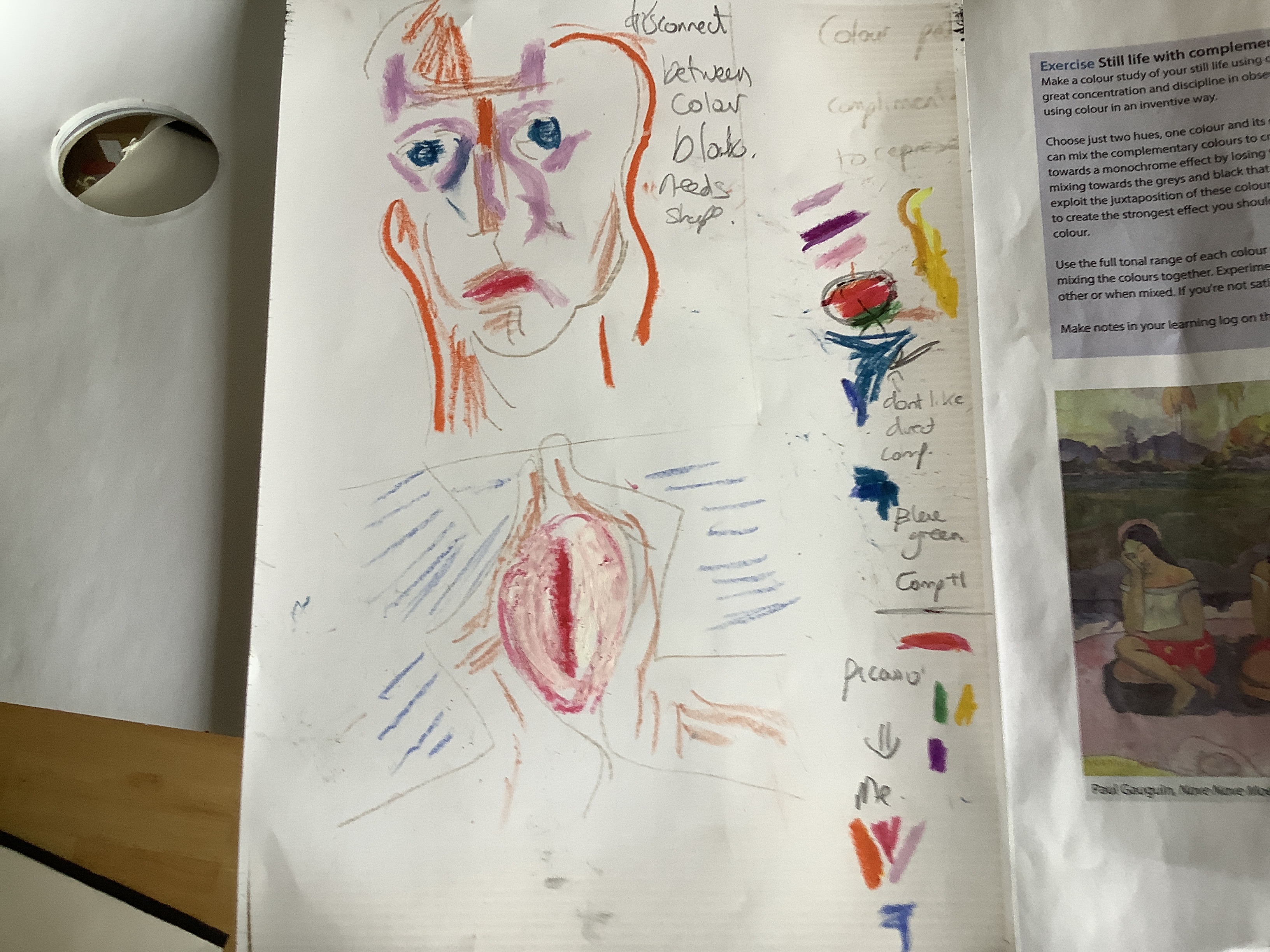
As I begin to develop my shape and form from the last posts do to consider exploring contrast and successive contrast exercises,

I realise that it would be easier to establish colour relationships by using colour blocks as Picasso did in his Weeping Woman.
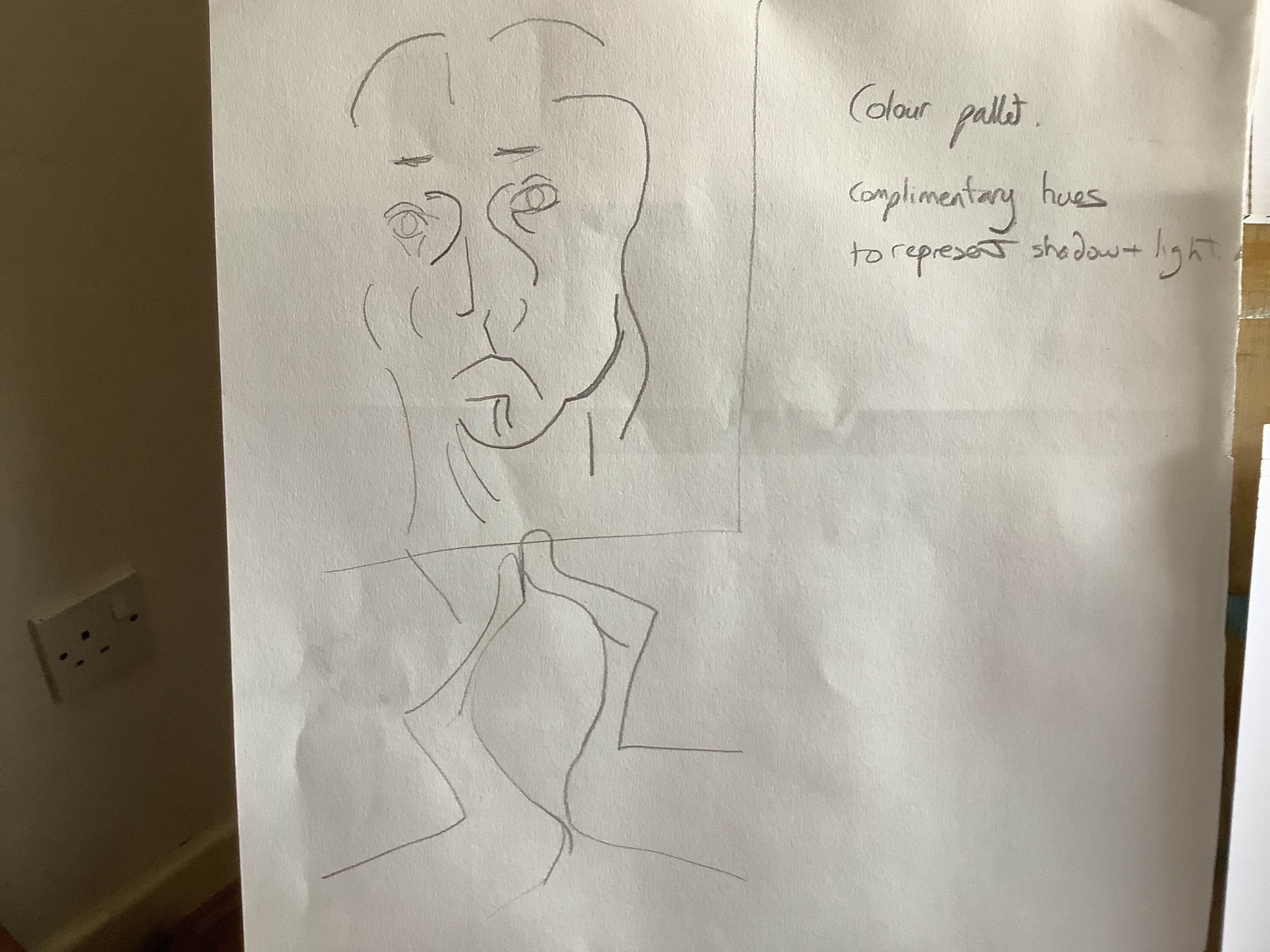
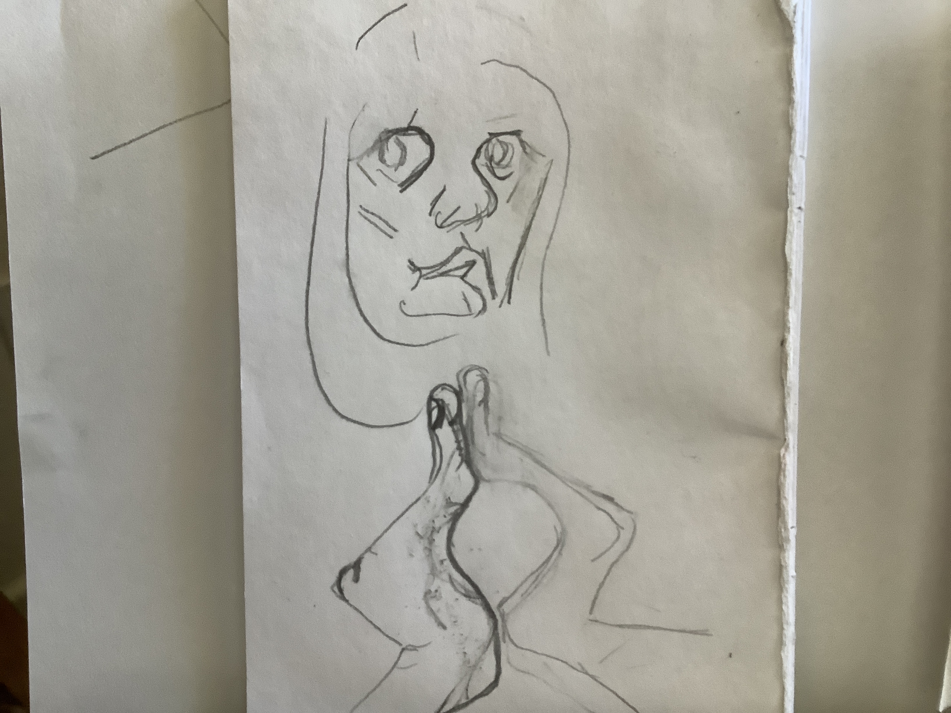
I have realised that after initial noticing detail in form and tone in a subject it is important at my stage to go back a step and forget detail in order to envisage colour.

In the same way that I have had to learn to sacrifice initial drawing  detail to establish form; I now want to  begin colour planning without  much tonal analysis. Tone and shade will follow during the painting stage.

Suddenly it hit me that I could cut out the key shapes to make colour blocking simpler. Then I realised that putting pieces on a black background would give me an opportunity to play with aspects of optical mixing. The rush of excitement and possibility that fills me at this time is rare and definitely one to cherish and remember in the many fallow idea times!

image

I was not able to enlarge the side profile without sacrificing the shadow  shapes ai want to explore. This gives me a further opportunity to expand the project in a completely different way later.

Meantime I moved the head on the same plane to emphasise the LHS- enlarging this side of face and hands and flattening out this side of the nose. ( I chose the LHS as it is most in shadow which is what I want to develop. The Left hand has moved out larger and forward. This will help me to indicate shade and depth in my similar colours ( orange and red).

in pictures 4 and 5  above I increased the negative space between blocks.

in 1 and 2 I played with the classic candlestick negative space that I realised had appeared and is mentioned in a lot of well known samples of optical mixing.
2 shows a diagonal move to suggest different between the blocks but I  note that it also show movement?

3 is an attempt to give significance to the space between the cupped hands. I have a notion to use tonal shading in this. Such spaces have been used by artists to represent the heart and also the centre of femininity in the reproductive system. I am still to develop where I choose to go with this!

Doing e recises to show complimentary colours together I can confirm colour theory findings that both are enhanced. The use of complimentary colours to frame a subject is particularly effective. While doing my weeping woman project I have discovered thr even though I like certain combinations eg blue , violet and pink it is of little surprise to see that Picasso’s choice of yellow , yreen and complimentary red wirk much better. Here lies a dilemma for artists!

Still life and still life with colour used to evoke mood.

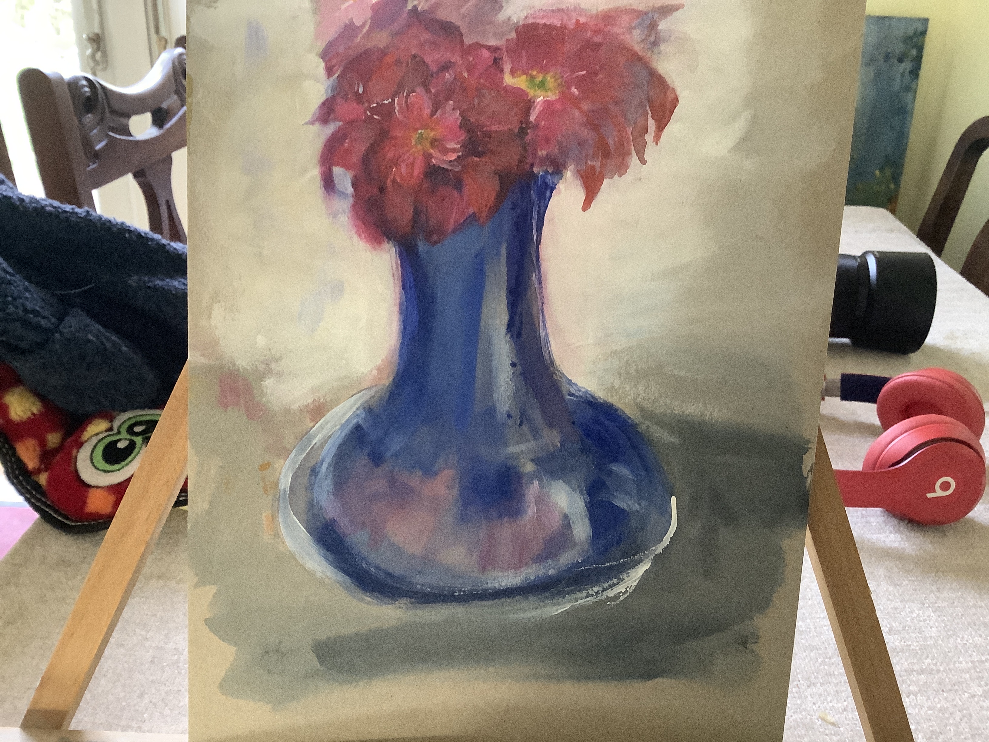
The best example of this that I have is the kettle oil and tomatoes still life. Here I found it easier than usual to move through a fuller tonal range of red , blue and their mixes. Working on depth and looking at the result from a distance I was able to go back and add lighter and darker shades to give greater depth. Mixing more tones before would help me to make this more effective.

In the fruit study I kept the study small and simple. Using red and yellow tones I believe helped to create a mood of warmth of these summer fruits. This is better than previous studies where I mixed in blues to cool it down unintentionally. This latter picture is not successful in terms of linear perspective. It does use a doorway to frame the scene which is a useful device. AS I struggled with appropriate shades of shadow under the table and worked into it while still wet I muddied the effect.763413c2-8b35-4f48-9ccb-b9892c946d02-3251-000002ff29598b51_file

Where does inspiration come from? – Podcast | Tate

Fly under the radar, explore creative spaces, and discover the importance of drawing a sheep
— Read on www.tate.org.uk/art/artists/pablo-picasso-1767/where-does-inspiration-come

I found the podcast interesting and inspiring, that artists do not just “wait for the creativity to descend upon them”. One contributor described that environment and emotion can be so exhausting that inspiration dries up. It is important to go back to what was found to give inspiration and work to recreate the feelings that gave ideas.

The Tate article also uses Picasso’s Weeping Woman to illustrate his drought period in the 30’s and how he moved on from this. Looking at the Weeping Woman in the context of the colour wheel and optical mixing I suddenly got part of what Picasso may have been saying. Immediately this became an inspiration to make a response and fulfilled the criterion of the still life exercise on P68 .

Project – response to Picasso’s Weeping Woman

An interesting web article on inspiration sources lead me to re-examine Picasso’s Weeping Woman. Wow- finally I am beginning to understand my own sense of something that Picasso is tiring to convey. For me I see his attempt to show the most important shapes in the human form. These are not necessarily allow a linear plane. He moves perspectives of the face so the half of face in shadow is front on and the lighted right side is a side profile. Why ? Perhaps to emphasise what are possibly the more attractive curves and line relationships? For example the shaped curves of shadow encompass the eye sockets, sweep round the mouth and flick down through the cheeks to the chin – creating a slightly different geometric pattern on each side of the face.
His genius takes this further for me as he effortlessly suggests pleasing combinations of colour triads ( two similar shapes in closely positioned tones of cold pale yellow and green matched with an almost complimentary partner purple). This had never occurred to me and took some time to work out as I worked through shape and form drawings to produce this:image


It occurs to me that it has  it has vocalised for me an idea that has been forming in my head for the last few years: the geometry and shape that shadow forms on the human face.

Now to add colour. I tried to use oil pastel lines to identify blocks of colour but found that this looked unconnected.image

Following a Picasso’s blocking , I worked out my own triad shapes: red for the shadow side space on and orange for the right hand side of the face with the perspective swirled slightly to emphasise the light shapes on the RHS of my face.This is mirrored in the hands.
Using a black out line helps to differentiate.

Next steps:

.add whitened tones to suggest depth?

. emphasise the swivel in the right hand side of the face and hand

. add the third compliment colour blue. Picasso used this as shadow ( small purple triangles) I need to work out my response to this.


05/04/20 Still life. Of flowers continued…

I decided to work from white to dark but made this mistake of using a dark violet to mark out the deepest shadow. In order to cover this I got frustrated, layers became thicker and I fell into the same mistake of using too much paint again! However I enjoyed the plant mark making and like the way that the loose leaves were expressed- one positive point to take forward!


the vase worked better here. I managed to start with a clearly defined shape and an idea of how I would add tints and tones to the blue in thin layers. I also managed to incorporate some of my loose strokes into the plant. The drape is unfinished but as the makings of being better because I worked slowly towards a darker brown over time. I must confess I was not confident enough to complete this process and left it as seen! The skull is too clumsy and I seem too stubborn to leave it out until my technical ability catches up. ( I put it into the lamp study below but finally got the message and dropped it for a simple apple after that.)
I used my fingers as an experiment with movement marks. I like the tonal values in them but believe that I should have used a fine brush to apply deeper layers of tint between the dark shadow red with added ultramarine and the white set tint. I like the softness and movement achieved by using my finger tip but admit that it is not neat and again touching up with a fine brush would help. Perhaps this softer look is better for mid picture work?

The lamp study used some tonal variation but not enough and I still got the sheep head wrong. I am much happier with my Apple work. This is a simple shape on a piece of white paper . Therefore I was able to concentrate on making a range of tints and tones . I recognise that it is not giving up to go back to basics- I need the technical skills before I can progress! The shadow is wrong in form and colour . Grey would have been better.

image

This painting is watercolour on cardboard. I found this medium pleasing to use on cardboard as it flowed smoothly allowing long sweeping strokes.

White gesso was used as the background and provided a good colour contrast to the dark rich blue and pink. In order with colour theory this contrast enhanced the blue of the vase very well. I am pleased with this effect.

The roses that I was painting were double headed and in an attempt to depict this I have lost the fluidity and shape of individual petals. I am quite happy that I have used a variety of tones in the pink petals .


Painting 1 coursework part 2

This is a particularly helpful exercise to concentrate my mind on accuracy rather than my usual rapid draw style. It also gives me a reference point to think about how I use tones in my work.

I found it useful to play around with tints, shades and tones afterwards to visually test out what I had read. My understanding of tints was greatly enhanced by this. I also gained a better understanding of adding warm yellow to make a mixed colour warmer and observed what happens to the hue against different colours. This aspect became important in the next set of exercises. I observed that to create the complexity of colour in a red lamp, I needed to look at the source of the light being added( natural white light) or yellow artificial light as the component colour wavelengths affected what was seen by the eye. Also the toning was not just a case of gradually diluting a colour with white- dark shadows enhanced the brightness and hue of adjoining parts of the lamp and white light tints seemed often to appear as a Matt effect- fuller than the shines bright hue absorbing red wavelengths to ‘pop against ‘ the lighter tone area beside it.

I have tried to cover my main observations in the pencil notes above this still life of man made objects. I was most surprised and pleased that during the processes that I went through to paint this, I felt more aware of how to think about the scientific production of tones and this helped me to recreate them a bit better – I hope it makes the depth and perspective more realistic too. I enjoyed the work better as I felt that I was doing less pure guess work and more observation of the scene.
Of course there are still many errors in the work: there is not enough definition of the budah figure and the surface is not accurate in its tone. However I feel it better represents the constitution of the natural light processes in this environment.
I was also happy that I took time to creat more layers of tint, tone and shade and that the construction of the colours was informed by the different natural and artificial light sources. I instinctively added a hint of warm or cool to reflect the environment too.
response to exercise questions:
As I have commented through out part two- I am learning to step back and enjoy the planning phase, realising that this does not need to kill spontaneous ideas. I will have my sketch ideas and have already begun to jot ideas and concepts onto a digital mood board. It is rewarding as I begin to realise that intuition was heading me in the direction of considering colour theory – however now having access to the knowledge allows me to use it in a more effective way.
I selected objects that had strong tonal values-a blue paint container, a red lamp. The small neutral coloured Budah gave contrast as a neutral colour to promote depth and allow negative painting between my two primary coloured objects and it was also something of interest. I placed the objects in front of a mirror with natural light from a window to the right and a secondary artificial light bulb coming from the left as I was interested in the comparison between the two types of light.
my scale was close up- I am aware that I am biased to this rather than wide angles – perhaps something to do with the way that I see the world as I am short sighted! My dilemma is whether it is good to stick to this as my own response or whether I would learn more by taking a different view from a distance. I at least need to try this theory out!
Looking from a distance at my group of objects takes away from the detail of objects like the Budah but may give me a better way of using negative spacing as the objects can be separated more allowing me to use the shadow space between them to greatest effect. This would indeed solve a problem that I know is in my painting: the Budah does appear indistinct and unrecognisable from a distance so negative shadow space would help me to define it more.

as I indicated in previous paragraphs I am pleased that I have the patience and seen the need to use multiple layers of paint in tints . I believe that this is a positive change to my paint handling technique.

Flower still life exercise:

I decided to make sketches of a modern vanitas set up in my work area- thinking about my observation that I “go in too close “ on my subjects. This helped me to select the best position to work from.

( see sketchbook2)

I made a paint quick drawing and began on the work. Unfortunately it was a problematic piece from the beginning. I have not yet grasped whether frustration brings a worse painting or the reverse is true. I ended up changing positions and colour tones of all grew subjects making them less effective. This is especially true of the skull. While I managed to keep paint layers thin and eventually reached a degree of tonal balance and perspective, this eluded next for the skull. Maybe it’s rich layers of very similar tones was too complex at this stage- it ended up being thick layers of undifferentiated colour without depth.


At this point I had my assessment I feedback ( postponed at my request).

main feedback points that I would like to incorporate into my next painting are:

  1. Pull back from being too ambitious on my subject- use a view finder.
  2. use thinner transparent layers to make the variety of tones and tints richer


Applying this to my picture:

too much thick paint in the shadow and skull

too little definition in the mug- it would help me to mix up a scale of reds before starting.

making the skull much less complex would be a good idea- put it at the back and concentrate on the areas which work better may help.