

Reflection on assignment 3 and tutor comments
Exercise – writing a review p103
Exhibition- online. This will not meet all of the criteria for physically visiting a gallery , however this is the best way for me to perform the exercise under COVID-19 restrictions. For the record, I do have notes, sketches and photos from quite a few visits but none are landscape based, probably because I am not particularly drawn to landscape work. This is a point of learning for me. Perhaps I need to extend my choice to include this genre in an effort to absorb and learn more.
Tate- online exhibitions weather and art.- Spring
A quick Google of spring themed art work confirms my own first impressions of the exhibition title: blossom covered trees; bright hues and sunshine and daffodil filled fields dotted with frolicking groups of lambs. On page 1 Alfred Sisley ‘ The small Meadows in spring ‘ and Duncan Grant’s ‘ Garden path in Spring’ illustrate the familiar pastel shades and gently blowing blossom ladened trees show that traditional artistic springs in 1880 and 1944 respectively alter little from my imagined image of the season.
However, if this is also your perception – you are in for a surprise.It feels somewhat like a rummage sale of everything who’s title includes the word spring from the Tate’s extensive collections has been thrown together in 47 pages of assorted images. This may seem unkind- and to start my impressions were negative. Oersiverence and engagement with the work on offer is the key to unraveling what is a real treasure. Page 3 shows Black and white engravings such as Frederick Walker’s’Spring days’ where children scramble through an overgrown bare garden and Barnett Friedman’s lithograph ‘ untitled .Verso: The real spring has come 1950 depicts a winning post picture of a horse and rider in earthy browns. There are sketches for paintings( only some of which appear elsewhere in the exhibition) watercolours, ink and gesso studies and oils from several centuries, cassette tape recordings of 1970’s sounds throughout the UK and all manner of sculpture from Hepworth to Raphael Montanez Ortiz deconstructed piano ( the piece played on it contained Spring in the title) all jostle for the viewer’s attention. A I flick through more of the pages, I find a page from Turner’s note book ( thankfully translated from his faded Victorian pencil scrawl) , I realise that this is so much more than I expected. It is a valuable reference source reflecting multiple medias of visual and audio sources. I will return to this again and again dipping into the social history and wealth of master artist preparatory work. In a short viewing I find my mind stretched on the true meaning , not just of the season but of any descriptive term.
Whilst I admit I could not manage or want to view the whole of this lengthy collection, I am impressed by the curators’ brave decision to go with such a wide brief. The very fact that there is no mechanism to select favourite images in search of the nostalgia invoked by Dame Laura Knight’s familiar cheery blossom and romance filled ‘Spring’ (page 1 ); means that viewers are forced to question their perception. Can it be altered by country, social circumstances and century? For me the answer would be yes.
references:
https://www.tate.org.uk/art/weather-and-art
Exercise- view from a window or door p105
I have decided to use the interface between inside and out- this has been a part of my subconscious thinking but not quite articulated into my conscious decisions till reading this unit.- the viewer is on the inside looking out. I am first struck with the issue of how much of the Van to include to make it clear this is the inside- too much adds complication- which is one of my aims to avoid after part 3. Once the interior ‘box’ or ‘boarder’ is selected I need to work on the shadows to give depth. This is the reason fir my first 5min sketch

It strikes me from my research of Dufy, he uses angled linear perspective- looking down on his subject to make sense of his inside-looking-out theme. ( He also introduces an element of aerial perspective in his work that shows cooler darker colours inside the viewer’s room.
I have tried out quite a few sketches and photos because I don’t want the link to be awkward or improbable- the view out of a van is not most people’s normal!


View 2- sunset through the facilities open doorway at the back of the campsite


Reflections on window and door framing of a landscape using photos from my recent travels to inform my work
As we travelled around Tiree this exercise was on my mind. I was able to observe a lot of natural framing examples of door and window type settings which improved the view.


excise hard or soft landscapes p 106


Exercise Linear perspective p108

On reflection I should have gone back.and reworked the sleepers to make them a more prominent depth effect. I forgot that watercolour fades quickly as it drys. I think going over the receeding tree arch with a biro would help to show the linear perspective line. Perhaps also introducing a horizon would help.


Exercise Aerial perspective p109

Also the ducks in the foreground are proportionally too big.


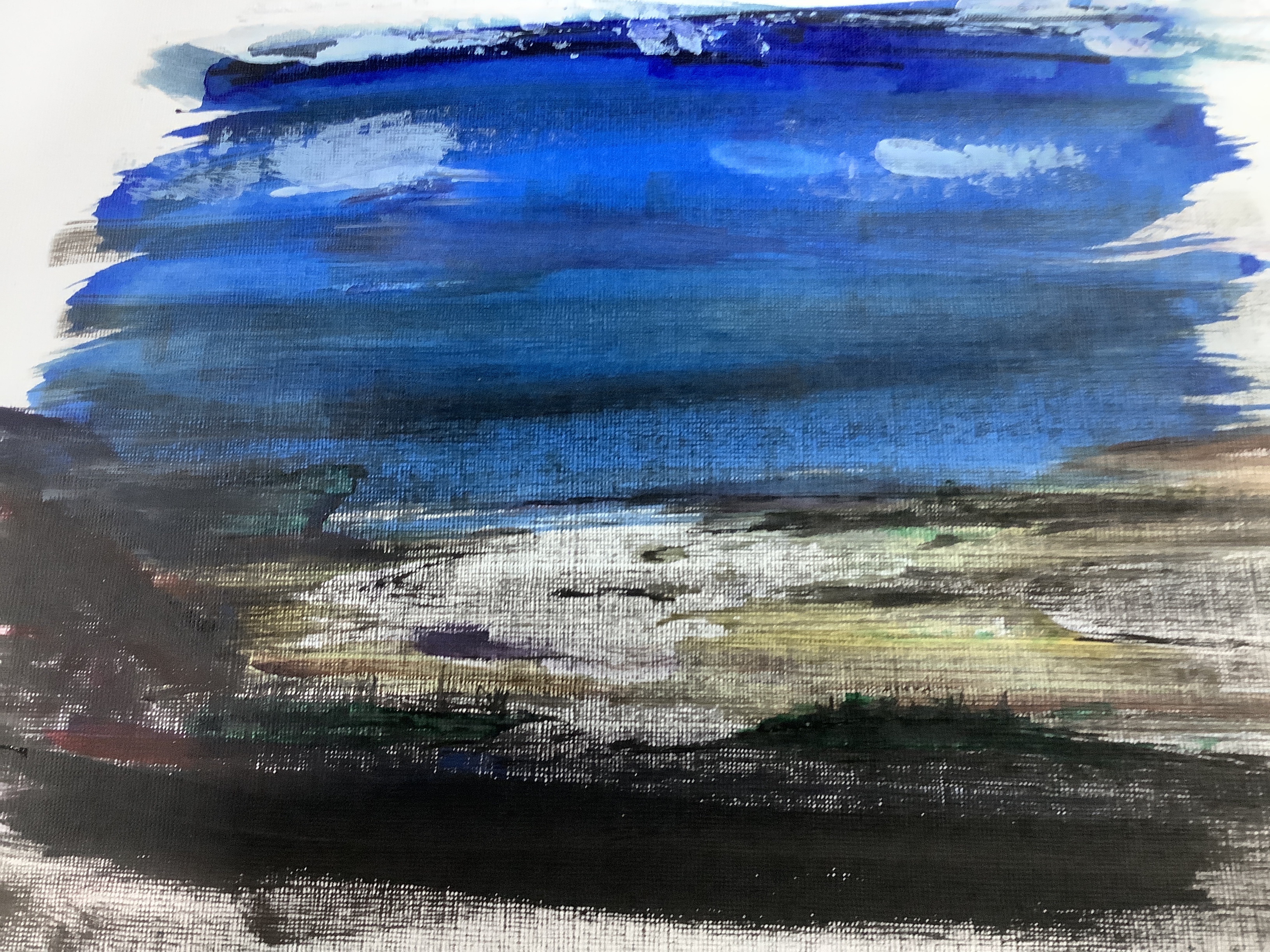
Expressive landscape- Exercise creating mood and atmosphere p111
In my research for this exercise ( see research 4) , I am inspired especially by Nash, Sutherland and Nolde. Therefore while I appreciate the simplicity of the Surrealist landscapes- and am aware that this is one of my aims from assignment 2 & 3; the more emotional work of Nash and Sutherland appeals to me. I love Sutherland’s idea of humanifying objects in nature and Nash’s technique of making the landscape integrated into the narrative of the painting. I realise that these are not simple aims to achieve , especially for a beginner but I want to keep them in mind in my work. I was also struck by the impasto and bright colour theory employed by Nolde- this should hopefully be easier to incorporate into what I paint.
Looking back at landscapes which I have recently painted I can see where use of colour could alter the mood. I think that I naturally am drawn to colourful scenes and try to work with colour- using Nolde I could emphasise this eg emphasising the brightness of my sunsets and autumnal leaves by using inks to lay down intense hue blocks which I can build up tones in acrylic and add depth through impasto mark making. Obviously I could use a grey shading wash to darken the scenes to show night or in rural scenes the rain clouds suddenly dropping a shower over part of the scene .
Thinking along the lines of Sutherland, I could make rocks and boulders into suggestions of grimacing faces. Sometimes I am drawn to the juxtaposition of beauty and ugliness; scenes where a rusty wreck of a shop is decaying on a beautiful shore line. It could be argued that this is an attempt to shock as Dali did, however as my theme is the tradgedy of abandoned livelihood and loss of a previous way of life , I could argue that it may be something that is Nash influenced?


Exercise painting a landscape outside p116

Although the sketch above is from an area unfamiliar to me the content is one that comes from my childhood and therefore is familiar for me to interpret. The shore line covered in seaweed with islands and hills behind is something I can imagine with my eyes closed so I understand why the exercise suggests this.

sharp and swirling edges which I wanted to transfer to my picture.

Outdoor painting commentary:
I did not have time to finish this painting before leaving the area and so decided to start again, this time with a very familiar scene- the view out over a fen-land field with the watery winter sun reflecting off the dark black turned earth.
Sitting in this environment stirred me to paint so I made a series of sketches of the scene from different positions and focusing on certain aspects: the knotted tree in the foreground ;the horizon far away over the flat field line with faint trees dotted along it and a pylon line advancing from it. The straight lines of the pylon wires and the ploughed earth formed natural lines of interest . While it was tricky to give the far ground enough detail to illustrate the flatness and extreme distance that describe the fens, I was aware of the importance of trying to keep the content simple.
However after sitting for a while in contemplation I realised that what held the scene together was what the area is famous for- it’s big sky’s. That morning the sky seemed huge- there was no drama in the clouds- in fact they were barely visible as the whole sky was a very, very pale tint of light grey/powder blue. The sky and it’s stillness needed to form two thirds of the picture. I found it helpful to make a sound file of the words that came to mind looking at the scene and the tractors,birds and calm of the day. Unfortunately this device will not support a copy of the file.
While I don’t mind people being around while I am working, I realise that the time alone while I sat thinking about what mattered to me about the view was important. This is a key realisation for me and something I intend to integrate into my practice along with gathering colour samples and sketches.
Looking at my sketches I felt that the garden in the foreground with the apple tree would frame the work. In reality however I think it was too much detail. I am becoming aware that I try to add a lot of close detail in my foregrounds which flattens the scene. I want to try to change my focal points to the middle.
The flatness and colour seemed to take the feeling away from my work. I think that the silvery/grey of the sky called for the painting to be a tonal work because this was what struck me about the view. I remember that I instinctively chose a flat ultra marine and a special effect powder blue sparkly paint to make my sketches and tonal works. This was my gut instinct and on reflection I should have stuck with this. I suppose this means that I have to learn to be confident in my feelings and would like to be brave enough to go with this. Connection with what is making the magic in nature is fleeting , I feel that I must learn to work quickly to capture this in instinctive sketches and audio note and videos to take home with me. When I recorded my thoughts it was key adjectives that seemed important rather than formed sentences.


Exercise painting from a working drawing p119


Necessary constituents I think I would need for an effective sketch to paint from: textures, more detail in tonal changes and negative spaces.
Exercise squaring up p120

In addition I used a pallet knife to apply the sky paints and found that I could get more energy into it using this. It is a new technique suggested in this exercise and it is pleasing to apply in this manner. I am also enjoying the opportunity to be tactile and engaged with my work . Most of the previous exercises have concentrated on LO 1 skills. It is great to be able to focus now on application of different media to creat a visual effect as part of LO 2 skills. This feels like an important step forward. I believe that the energy also helps to bring a narrative of drama to the sky. Using some tonal contrast in the blue of the sky would have given more definition and depth.
Looking at the close up I could have made the scene better by taking away more of the land and thus increasing the proportion of sky. This is interesting as the thing that I thought would be the focus was the patterns in the cliff below the lighthouse tower! This shows how important it is to keep open to new types of marks and developments in the paint that can change the intended work into something better. The simplicity of the scene gave me the chance to keep the image loose and probably is why I am pleased with it.
I am not sure that the bird is quite correct in its proportion or in fact if it is necessary?
The colouring has come out the way I wanted- complimentary elements to give drama. However I could have added more tones to enhance the perspective in the rock- it looks quite flat.

Exercise working from a photograph p 122

The photograph was a good aid- memoir for a scene that struck me as unusual when out walking. I liked the way that the dunes framed the picture like a gate inviting the viewer into the action. The curve of the kite and the action of the kite surfer I hoped would bring a sense of movement to the work. I changed the angle of the kite surfer to make him completely visible and evened up the dunes to be aesthetically pleasing. I also added the dog to show movement.This may have been too much but I am glad that I tried it. I have used shells and sand and rock samples to help with the tonal balance. The local shells on the beach ( razor and muscle were pinky rather than blue so it felt right to use purple in the palette.
I used a grid to position the shapes and experimented with a fishtail sweeping brush and water diluted acrylic and inks. This felt quite loose and freeing to start with. I liked the blue and purple tones together but didn’t feel the grass on the dunes was quite right.
As I added colour I think I became more stressed and the image tightened up losing the movement. This was disappointing. Next I tried to add more colour changing the kite to red. Somehow this felt out of place and jarred with the harmony. Unfortunately changing back to purple made the kite heavy and unrealistic with little tonal change.


Assignment 4


Photos of the process


Selection of subject: looking at all of my work, the view of the lighthouse left me with most satisfaction .I felt that it was most flexible and realistic, possibly because I connected most with the subject and found a way to bring texture and feeling to my work with a pallet knife and impasto acrylic.
Review of what I might wish to change from : I used my mind -map checklist (review of assignment two) for this. -Using a squaring device allowed me to concentrate more on developing mark-making to add definition and perspective (lo1). -. As the size was larger I had to resize my grid and reassess the view I was using to give a simple and well proportioned work. Therefore I decided to change the focus to the clouds in the sky and so decreasing the foreground to 1/3 (lo1) -I changed the lighting angle from overhead to coming in from the sea. This meant I could add shadow in the foreground of the lighthouse and cliff to allow more colour perspective. – I added waves to increase the positioning of impasto work giving more movement and fluidity to the foreground of the painting (lo2). – learning from other artists .The previous lighthouse I felt was not telling the whole story, the impasto cloud work was not enough to convey the energy and danger of the treacherous meeting of the Atlantic and North Sea at the tip of Lewis ( The butt). (Lo4) I decided to add a ship and waves crashing onto the cliff to suggest this. Changing the angle of view allowed me to show the horizon out at sea in the distance. I thought about artists such as Ernst Kirchner who looked to add energy throughout his paintings- not just in one section like the sky. This time I didn’t include the angles and jarring geometry of his earlier work but studied and tried to take inspiration from later Austrian landscape works. ( lo3) These contained contrast colours ( hence my tones of blue and golden yellow) and strong curved feature shaping. I tried to suggest this through cotton wool defined clouds rather than showing a bank of stormy rain being deposited from a heavy blanket. I also used negative colour( cf mind- map checklist) to emphasise the curve and structure of the cliff line.
Media: mixed. Acrylic ( heavy ) , coloured pencils (aqua) , sand secured by clear levelling medium, small filberts and 1/4 inch painter’s brush, pallet knife . Support cardboard.
Preparation: I used my research for my lighthouse exercise ( squaring up exercise P120) . Using my mind- map checklist ( review of assessment 2) I realised that I needed to reframe the view to create a more interesting painting and one with a better perspective . Focusing on the sky as 2/3 there would be more scope to introduce colour perspective to the clouds and using impasto would suggest turbulent weather to give a narrative to the work (Lo1) .
I also chose grass samples ( green /yellow/ red), previous prep sketches and tonal sketches and observations on my finished acrylic and pallet knife work. (Lo1 and 2)


Intention and narrative: I knew that I wanted to focus on the sky as I had enjoyed using impasto acrylic and a pallet knife to make what I felt was a more realistic scene. I also wanted to constructive narrative. Thinking about the instruction in this unit I used a lighthouse local to me and the sea and sky which I love. Then I added a fishing boat returning from a trip as my minded had been occupied lately by a story about loss and social poverty in the local fishing community.
preparation: I wanted the lighthouse and fishing boat to be the main focus in the bottom right third quadrant with cloud lines diagonally focusing the eye into the lighthouse area. Therefore I needed to alter the perspective, making the lighthouse a little closer to the viewer and the sky bigger 2/3 ) . For this reason I used a new grid to create a rough pencil sketch.
important points: I wanted to make sure that the horizon line stood out clearly and that the sea and sky were in the correct tones. Spending a lot of time observing the sea I knew that the sky lightens from the top down to become transparent on the horizon line. The horizon then becomes a little darker blue and again recedes to a pale blue/grey becoming darker as it gets closer. I have also been watching breakers in the storms . They develop a roll in my experience from right to left where the energy throws up a wave curve of turquoise green. As it falls it becomes a white tunnel, sometimes with tails coming off the top if there is a prevailing wind.
method: After the initial background ( blue) dried I applied large amounts of heavy acrylic white and folded it into clouds with a pallet knife. The blue for the sky was smother on with some impasto ridges and white added to ensure toning . The clouds in the furthest away paler sky were applied as lines with the edge of the pallet knife. As areas dried I added layers of detail. Sand from the location was useful to add texture to the ground and in the foam of the waves. Finally I began to make finer detailed tonal layers using wet and dry aqua coloured pencils. As I work quickly and loosely with brushes I have discovered that I can bring some controlled detail with pencils. This means I can add more layers and hopefully more tones to increase perspective. I was pleased that I had managed to keep my acrylic work looser. This was a problem in the original squaring work and I attribute this improvement to the use of heavy acrylics and pallet knife work , leaving the detail to wet and dry pencil.
The final two layers were applied with 24 hrs between each to give me more time to observe what needed improving. For the final layer I identified the left hand side clouds as needing more definition in grey and tinted yellow light and the lighthouse was reshaped and to ally improved by adding negative space colouring around it. I also realised that blue needed to be added to the glass area as it is see- through.
Artist’s influence:
I have found myself thinking of landscape in a much looser sense since viewing more of the work of contemporary artists like those recommended for me to study in feedback 3. Although I didn’t write up their reviews till the end ; I spent a long time in contemplation before starting the unit properly looking at their work methods on you tube videos. This was really helpful and I feel gave me a sense of permission to try exactly what I wanted to do to put expression into my working process- eg changing tools (knife instead of brush) , new materials ( large amounts of heavy acrylic) and more bold colour. However as I often do , I abandoned my practice doodles fir the exercises and returned to my usual formality. This felt so frustrating and many of the pictures really suffered as I didn’t connect properly until the squaring exercise where I finally let go and was brace enough to experiment. Yao Pei Ming , although working in a different genre really had an effect on me to try effects with different tools. I. My assignment piece this included using a knife again and introducing a small 1/4 inch decorating brush which added smoothness which I felt balanced with the impasto in the sky. Studying the German Expressionist Emil Nolde inspired me to try colour and loose marks ( eg the foreground in my final work). I think the whole process of a block of time spent studying h theses artist’s beliefs and techniques has been absorbed into my creative thinking. What I need to do now is to relax and listen to my instinct to let this come through.
critique: I am happy with the construction of the picture and the lighthouse being in the right place. However, I notice that as I worked the foreground splash from the sea has taken over as the focal point. ( the fishing boat is really too far away to be a focus). The receding coastline looks better being lighter with dark negative colouring behind it. The clouds work fairly well but still look a little stiff. Putting more definition into the edges helped to make the larger clouds on the left foreground stand out more. However as I have already stated I need to relax to the same extent as I do when experimenting in order to keep fluid.I like the colour contrast between the sea blue and the green and yellow tones of the ground. Observing the reds and oranges in the ground helped me to make more definition and adding some blue puddles in the foreground helped to draw the two areas of the painting together. I could have added more detail in the front in acrylic to make it stand out better. I am pleased with the mixed media format as it has allowed me to work more effectively with my strengths and weaknesses ( eg texture to help with perspective as linear perspective is not a strong point and using heavy acrylic and a pallet knife has helped to keep my work looser with the pencils for necessary detail and to give more layers of tones.
