
Category: Coursework
Sketch book 5

Impasto p130


Dripping, dribbling and spattering p131


Preparing a textured ground p134


Mixing materials into paint p135


Abstraction from study of natural forms p137


Abstraction from man- made form p 137

Assignment 5 Sketchbook


Part 5 course work and assignment 5

Personal development reflection
My favourite projects so far are those which have allowed me to work with loose mark -making and bold colour. In particular ‘ Painting outside’ and ‘ working from drawings and photographs’. The way in which they were written and structured inspired me to go outside and take notice of my surroundings again .’ Painting Outside’ began to allow me the luxury of a long time to contemplate the scene and consequently I began to plan properly what I was going to include. Furthermore I was inspired by the atmosphere and sense that I could engage with what to put into the painting and how to allow my self to progressively develop work. Building on this, time spent appreciating and noticing the energy of the sea at the lighthouse where I chose to paint the ‘squaring up exercise’ meant that I really ‘felt it’ before starting to plan the composition and early sketches. This helped to boost my confidence and marks flowed more loosely . In addition the process -skills behind all of the previous disciplined exercises in the course were finally beginning to make more sense and they were becoming more natural for me, further allowing me to relax a little and loosen up.
Through conversations with my tutor I have been able to identify and paint more towards my natural strengths to increase my confidence and understanding of what a more mature painting process might involve. We concentrated on exploiting my natural instinct to paint quickly with large loose marks and to experiment with mixed media to incorporate texture.I recognise that at certain points in the life -long learning experience of anyone who wishes to be a visual artist, there are light- bulb moments. This could be compared to learning to drive. A learner’s three -point -turn performed inexpertly and jerkily suddenly becomes a smooth process because the brain learns to perform it automatically. This frees the mind to work on other important driving procedures.Of course the skill is still quite elementary but each time it is used, it improves. This is how I have felt since painting my first light house ( squaring exercise Part 4 p 120).The squaring process allowed me to make a better composition with more accurate perspective.With the pressure off this ‘problem’ I began to relax, painted looser larger marks and managed to notice how to exploit the developing energy and movement in my painting .Initial studies of artists who work in this way has been revolutionary for me. On videos I have watched, Joan Eardley working fluid thick marks onto a large board with urgency and passion. I have studied photographs of her sea scapes, exploring the marks and textures left by her frenetic painting process and felt this movement coming through her work. Each painting and letter describing her views and emotional response to her work encourages me to try this style because I feel this urgency and passion to record the power of the natural environment. I need to keep practising technical skills and improving my use of tones and contrast but at last I feel that I have started my own journey influenced by the marks and textures that act as my vocabulary.
Projects requiring linear perspective and fine detail were difficult but having said that it is rewarding to understand where some of my weaknesses are coming from and what I can do to improve. ( see the flow chart at the start of my course work in assessment- review of assessment 2 . I took a lot of time consciously trying to apply this checklist to my work in part 3 which was demanding and hard going.The portraits were not particularly good in terms of quality, my work became tight as I tried to concentrate on linear perspective. Texture, colour and impasto would have been a better was to approach this. Then I lost heart and didn’t develop the layers through tone and detail. To go back to my learner driver analogy, I was still at the beginning of learning and I could only concentrate on one aspect at a time. By mid way through Part Four I began to notice a change as I have described in relation to the squaring exercise.
I can see development of a checklist and squaring my work as key events in developing my process but I cannot exclude the study of individual painters and artistic movements.
Project- Different ways of applying paint.
Exercise- Impasto p130


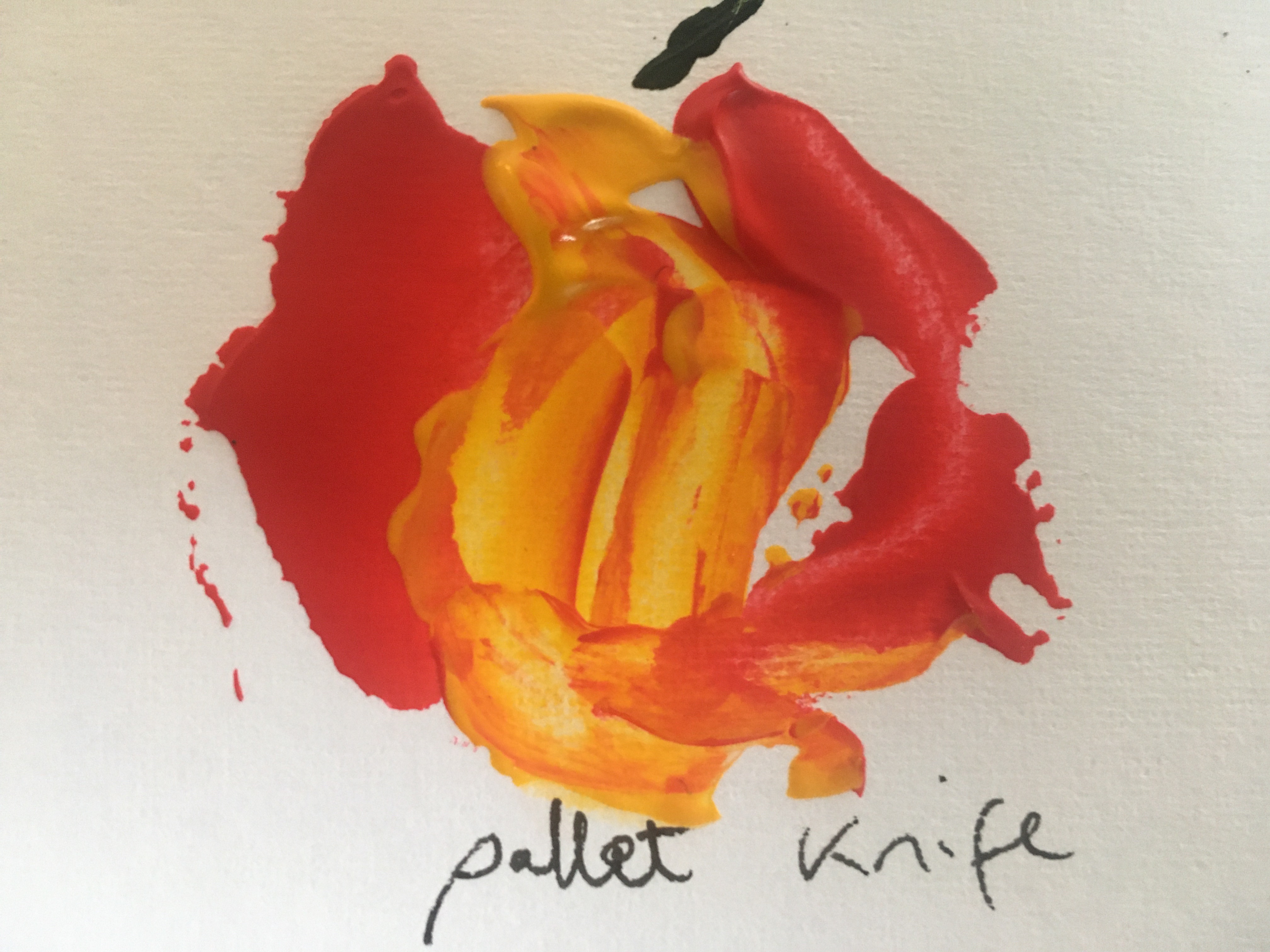
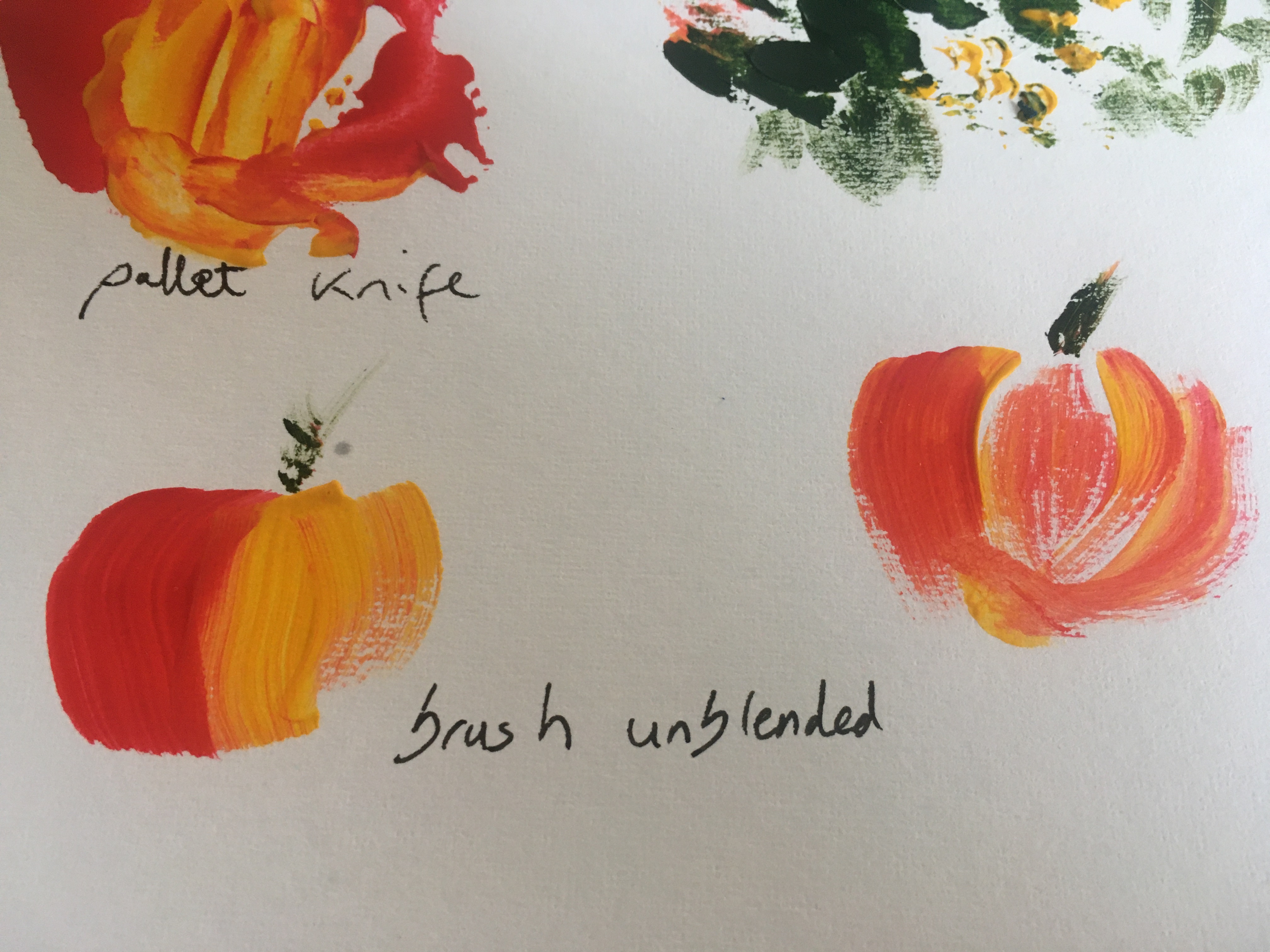

I spent some time experimenting with different methods of applying the paint by knife, card etc . This is useful to be aware of in different settings. It may seem quite trivial but a big discovery was taking the time to experiment and find the best ratio of medium to paint . Also my mixing technique was a bit slap dash previously- mixing away from the pallet in a tub and almost beating in the medium had a much better result. I think applying thick medium -assisted layers with a pallet knife would have brought much more drama to my portrait exercises.


At the bottom of the picture is a thick layer of stiff blue acrylic- pulling it away at the top into a layer of wet paper allowed me to try to show how the sand moves when water is sucked back off the beach into the sea.
Exercise- Dripping , dribbling and spattering p 131
It is curious that while I love making big dramatic sweeps and curves, I do not find it easy to create good splatter work! My efforts below feel a little stiff and lacking in spontaneity. I think I am subconsciously worried about spoiling my work entirely if they are uncontrolled. I was working away from home in a limited space so didn’t embrace the Pollock inspired kinaesthetic dripping fully. I will try this in the future in a large area and following his idea to almost dance around a the painting while making the marks. I can see why this looks less stiff. I have also seen videos of paint cans pierced at the bottom attached to string which act like the fulcrum of a pendulum. I think that this could add energy to a landscape or a seascape work. I think it is possibly a case where more than 3 colours would become chaotic. Also stopping while I could still see lines and track marks would be important. I watched a Tate interactive exhibition which illustrates both of these points. The artist Yayoi Kusama is of course well known for her trademark dot work. In this installation she invites visitors to create the design using provided Ed stickers to place in a white room. The overall result is for me well past the optimum point but it is fascination to watch the time lapse video showing the installations progression over a period in time. At several points a really beautiful result is produced and then changes completely as different marks are laid down. This is a learning point in itself- if it feels like the work has gone too far, it may be that it just needs a fresh direction and it is not necessarily healthy to stick to an original idea. Here flexibility and courage to go in a different direction produced surprising and beautiful results.
Bloomsbury /Tate shots: Yayio Kusama ‘s Oblitteration Room accessed on 3/12/29 online at https://youtu.be/-xNzr-fJHQw


Project- adding other materials
Exercise- preparing a textured ground p134- Rough sea


Exercise – mixing materials into paint p135


These exercises have been really informative and I can use the results to improve my perspective techniques eg using texture lines and patterns to suggest distance especially in the foreground.
Project Towards Abstraction
Exercise – abstraction from study of natural forms p137
I spent time looking at natural patterns in nature as I already find these fascinating. Eg looking at the light reflection ( rather than pigment) on butterfly wings and on bird feathers that produces their spectacular patterns.
This lead me to review my understanding of naturally occurring patterns in nature that can be described by mathematical formulae. The Fininache or golden ratio occurs in shells , seed -heads, petals and countless other areas and is copied in a basic form by artists to find the most impactful place for focal points. The Manderbelt Theory has been worked out and programmed digitally to show repeating patterns. Both of these formulae produce amazing and pleasing abstract like patterns. I decided to sketch broken shells from the beach as their abstract patterns make beautiful spiral shapes which I feel could be incorporated into abstract painting.

This led me to complete a small piece I had started for another exercise as a ‘ fantasy’ landscape where the twisting cloud looks a little like the interior spiral of the shell. On the beach this usually remains in some form as it appears the strongest part of the shell. The colours are influenced by the work of Giorgio de Chirico whose stark modernist works where full of bold colours. He managed to change the feel of a work by positioning of the subject using realistic objects placed out of context which triggered a feeling of unease in the viewer. In my quick sketch I can relate to his aims – the cloud symbolises the broken shell I drew above and is intended to reflect a brokenness in the landscape, further suggested by colour use – only tonal hues without a contrast. To improve this idea I would have to chose a more familiar symbol which any viewer would recognise


I also became fascinated by the patterns created by reflection of light to produce wonderful fluorescent patterns that change with the angle of viewing eg in feathers and butterfly wings this is produced by scales sticking up at different angles to reflect light differently. At some point I would love to creat a project based on this finding in nature and how it can be mimicked
Assignment 5
Assignment 5 – reflection on studies and coursework to date
My path to Fine Art has been through self exploration and internet assisted discovery rather than the discipline and technical skills which I presume are taught during recognised academic art qualifications therefore the very necessary technical skills projects in Painting one have been tremendously rewarding but have required a great deal of concentration and I am aware that in doing this I have become tight and less confident in my process. Advice and encouragement from my tutor has kept pushing me back towards a looser style which allows me to compensate somewhat for my lack of technical skills in fine detail and linear perspective. I feel that I have had to start from the very beginning on most projects and worry that this leaves me completing exercises at a very rudimentary level.
Picking my topic
Although this does not disillusion me, I was delighted to feel that I may not be starting quite at the beginning for Part 5! It is inevitable then that I enjoyed exercises involving impasto and mixing techniques and believe that I have managed to loosen off my style more than in previous parts of the course. Therefore using the skills practiced in Part 5 on the topic I most enjoyed in the course- the sea felt the right area for me to develop my work for Assignment 5.
I mentioned earlier in coursework 5 that living on the coast I have become intoxicated by the rhythm of the sea and tides . Coincidentally I have been studying the effect of gravitational pull and lunar cycles on tides and sea conditions in relation to safety swimming at sea, so this naturally influenced my painting subjects . I have found myself looking more and more at the difference between high and low tides and how this and the local environment ( eg rip tides) affect the beach. [ Reflection and contemplation prior to undertaking a project was something that I learned to develop in Part 4, ex . Each new tide has an impact on the ‘furniture’ of the beach, making it into a constantly changing muse. Throw in the weather and light and the coast has become a place of amazing beauty and variety. Like so many artists I now find myself compelled to record its changing nature.
Aim
I want to try to express some of the many natural phenomenon that I see at the same stretch of beach over a few days.
Technical skills practice


feeling the softness and suck of the sand around the ‘ tidal pull -back’ ; impacted ripple-beds created by the tide on the foreshore and the crunch of little groups of muscle and mollusc shells caught up in clumps of kelp.. I laughed at blobs of foam shooting across the sand at the mercy of the changing wind and noted the smell of freshness and decay in different parts of the beach and tasted the salt from spray blown onto my lips.In other words all of my senses were now engaging in the assignment project. This is a first for me and feels like a small victory in my desire to develop a personal process.
I spent a great deal of time watching the waves from the body of the sea right up-to the tideline and the beach beyond. I wanted to try to reproduce some of the effects I saw so got to work experimenting with different tools and ratios of paint and media.


Observation
The wave is usually blue behind and turquoise underneath the wave before becoming white and frothy at the end.Next I wanted to look at wave formation. This study shows some of the different hues in the sea. Most waves come in sets and break as they reach an object or the shallower water of a a sand bank or when waves meet water being driven in an opposing direction ( rip current). I began to notice a pattern : a wave begins to fold over at one end and the white crest forms diagonally up the wave in a chain reaction like a line of dominos each being knocked over by the fall of the one in front.

Emotional response to work
During time spent over the last month with a local Uist artist Ellis O’Connor, I learned the importance of engaging with your subject. I spent time sketching the sea and painting in watercolour and acrylic on the beach to capture the energy of the waves. To recreate this when not in situe she told me that it is helpful to recapture feelings by looking back at sketches and a plan air work before starting work indoors. In addition I have looked back at photographs and videos from an emotional aspect rather than as a reference.


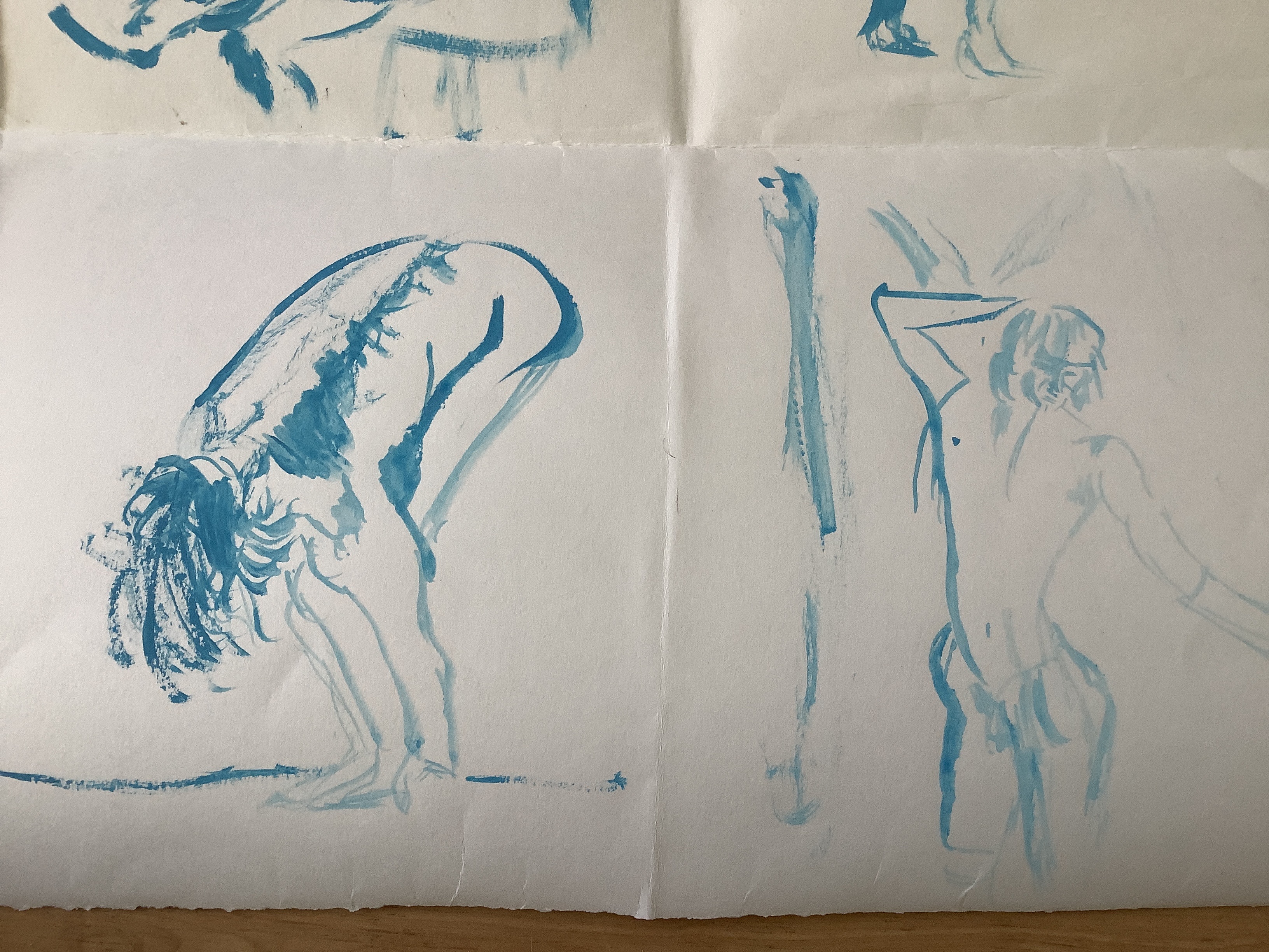
While studying this I thought about the domino wave effect where the white surf is sometimes illustrated as free-running white horses. It is not easy to see but in the study below I had a go at doodling horse heads and front legs into patterns that I saw in the white already laid down. This really engaged my sense of connection to a wild sea and is one that I used in the exercise using impasto white gesso and a steel wire circular pad.


Next I looked at how to show the ridges and ribs in shells


Interpreting the style that would best illustrate my understanding of place.
Composition and Style
I am extremely fortunate and have to appreciate the serendipitous timing of relocation and personal learning and feedback from part 4 .I have begun to realise the importance to me of a sense of place and how having an awareness of the ‘soul’ and history of a place can help me to find a narrative for my work. I have spent the last 6 weeks absorbing the natural environment and social history of the Outer Hebrides. Talking to local creatives has encouraged my sense of awareness of the ancient and modern influences on the coasts that my beloved sea beats upon.
I wish to quote some local and international artists who have affected my development of process and style as I have worked through this assignment.
Pauline Prior-Pitt from Shore Sequence
today the sea has left skeins
of treasure on the sand
each wave ebbs a necklace
seaweed threads, broken shells,
feathers, straw and fine peat grains
Recently I have become aware of how much my personal health and happiness is connected to nature around me. It gives me a sense of grounding and the raw power of the sea demonstrates so clearly that humanity is just one small part of creation. I want to share my delight in the sea’s changing moods, it’s energy and paradoxically the security that the constant rhythms of the tides brings to those who study it.
Sense of place is important in the work of both Joan Eardsley and Paul Nash and I have been influenced in how they communicated it.
When I first saw one of Joan Eardley’s street kids pictures I was struck by the freedom of her mark-making and her bold colour choices. Solid blue rings around a child’s eyes is not conventional- and yet it works. It is spontaneous and says something of the plight of the impoverished children that she knew so well from the streets around her Glasgow studio. The colours of the clothing are bright and used repeatedly as a complimentary colour technique to make her work ‘pop’ and to draw attention to the poverty of the residents – the same items of clothing appear again and again on different siblings . As one of the artists for recommended study in this unit , I returned to her work . New amazement hit me- as I felt the frenzied energy used in a breath- taking manner to portray storms she observed from the small fishing village that she spent a great deal of her latter years living in. She worked outside with huge canvases lashed down to prevent them blowing away in gales and apparently worked quickly and loosely to paint in the same spots again and again, claiming that the more you studied a site the more detail and feeling you got from it. I greatly admire Eardley’s bold mark making, impasto, application of sand in her ground and scratching into her work. This conveys the urgency of her paint application and therefore her passion for the subject. In her work I can detect the joy that she must have felt in her paintings and realising this I felt more able to try to loosen up and experiment in my assignment . I commented in part 4 that I realise I retreat into convention and lose the sense of what I am trying to paint. Therefore Eardley inspired me to be bolder in this submission.
Ellis O’Connor says that “ on stormy days the sea and sky converge” and this is what she tries to bring to her work.https://youtu.be/U6SZjQgeZIc
The next paragraphs about JE have been added after formative feedback. 12/01/21
I have taken Ellis’s words very much to heart and sat for many hours absorbing the moods and tides of the sea. I best love the bubbling white mass of foam as tall rollers crash in from the Atlantic and smash many miles worth of built up kinetic energy into stacks of outlying rocks or collide with rip tides bouncing of the bay. This wild caldron is imprinted on my mind to the point that I must try to describe it using colour,texture, splashes, pallet knife marks and anything that I feel will develop my depiction of this amazing and dangerous sight.
Until very recently I felt a sense of defeat when I picked up a brush or chalk to record this scene. It has taken technical ‘light-bulb’ moments as referenced in ‘Personal Development’ at the start of Part 5 ) and without a doubt the research into the work and emotions of artists like Joan Eardley to encourage me out of my previous artistic paradigm . It may sound over dramatic but I am convinced that discovering the level of passion and self belief and observing the mark-making that Eardley used in her seascapes opened up to me the possibility that I did not have to paint as a photorealist. My journey in art is to represent the energy that I feel in a subject through urgent mark-making and development of my emotional response to the subject and my evolving work.


Paul Nash connected again and again with environments that were of great significance to him : a hillside near to his home in Oxfordshire and the war torn landscapes of Europe in both world wars.
David Boyd Haycock gives an interesting incite into his process in a recent Heni Talk, revealing that Nash wanted to show the unseen psychology and feel of a place as well as how it looked. It is interesting that he often chose to do this by using trees as a metaphor: in his Great War paintings he uses the blown up stumps to describe what humanity has done to the world and in late paintings he returns to his favourite clumps of hilltop trees in Oxford to convey his feelings about the passing of life. Reading about this has made me think a lot about more deeply about how I can use the coasts around me to convey my message.
Donald Smith another artist originally from the Isle of Lewis uses colour in a powerful way. He chooses a limited pallet of similar tones and adds one complimentary colour – using a technique from colour theory rules that part 2 taught me to be aware of. In the untitled Stornaway harbour image below orange/ yellow tints form the main body of the painting study made to ‘pop’ by the inclusion of a single splash of blue winding across the scene.

Smith also uses a simple block pattern outlined in thick black to create landscapes that really stand out. See his image below.

Joan Eardsley’s seascapes are full of understanding and abandonment to the wildness of the sea. In my reference work I have detailed sources explaining her plein air work and her love of painting the coast around her part-time home. She talked of the importance of painting it again and again to really know her subject. I have come to appreciate the importance of this point of view. For me knowing every inch of the rocks and how each storm and ebb tide interacts with the beach leaves less to get wrong in composition. It also develops a kind of muscle memory allowing me to relax into my painting , enjoying it and working in a looser manner. As my painting is my main recovery tool from long term depression this experience of losing myself in the work is key and as such I feel this the only subject that I could use for my assignment at this time.
Project paintings
Image 1 night sea- rejected


Image 2 – wild sea- rejected


Image 3 -Alone on the beach- rejected


Image 4 – The storm


Image 5 – Sunset


Image 6- alone on a beach 2
I wanted to develop the theme of expanse that I first explored in Image 3. My main learning point was to add drama to the expanse .


Images taken from the section of beach I wanted to paint showing the topology, cloud structure, sand texture associated with different parts of the beach and around the seaweed , a guide sketch plan I made earlier of typical beach structure . I spent a long time observing the sea. It is not obvious from the pictures but the area on the left is an estuary and the beach sweeps round to the open sea at the top RHS. For this reason the fore and mid ground sea in this work will be slightly calmer and the splashes and energy comes from hitting the sand and small rocks. The sea state is choppy rather than sets of rollers. The sky is grey with rain clouds some passing quickly over head and one dropping its rain visible as a grey sheet stretching down into the back ground Atlantic. Clouds not clearly visible on a mobile camera device.


Image 7- sea eye view of the lighthouse


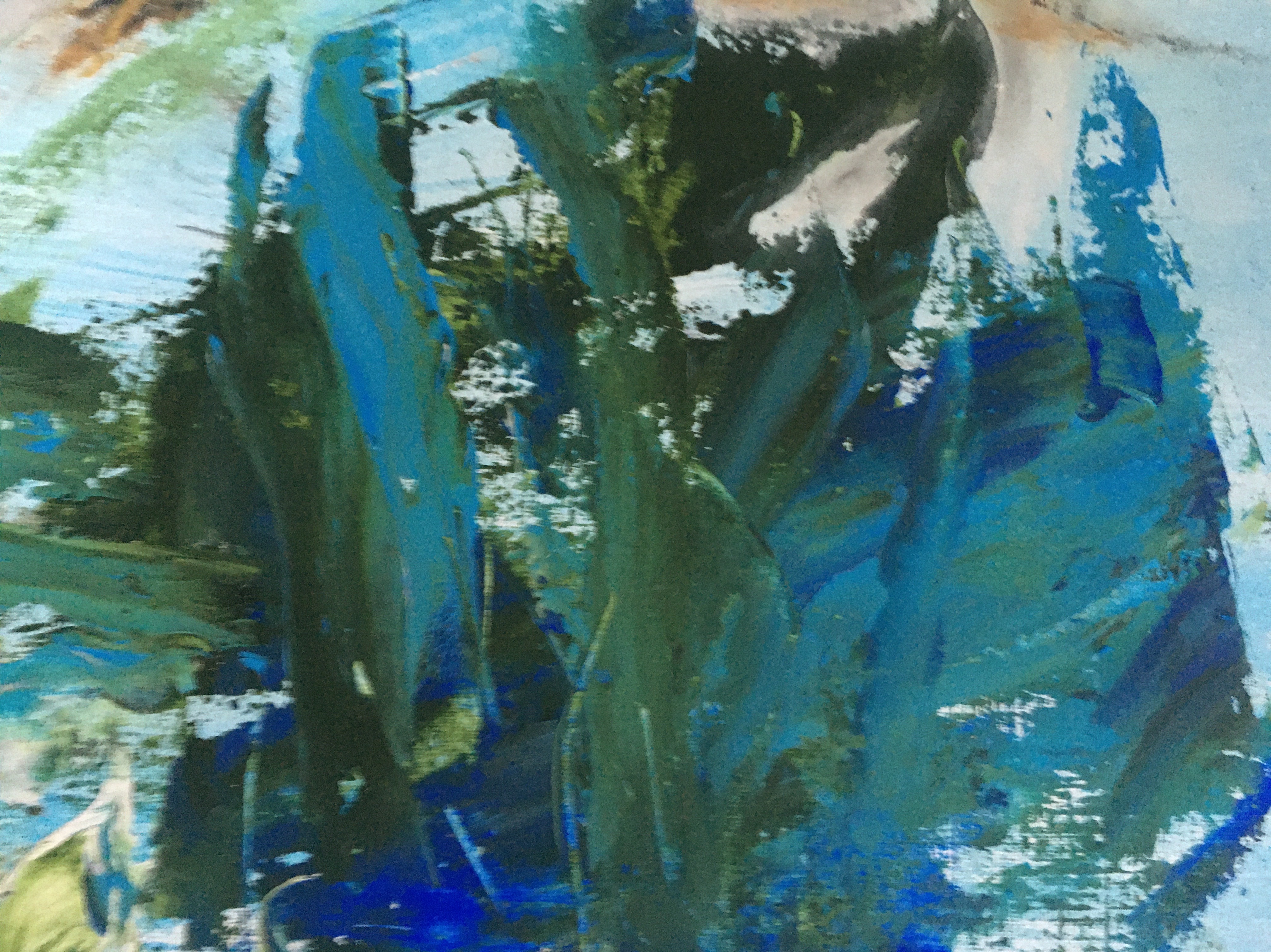
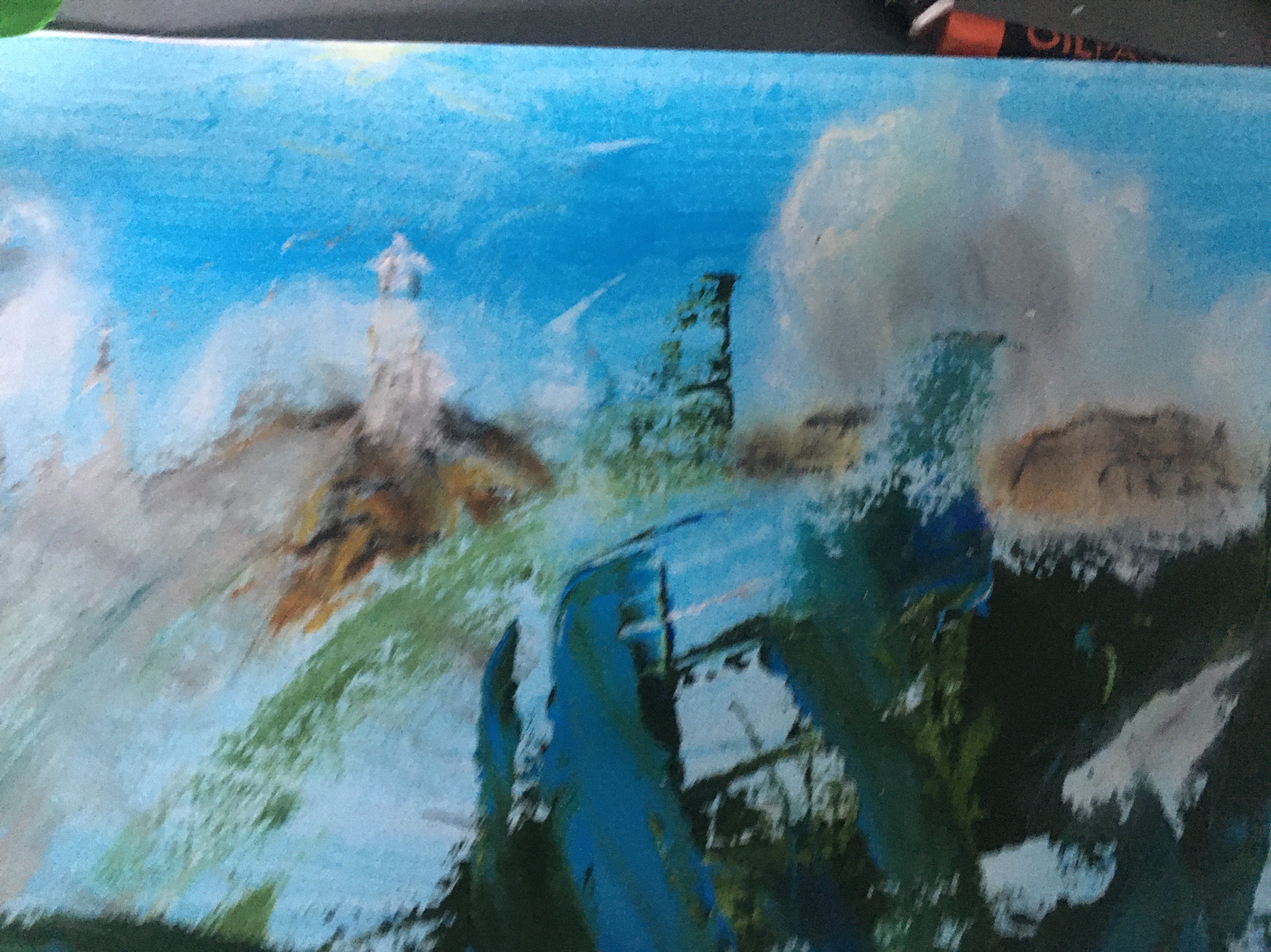
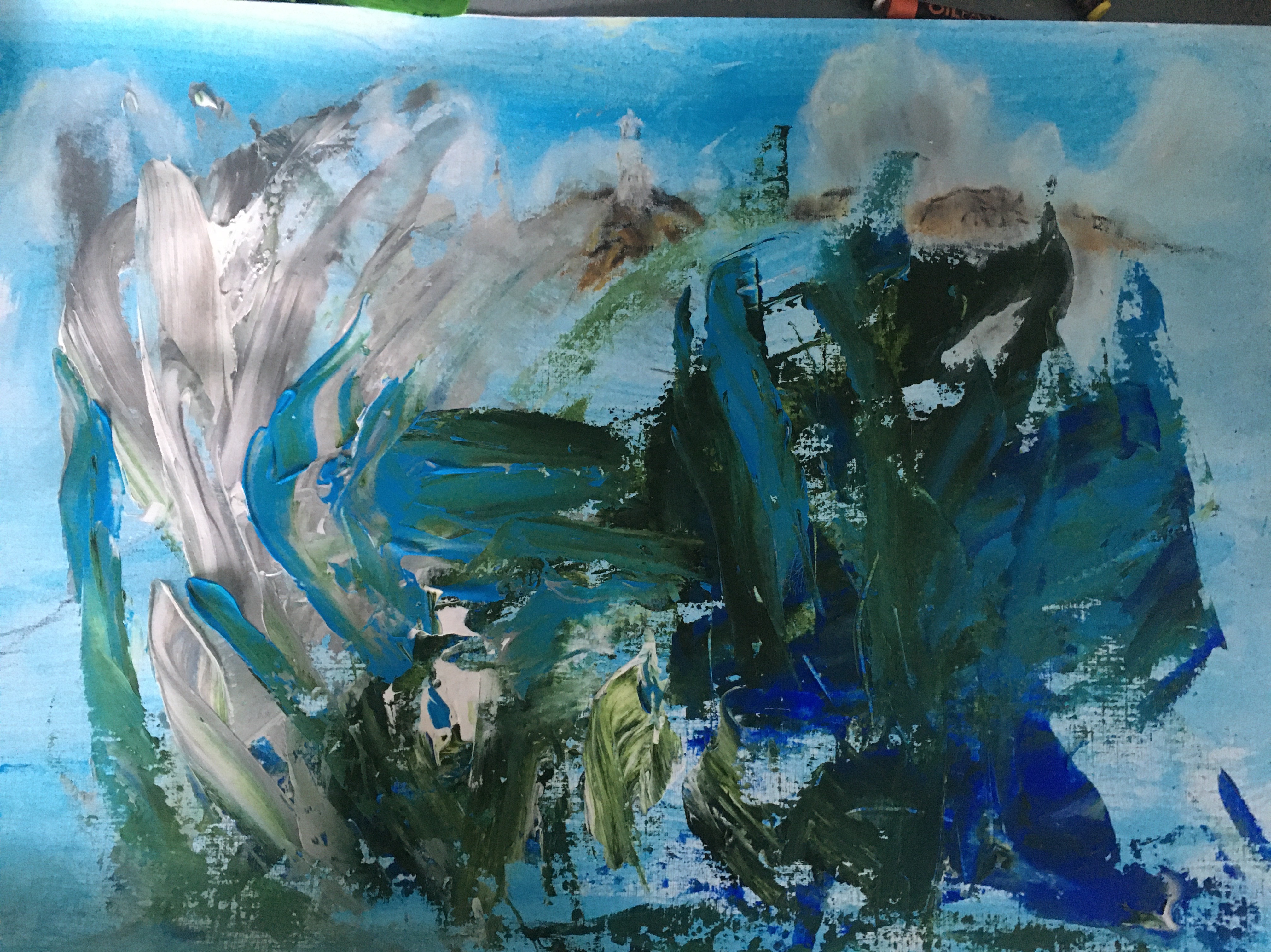


Image 8- Semi-Abstract seascape- fishing boat heading out of the harbour
So far I was really pleased with the development in my energy , use of texture and mixed media and loosens of my style. To push myself further I felt that I had to move more towards the work of the artist whom I admired most in my research for this course- Joan Eardsley. While the resulting work is not my most accomplished in terms of composition or technical skill, I feel that I must include it in my painting selection as it shows a turning point- my first semi- abstract landscape.
Eardley worked in fast vertical marks . I am not quite so confident to do this and find that for now I have found freestyle working from dribbled PVA glue and having foam patterns. This time I wanted a larger abstract form representing a wave so I decided to try an acrylic pour onto my primed support.


Reflection
I have really enjoyed this assignment project more than anything else that I have done in Painting 1. I think this is partly because I am finally beginning to understand some basics around painting technique. Perhaps more importantly I have begun to pick up on recommendations and artistic good practise that I have read about I’m my research. This confidence has in turn inspired some looser work and combined with finding a subject that I am really passionate about, I feel that I have been able to explore my topic in an artistic way. I am pleased with the development of my surface preparation and the incorporation of grounds and the use of impasto and a wide range of tools to give texture to my work. Noticing the techniques applied by artists like Donald Smith and Joan Eardsley’s has allowed me to become aware of limited pallet and blocking, perspective through colour and expressive energetic mark making.
I cannot afford to lose sigh5 of the technical skills that I need to develop such as fine detail and linear perspective. However I have more confidence now to work from the areas that I have developed and have more confidence to explore new techniques.
Proposed order of viewing


The final selection and viewing order
I feel that this semi abstract work has given me greater confidence to develop this side of my work to incorporate more technical perspective and fine detail. However I feel that I have really pushed myself in the whole project and especially this last work. It has been a challenging but very rewarding process. These works best represent this development towards awareness of my surroundings: The voice of the Hebridean Seas.


Bibliography
Th Artist painting the climate change she sees on the horizon/Loop: BBC Scotland on You Tube, 24 April 2019. online at https://youtu.be/U6SZjQgeZIc Accessed on 08/12/20
Shore sequencePauline Prior Pitt: Performance Poetry. Online at https://www.pauline-prior-pitt.com/2017/05/20/shore-sequence/. Accessed on 08/12/20
David Boyd Haycock on Paul Nash. The landscape of modern war/ Heni Talks.online at https://vimeo.com/henitalks/davidboydhaycock .accessed on 08/12/20.
Le Eileanach, D. Donald Smith the paintings of an Islander, p63. Acair:Stornaway. 2019

Review of Part 5 Assignment feedback
1.I am encouraged that mark – making and layering has improved my painting perspective and have gone back to some of my assignment 5 work to see if I can improve this further.
2.Thinking about my tutor’s comment re improving use of paint : medium. I have been able to go back and identify where this has worked and notice where my every has overridden planning to make it too heavy and laboured. I can see the importance of adding this to my pre painting planning. I have started to think about including oil work in my project .The amount of medium to paint used in oils has to be planned before starting and this will give me an opportunity to put this skill into practice in a measured way. I love the greater potential to blend oil tones and make more changeable responses as each layer develops. I have looked back at the flexibility of Joan Eardley’s waves, the flick of the foam on the rollers and the scratching into areas that added energy to her work are to me more achievable in oil.
Seascape(foam and blue sky) 1962
Elliot,P with Galastro,A.Joan Eardley.A sense of place.National Galleries of Scotland.2016.
Sketch Book 4 .1

Through a window or door p105


Moving to a simpler view
Pen and ink


Exercise Hard or Soft Landscape p106


Perspective
Exercise – linear p108

Aerial p 109

Exercise create mood and atmosphere p111

Painting outsideExercise painting a landscape outside p116


Exercise Squaring up p120

Exercise working from a photograph p122


Assignment 4


Part 4 1

Reflection on assignment 3 and tutor comments
Exercise – writing a review p103
Exhibition- online. This will not meet all of the criteria for physically visiting a gallery , however this is the best way for me to perform the exercise under COVID-19 restrictions. For the record, I do have notes, sketches and photos from quite a few visits but none are landscape based, probably because I am not particularly drawn to landscape work. This is a point of learning for me. Perhaps I need to extend my choice to include this genre in an effort to absorb and learn more.
Tate- online exhibitions weather and art.- Spring
A quick Google of spring themed art work confirms my own first impressions of the exhibition title: blossom covered trees; bright hues and sunshine and daffodil filled fields dotted with frolicking groups of lambs. On page 1 Alfred Sisley ‘ The small Meadows in spring ‘ and Duncan Grant’s ‘ Garden path in Spring’ illustrate the familiar pastel shades and gently blowing blossom ladened trees show that traditional artistic springs in 1880 and 1944 respectively alter little from my imagined image of the season.
However, if this is also your perception – you are in for a surprise.It feels somewhat like a rummage sale of everything who’s title includes the word spring from the Tate’s extensive collections has been thrown together in 47 pages of assorted images. This may seem unkind- and to start my impressions were negative. Oersiverence and engagement with the work on offer is the key to unraveling what is a real treasure. Page 3 shows Black and white engravings such as Frederick Walker’s’Spring days’ where children scramble through an overgrown bare garden and Barnett Friedman’s lithograph ‘ untitled .Verso: The real spring has come 1950 depicts a winning post picture of a horse and rider in earthy browns. There are sketches for paintings( only some of which appear elsewhere in the exhibition) watercolours, ink and gesso studies and oils from several centuries, cassette tape recordings of 1970’s sounds throughout the UK and all manner of sculpture from Hepworth to Raphael Montanez Ortiz deconstructed piano ( the piece played on it contained Spring in the title) all jostle for the viewer’s attention. A I flick through more of the pages, I find a page from Turner’s note book ( thankfully translated from his faded Victorian pencil scrawl) , I realise that this is so much more than I expected. It is a valuable reference source reflecting multiple medias of visual and audio sources. I will return to this again and again dipping into the social history and wealth of master artist preparatory work. In a short viewing I find my mind stretched on the true meaning , not just of the season but of any descriptive term.
Whilst I admit I could not manage or want to view the whole of this lengthy collection, I am impressed by the curators’ brave decision to go with such a wide brief. The very fact that there is no mechanism to select favourite images in search of the nostalgia invoked by Dame Laura Knight’s familiar cheery blossom and romance filled ‘Spring’ (page 1 ); means that viewers are forced to question their perception. Can it be altered by country, social circumstances and century? For me the answer would be yes.
references:
https://www.tate.org.uk/art/weather-and-art
Exercise- view from a window or door p105
I have decided to use the interface between inside and out- this has been a part of my subconscious thinking but not quite articulated into my conscious decisions till reading this unit.- the viewer is on the inside looking out. I am first struck with the issue of how much of the Van to include to make it clear this is the inside- too much adds complication- which is one of my aims to avoid after part 3. Once the interior ‘box’ or ‘boarder’ is selected I need to work on the shadows to give depth. This is the reason fir my first 5min sketch

It strikes me from my research of Dufy, he uses angled linear perspective- looking down on his subject to make sense of his inside-looking-out theme. ( He also introduces an element of aerial perspective in his work that shows cooler darker colours inside the viewer’s room.
I have tried out quite a few sketches and photos because I don’t want the link to be awkward or improbable- the view out of a van is not most people’s normal!


View 2- sunset through the facilities open doorway at the back of the campsite


Reflections on window and door framing of a landscape using photos from my recent travels to inform my work
As we travelled around Tiree this exercise was on my mind. I was able to observe a lot of natural framing examples of door and window type settings which improved the view.


excise hard or soft landscapes p 106


Exercise Linear perspective p108

On reflection I should have gone back.and reworked the sleepers to make them a more prominent depth effect. I forgot that watercolour fades quickly as it drys. I think going over the receeding tree arch with a biro would help to show the linear perspective line. Perhaps also introducing a horizon would help.


Exercise Aerial perspective p109

Also the ducks in the foreground are proportionally too big.


Expressive landscape- Exercise creating mood and atmosphere p111
In my research for this exercise ( see research 4) , I am inspired especially by Nash, Sutherland and Nolde. Therefore while I appreciate the simplicity of the Surrealist landscapes- and am aware that this is one of my aims from assignment 2 & 3; the more emotional work of Nash and Sutherland appeals to me. I love Sutherland’s idea of humanifying objects in nature and Nash’s technique of making the landscape integrated into the narrative of the painting. I realise that these are not simple aims to achieve , especially for a beginner but I want to keep them in mind in my work. I was also struck by the impasto and bright colour theory employed by Nolde- this should hopefully be easier to incorporate into what I paint.
Looking back at landscapes which I have recently painted I can see where use of colour could alter the mood. I think that I naturally am drawn to colourful scenes and try to work with colour- using Nolde I could emphasise this eg emphasising the brightness of my sunsets and autumnal leaves by using inks to lay down intense hue blocks which I can build up tones in acrylic and add depth through impasto mark making. Obviously I could use a grey shading wash to darken the scenes to show night or in rural scenes the rain clouds suddenly dropping a shower over part of the scene .
Thinking along the lines of Sutherland, I could make rocks and boulders into suggestions of grimacing faces. Sometimes I am drawn to the juxtaposition of beauty and ugliness; scenes where a rusty wreck of a shop is decaying on a beautiful shore line. It could be argued that this is an attempt to shock as Dali did, however as my theme is the tradgedy of abandoned livelihood and loss of a previous way of life , I could argue that it may be something that is Nash influenced?


Exercise painting a landscape outside p116

Although the sketch above is from an area unfamiliar to me the content is one that comes from my childhood and therefore is familiar for me to interpret. The shore line covered in seaweed with islands and hills behind is something I can imagine with my eyes closed so I understand why the exercise suggests this.

sharp and swirling edges which I wanted to transfer to my picture.

Outdoor painting commentary:
I did not have time to finish this painting before leaving the area and so decided to start again, this time with a very familiar scene- the view out over a fen-land field with the watery winter sun reflecting off the dark black turned earth.
Sitting in this environment stirred me to paint so I made a series of sketches of the scene from different positions and focusing on certain aspects: the knotted tree in the foreground ;the horizon far away over the flat field line with faint trees dotted along it and a pylon line advancing from it. The straight lines of the pylon wires and the ploughed earth formed natural lines of interest . While it was tricky to give the far ground enough detail to illustrate the flatness and extreme distance that describe the fens, I was aware of the importance of trying to keep the content simple.
However after sitting for a while in contemplation I realised that what held the scene together was what the area is famous for- it’s big sky’s. That morning the sky seemed huge- there was no drama in the clouds- in fact they were barely visible as the whole sky was a very, very pale tint of light grey/powder blue. The sky and it’s stillness needed to form two thirds of the picture. I found it helpful to make a sound file of the words that came to mind looking at the scene and the tractors,birds and calm of the day. Unfortunately this device will not support a copy of the file.
While I don’t mind people being around while I am working, I realise that the time alone while I sat thinking about what mattered to me about the view was important. This is a key realisation for me and something I intend to integrate into my practice along with gathering colour samples and sketches.
Looking at my sketches I felt that the garden in the foreground with the apple tree would frame the work. In reality however I think it was too much detail. I am becoming aware that I try to add a lot of close detail in my foregrounds which flattens the scene. I want to try to change my focal points to the middle.
The flatness and colour seemed to take the feeling away from my work. I think that the silvery/grey of the sky called for the painting to be a tonal work because this was what struck me about the view. I remember that I instinctively chose a flat ultra marine and a special effect powder blue sparkly paint to make my sketches and tonal works. This was my gut instinct and on reflection I should have stuck with this. I suppose this means that I have to learn to be confident in my feelings and would like to be brave enough to go with this. Connection with what is making the magic in nature is fleeting , I feel that I must learn to work quickly to capture this in instinctive sketches and audio note and videos to take home with me. When I recorded my thoughts it was key adjectives that seemed important rather than formed sentences.


Exercise painting from a working drawing p119


Necessary constituents I think I would need for an effective sketch to paint from: textures, more detail in tonal changes and negative spaces.
Exercise squaring up p120

In addition I used a pallet knife to apply the sky paints and found that I could get more energy into it using this. It is a new technique suggested in this exercise and it is pleasing to apply in this manner. I am also enjoying the opportunity to be tactile and engaged with my work . Most of the previous exercises have concentrated on LO 1 skills. It is great to be able to focus now on application of different media to creat a visual effect as part of LO 2 skills. This feels like an important step forward. I believe that the energy also helps to bring a narrative of drama to the sky. Using some tonal contrast in the blue of the sky would have given more definition and depth.
Looking at the close up I could have made the scene better by taking away more of the land and thus increasing the proportion of sky. This is interesting as the thing that I thought would be the focus was the patterns in the cliff below the lighthouse tower! This shows how important it is to keep open to new types of marks and developments in the paint that can change the intended work into something better. The simplicity of the scene gave me the chance to keep the image loose and probably is why I am pleased with it.
I am not sure that the bird is quite correct in its proportion or in fact if it is necessary?
The colouring has come out the way I wanted- complimentary elements to give drama. However I could have added more tones to enhance the perspective in the rock- it looks quite flat.

Exercise working from a photograph p 122

The photograph was a good aid- memoir for a scene that struck me as unusual when out walking. I liked the way that the dunes framed the picture like a gate inviting the viewer into the action. The curve of the kite and the action of the kite surfer I hoped would bring a sense of movement to the work. I changed the angle of the kite surfer to make him completely visible and evened up the dunes to be aesthetically pleasing. I also added the dog to show movement.This may have been too much but I am glad that I tried it. I have used shells and sand and rock samples to help with the tonal balance. The local shells on the beach ( razor and muscle were pinky rather than blue so it felt right to use purple in the palette.
I used a grid to position the shapes and experimented with a fishtail sweeping brush and water diluted acrylic and inks. This felt quite loose and freeing to start with. I liked the blue and purple tones together but didn’t feel the grass on the dunes was quite right.
As I added colour I think I became more stressed and the image tightened up losing the movement. This was disappointing. Next I tried to add more colour changing the kite to red. Somehow this felt out of place and jarred with the harmony. Unfortunately changing back to purple made the kite heavy and unrealistic with little tonal change.


Assignment 4


Photos of the process


Selection of subject: looking at all of my work, the view of the lighthouse left me with most satisfaction .I felt that it was most flexible and realistic, possibly because I connected most with the subject and found a way to bring texture and feeling to my work with a pallet knife and impasto acrylic.
Review of what I might wish to change from : I used my mind -map checklist (review of assignment two) for this. -Using a squaring device allowed me to concentrate more on developing mark-making to add definition and perspective (lo1). -. As the size was larger I had to resize my grid and reassess the view I was using to give a simple and well proportioned work. Therefore I decided to change the focus to the clouds in the sky and so decreasing the foreground to 1/3 (lo1) -I changed the lighting angle from overhead to coming in from the sea. This meant I could add shadow in the foreground of the lighthouse and cliff to allow more colour perspective. – I added waves to increase the positioning of impasto work giving more movement and fluidity to the foreground of the painting (lo2). – learning from other artists .The previous lighthouse I felt was not telling the whole story, the impasto cloud work was not enough to convey the energy and danger of the treacherous meeting of the Atlantic and North Sea at the tip of Lewis ( The butt). (Lo4) I decided to add a ship and waves crashing onto the cliff to suggest this. Changing the angle of view allowed me to show the horizon out at sea in the distance. I thought about artists such as Ernst Kirchner who looked to add energy throughout his paintings- not just in one section like the sky. This time I didn’t include the angles and jarring geometry of his earlier work but studied and tried to take inspiration from later Austrian landscape works. ( lo3) These contained contrast colours ( hence my tones of blue and golden yellow) and strong curved feature shaping. I tried to suggest this through cotton wool defined clouds rather than showing a bank of stormy rain being deposited from a heavy blanket. I also used negative colour( cf mind- map checklist) to emphasise the curve and structure of the cliff line.
Media: mixed. Acrylic ( heavy ) , coloured pencils (aqua) , sand secured by clear levelling medium, small filberts and 1/4 inch painter’s brush, pallet knife . Support cardboard.
Preparation: I used my research for my lighthouse exercise ( squaring up exercise P120) . Using my mind- map checklist ( review of assessment 2) I realised that I needed to reframe the view to create a more interesting painting and one with a better perspective . Focusing on the sky as 2/3 there would be more scope to introduce colour perspective to the clouds and using impasto would suggest turbulent weather to give a narrative to the work (Lo1) .
I also chose grass samples ( green /yellow/ red), previous prep sketches and tonal sketches and observations on my finished acrylic and pallet knife work. (Lo1 and 2)


Intention and narrative: I knew that I wanted to focus on the sky as I had enjoyed using impasto acrylic and a pallet knife to make what I felt was a more realistic scene. I also wanted to constructive narrative. Thinking about the instruction in this unit I used a lighthouse local to me and the sea and sky which I love. Then I added a fishing boat returning from a trip as my minded had been occupied lately by a story about loss and social poverty in the local fishing community.
preparation: I wanted the lighthouse and fishing boat to be the main focus in the bottom right third quadrant with cloud lines diagonally focusing the eye into the lighthouse area. Therefore I needed to alter the perspective, making the lighthouse a little closer to the viewer and the sky bigger 2/3 ) . For this reason I used a new grid to create a rough pencil sketch.
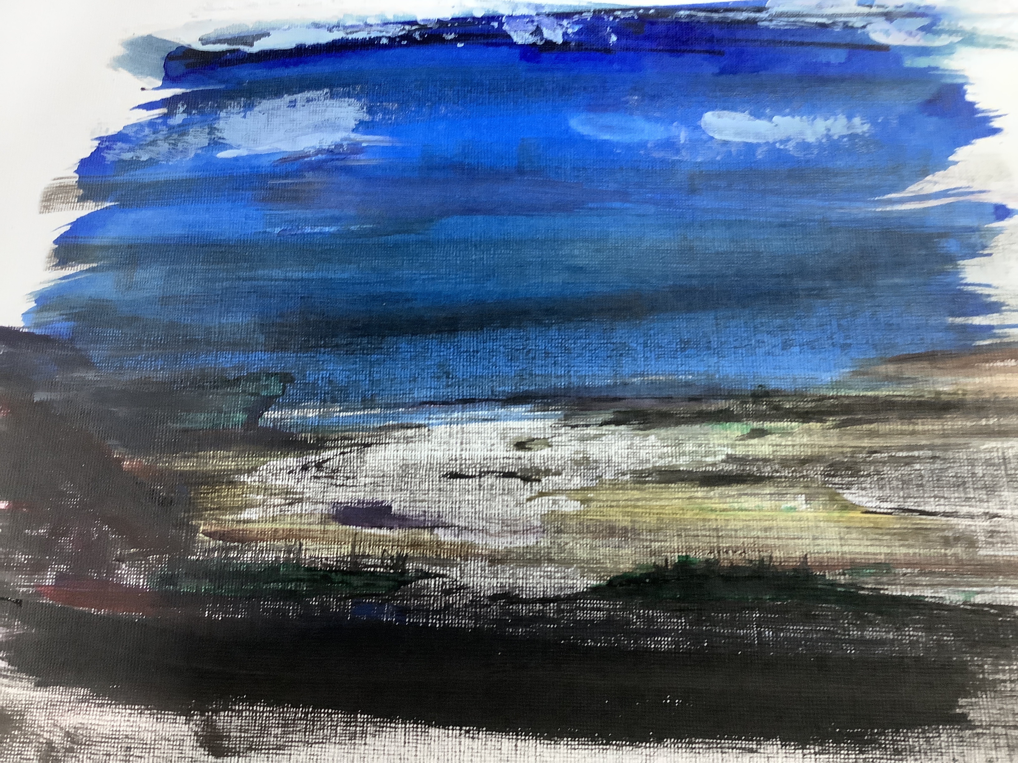
important points: I wanted to make sure that the horizon line stood out clearly and that the sea and sky were in the correct tones. Spending a lot of time observing the sea I knew that the sky lightens from the top down to become transparent on the horizon line. The horizon then becomes a little darker blue and again recedes to a pale blue/grey becoming darker as it gets closer. I have also been watching breakers in the storms . They develop a roll in my experience from right to left where the energy throws up a wave curve of turquoise green. As it falls it becomes a white tunnel, sometimes with tails coming off the top if there is a prevailing wind.
method: After the initial background ( blue) dried I applied large amounts of heavy acrylic white and folded it into clouds with a pallet knife. The blue for the sky was smother on with some impasto ridges and white added to ensure toning . The clouds in the furthest away paler sky were applied as lines with the edge of the pallet knife. As areas dried I added layers of detail. Sand from the location was useful to add texture to the ground and in the foam of the waves. Finally I began to make finer detailed tonal layers using wet and dry aqua coloured pencils. As I work quickly and loosely with brushes I have discovered that I can bring some controlled detail with pencils. This means I can add more layers and hopefully more tones to increase perspective. I was pleased that I had managed to keep my acrylic work looser. This was a problem in the original squaring work and I attribute this improvement to the use of heavy acrylics and pallet knife work , leaving the detail to wet and dry pencil.
The final two layers were applied with 24 hrs between each to give me more time to observe what needed improving. For the final layer I identified the left hand side clouds as needing more definition in grey and tinted yellow light and the lighthouse was reshaped and to ally improved by adding negative space colouring around it. I also realised that blue needed to be added to the glass area as it is see- through.
Artist’s influence:
I have found myself thinking of landscape in a much looser sense since viewing more of the work of contemporary artists like those recommended for me to study in feedback 3. Although I didn’t write up their reviews till the end ; I spent a long time in contemplation before starting the unit properly looking at their work methods on you tube videos. This was really helpful and I feel gave me a sense of permission to try exactly what I wanted to do to put expression into my working process- eg changing tools (knife instead of brush) , new materials ( large amounts of heavy acrylic) and more bold colour. However as I often do , I abandoned my practice doodles fir the exercises and returned to my usual formality. This felt so frustrating and many of the pictures really suffered as I didn’t connect properly until the squaring exercise where I finally let go and was brace enough to experiment. Yao Pei Ming , although working in a different genre really had an effect on me to try effects with different tools. I. My assignment piece this included using a knife again and introducing a small 1/4 inch decorating brush which added smoothness which I felt balanced with the impasto in the sky. Studying the German Expressionist Emil Nolde inspired me to try colour and loose marks ( eg the foreground in my final work). I think the whole process of a block of time spent studying h theses artist’s beliefs and techniques has been absorbed into my creative thinking. What I need to do now is to relax and listen to my instinct to let this come through.
critique: I am happy with the construction of the picture and the lighthouse being in the right place. However, I notice that as I worked the foreground splash from the sea has taken over as the focal point. ( the fishing boat is really too far away to be a focus). The receding coastline looks better being lighter with dark negative colouring behind it. The clouds work fairly well but still look a little stiff. Putting more definition into the edges helped to make the larger clouds on the left foreground stand out more. However as I have already stated I need to relax to the same extent as I do when experimenting in order to keep fluid.I like the colour contrast between the sea blue and the green and yellow tones of the ground. Observing the reds and oranges in the ground helped me to make more definition and adding some blue puddles in the foreground helped to draw the two areas of the painting together. I could have added more detail in the front in acrylic to make it stand out better. I am pleased with the mixed media format as it has allowed me to work more effectively with my strengths and weaknesses ( eg texture to help with perspective as linear perspective is not a strong point and using heavy acrylic and a pallet knife has helped to keep my work looser with the pencils for necessary detail and to give more layers of tones.
Assessment
Auto Draft
Coursework part 3

In this unit my aim is to go further than simply working through the technical aspects of study. In tandem I want to explore where possible how artists have approached appropriate tasks and what their process and thinking (ie their context ) was while working. I have discussed with my tutor ( as part of assessment 2 feedback) how important it is to take my research a stage further than simply investigating artist’s work. Now I would like to interpret their ideas and process into my own style and experiment with this. Therefore I have reviewed these sources in the reference section. As well as the personal selection that I am drawn to I will use tutor suggestions selected as being suited to support my artistic growth.
For the first exercises I will be using information researched from :
. Gerihart Reichter’s Atlas collection- a huge catalogue of the artists’s personal phitographs and cuttings which helped him to find inspiration and contextualise his work.
. Clare Shenstone- a contemporary portrait from her exhibition catalogue Personification.
Shenstone says that her motivation is to move on in her understanding of art and life through her work. She tries to do this by connecting with her subjects through biography and photographs that inform her understanding of a sitter. In a similar manner to Reichter. Of course face to face dialogue with models will not always be possible but I can apply any additional photos or facts to notice more about posture and visual traits.
Project 1 – observing the human form
looking at shapes, spaces and objects that locate the figure in space.
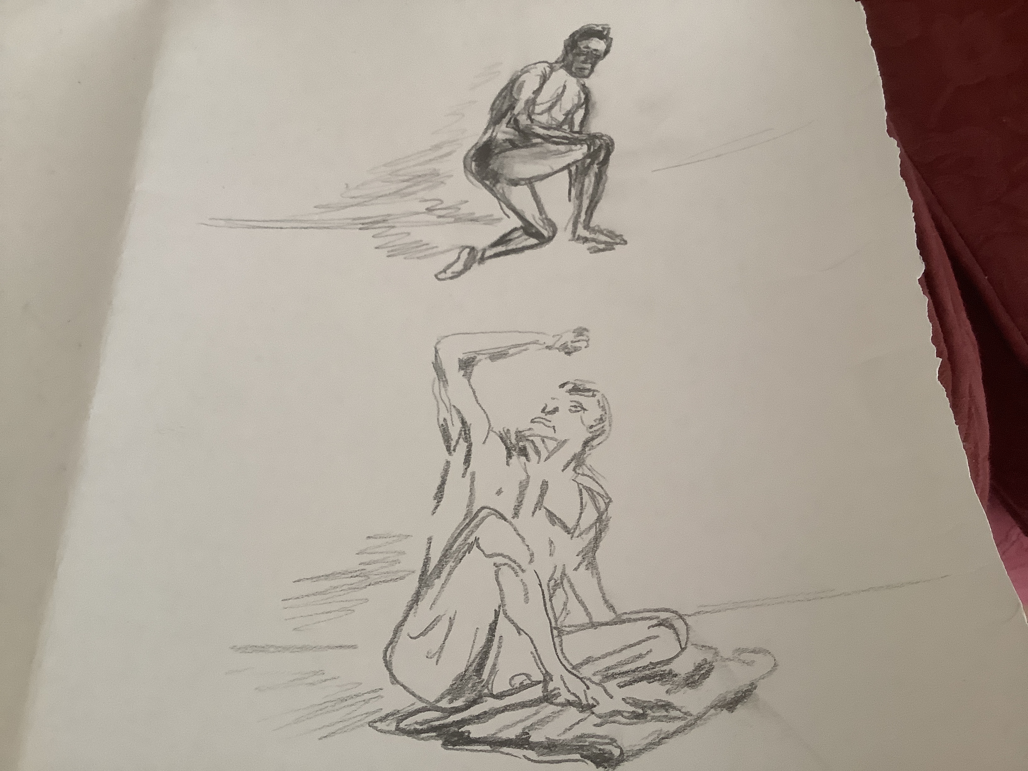
I used a series of 1minute, 2 minute and 5 min model poses from Croquis Cafe to practice initial anatomy. Then I used my husband as a model and other poses from Croquis Cafe which showed how props helped to support the model’s body. This was useful to see how posture and musculature changed between standing poses and poses supported by a prop eg dance bar or stool.
This model exhibits a ballet dancer’s posture in several of his poses for Croquis Cafe. I have tried to use sweeping strokes and curved musculature to suggest the movement of his body. The addition of a dance bar in this picture helps to anchor his limbs and gives credibility to the unusual angles of his body. Looking back at my drawing I feel that I have not been bold enough- I need to be confident to use looser strokes in my initial drawing as mine still appear too controlled and wooden. However – I have learned that it is important to anchor the figure by using appropriate props( less heads floating in the air that I am usually renowned for) .
The sitting figure again benefits from the stool to place it properly in into surroundings- this pose would look even more ridiculous without showing the prop! I cannot help feeling that my male figures require even more practice than my female ones. I realise that I have drawn women much more and need to redress the balance to improve .
Artist’s use of props
Shenstone uses chairs as a favourite prop. Looking at the following images it is obvious that she uses this prop in several ways: to emphasise poise or slouch in the sitter; to position arms to show them off better and to anchor the model realistically in the surroundings.


I am very drawn to the Francis Bacon portraits. Each are set in the same chair but look so different.The chair arm are perhaps like a prop within a prop: to control whether the sitter is slouching or sitting erect and then the arms- to support a pondering finger to the lips or a tight grip of fingers on the frame showing tension ?
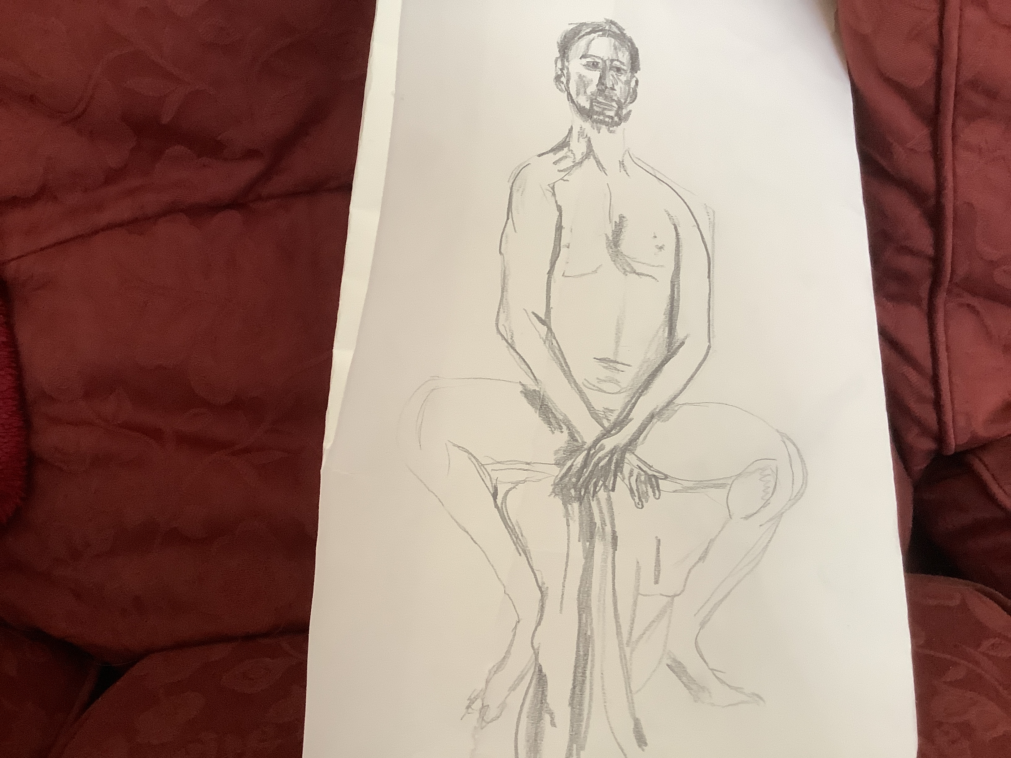
Exercise- painting the figure
I experimented with different brushes and varied paint consistencies to see which worked best for me. I was surprised to learn that the brush that I had most control using was a rigger ( below) . I also liked a watery acrylic burnt umber which allowed me to move from light to darker , thicker applications to indicate areas of shade and depth. The chair allow3£ me to practise foreshortening and turning of one knee on a chair. I had to observe this closely and it took several attempts to sort out how the leg turned and how to try to achieve perspective as the raised foot disappeared back into the chair. Accuracy and my ‘ memory muscle’ for figure drawing will only develop the more I practise. Therefore I have made lots of different drawings and painted figures which are shown in sketchbook 3.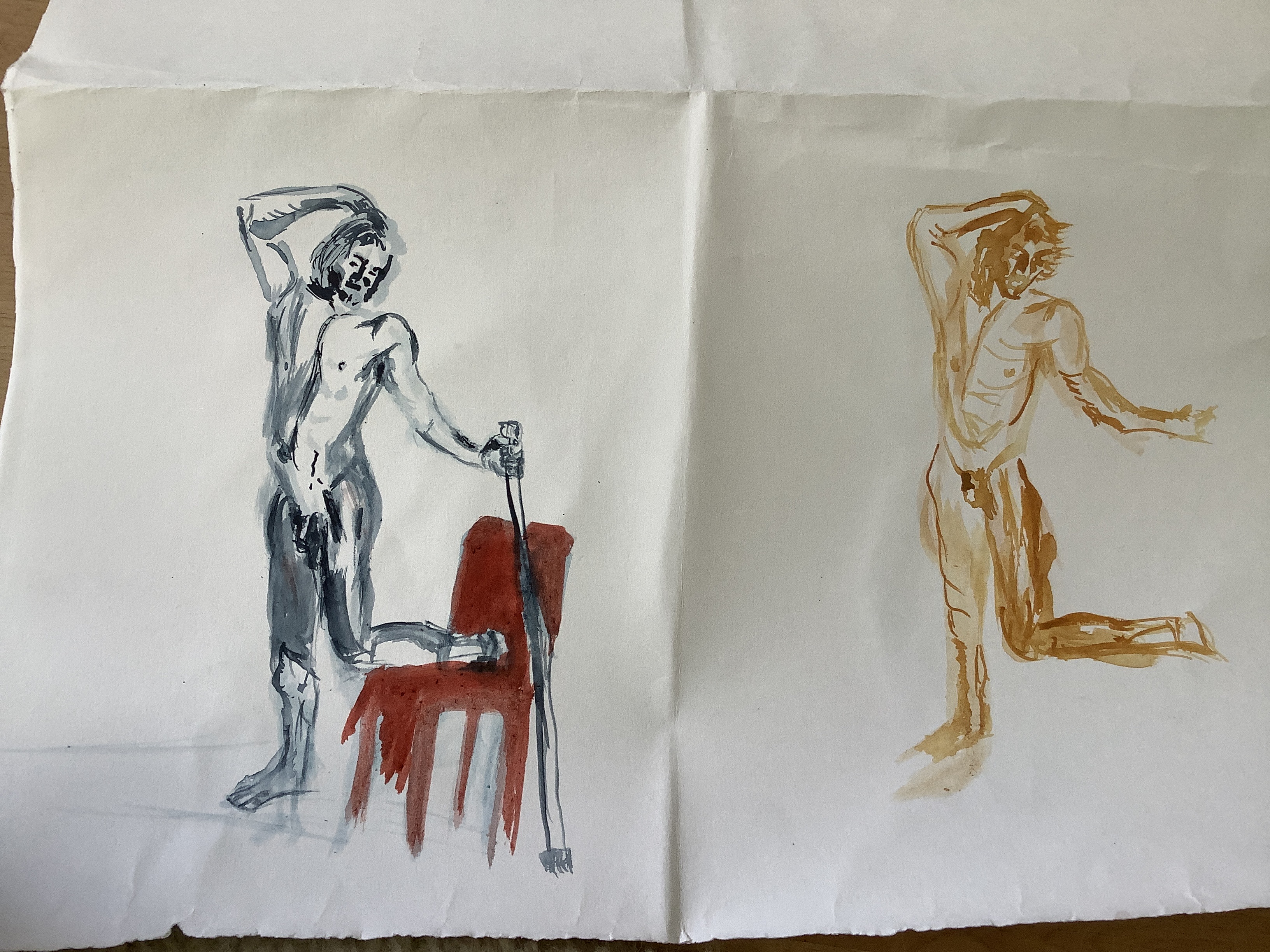
Looking at the background to develop perspective, the bent over figure above works quite well with just a single line to denote the background- is this because there is more tonal work on the the man’s back to show depth so it is less needed in shading work in the background.? I like the dry paint strokes as they help to convey movements in the random bushy hair strokes.
The pose to the right works less well proportionally. It has strong unconnected lines to represent the folds in the backdrop cloth. However this is not enough to distinguish the figure as being in front. I think it would have worked better on a faint backwash.
The two above show elements of tone and movement in the hair ( top right) but there is not enough to suggest a proper degree of depth. The proportions of the torso work better than the legs.
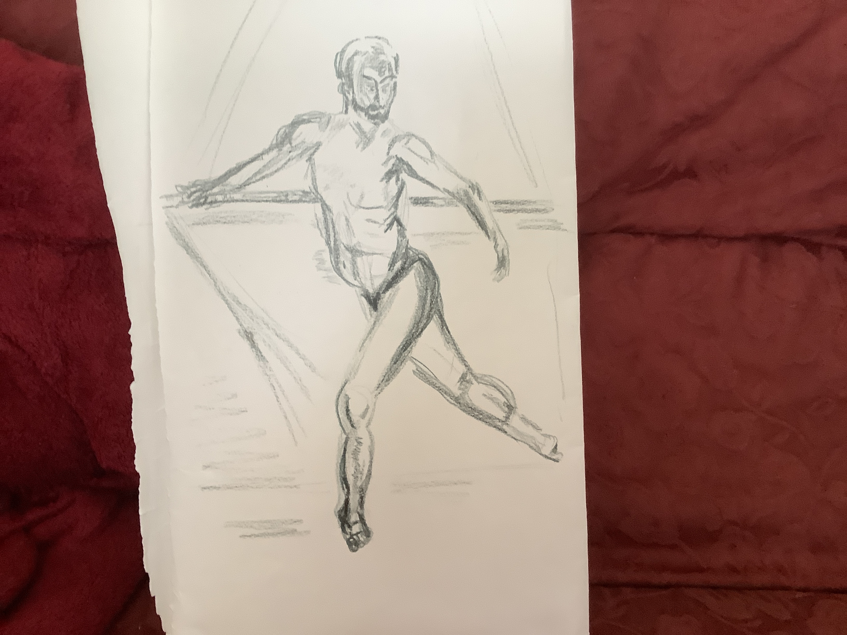
Tonal study exercise
The initial studies shown in sketch book 3 illustrate my initial attempts to complete a kneeling study. As I got more accustomed to the anatomy and perspective positioning I found it a little easier to imagine the piece in 3D as I worked and this helped me to add more layers of tonal colouring.
First attempt shows little tonal work- I think I was so focused on trying to produce a background I forgot about tone and proportion. This would have been a good time to look at the impasto techniques of Ernst Kirchner ( see research 3)
Next I moved to oils and although both of these pieces are small ( meaning I forgot about sweeping lines) I feel I achieved a greater variation in tones.
This feels more natural to me and the scratched areas in the hair add to depth and suggest movement in the face?

This one has lost definition in the face and needs more tonal values added. I did feel pleases with the layering to show shadow and fabric marks in the towel.
I used mixed media to creat texture and experimented with a black background to try to put a different atmosphere into the work.


I am pleased that I have managed to use some impasto techniques and some sgraffito to add depth to my painting. I think this has been of some effect and works better for me that linear perspective as a technique. Unlike Kirchner I have not been able to combine the mark making with large simple blocks of colour. Especially in the last painting above the effect is diluted as it is difficult to pick out the human form from the surroundings. Superimposing background colour blocks gives an indication of how to improve this.

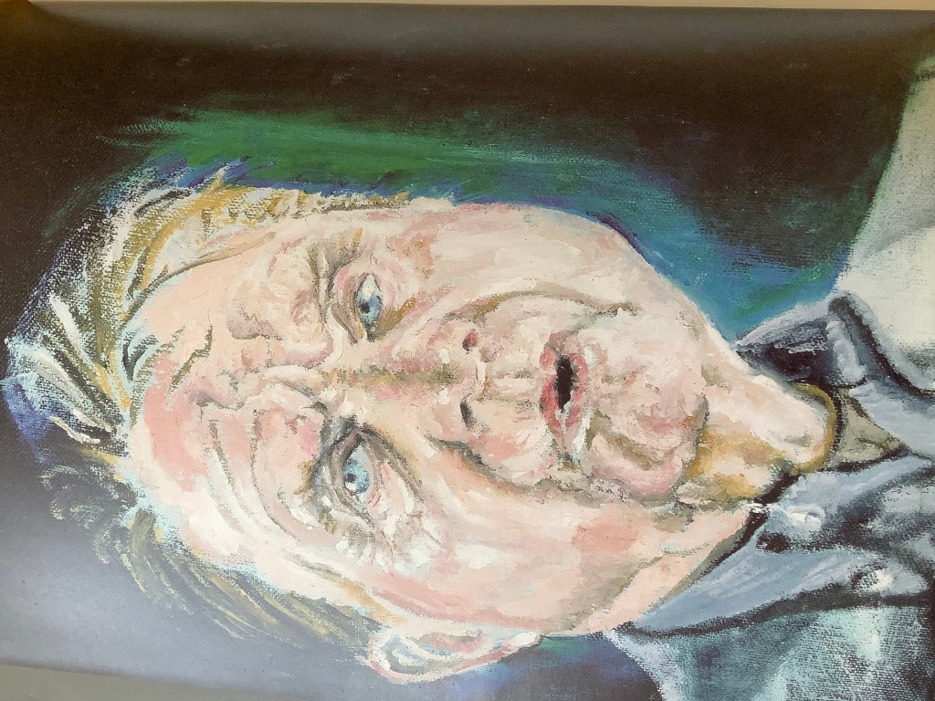
Exercise – self portrait
Lighting- natural
Medium- liquid acrylic limited pallet: canary yellow; Bahama blue and cherry red. Thick Acrylic titanium white. Black biro pen. Medium Fishtail brush and small flat brush.
Background- mid blue to act as a contrast to the green and yellow hues in the portrait- darker layers of blue worked in behind me on the left hand side – the light source is coming from my right.
Positioning – mid paper with body at bottom to ground in space as if looking in the mirror
Mood- lighthearted- as a conscious counter to the unit advice about sitters becoming serious and sad while maintaining a pose. This is indeed true and has been helpful to be aware of in this work. As an smile self consciously I naturally have a thin to disappearing upper lip – it helps to reset myself to a more normal look. I am not going for shock value so it is important on this occasion to make the expression more normal and easily read for viewers. I am also aware that the corners of lips alter completely in frowns and smiles and this needs to be accurate as well to give a balanced look.
The work began as a second pencil sketch which I roughly blocked in with background and lights and darks. I began with loose sweeping outlines for the figure using a fishtail brush. Then I came back to the piece constantly over the next day to build up many layers; adding detail, correcting shape and tone, stepping back to view from a distance and then adding more detail.
Response of an observer- this was quite encouraging. My husband is extremely supportive but very honest so to hear him say that he liked this a lot was very encouraging. He felt that it was realistic and more dynamic than usual. I feel that it has been an important lesson for me to create a new working discipline around my painting using the feed back flow chart ideas that I described in feedback 2.
Observations- I am also quite pleased with the outcome.
- Using a fishtail brush and rough blocking enabled me to keep a free and sweeping shape to my outlines.
- The limited pallet reminded me to keep observing and trying to show tones of each hue.
- I stuck to loose shadow in the tee shirt and background which felt less restrictive and I think works better for me at this stage.
- Using repeated layers allowed me to review and refine tones

The most challenging issue for me has been obtaining a fair likeness. I feel that I have achieved this better in this piece as I have not lost the initial distinguishing marks but built on them through layering. I still feel that the proportional angles of the left hand eye and the lips are least convincing. I need to keep observing and reworking to improve this.


Exercise – head and shoulders portrait
Scale- A3 to try to practise larger sweeping initial mark making.
Position- face on to give power to the piece*
Background- experimental mid brown murrled- to add interest but can be easily altered to give a complimentary effect to lights and darks in the portrait outline.
Light – from the right
Observations- I have altered the pose* from front facing to a slight side view. This happened as the unit predicted- I forgot to mark the head position at the start and my model ‘ sagged’ a little!
Also I caught myself gradually altering the pose to suit the right hand side eye gaze which l liked. However I know from experience that this leads to problems with the angle and this is indeed what happened. The eyes are out of proportion and I have had to correct the head shape and lips- this has not been particularly successful especially for the top of the head. Consequently the piece looks flat.
I was quite pleased with the initial sweeps of the headband which seemed to suggest movement – this also had to be altered with the angle and became less successful.
The glasses were quite tricky to position to prevent them becoming like a barrier – the right hand side was looser and more successful than the left hand side.
At this stage I also experimented with oil and scratching into the surface to show texture in the beard. I used a plastic comb and was quite pleased to see the marks that can be achieved . I will incorporate more of this in future. The hues are wrong but I was using the odd colours of oil that I had to hand. Consequently the tonal values are also not representative as I did not have enough medium or white to add.


Exercise: Head and shoulders p88


I enjoyed painting this image of my sitter. Having painted my husband from this angle before , I felt that I would stick to the same light angles and profile. This time I tried to capture more of his character: by using moving brush strokes flicked around his head and sides to indicate a three dimensional aspect. The strokes seen in the close-up are more gestural than image perfect as I want the viewer to get caught up in the process of putting the pieces together around his beard and glasses. This gives a lighter feel which fits in with the sitter’s character. Again I tried to use a wider tonal pallet to show shadow and depth. Sadly the head shape is not quite right making the image unrealistic- I should have stepped back and observed more frequently- the misshapen aspect was a result of a last minute alteration of the head. While the hues were bolder and added to the cheerful mood that I was trying to achieve; I still did not achieve enough tonal variation making the work very flat and 2 D.
I also tried to use a colour contrast limited pallet, where I could matching light background to dark areas of hair etc. I feel that this works better than previous colour schemes. Using a limited pallet feels simple in the message and allows me to use white to indicate the more significant light patches as it is not too busy with many colours. I like this colour selection and would like to work it into further pieces.
I am more pleased than usual with the glasses lenses – this usually looks artificial but here works fairly well and allows me to show a bit of twinkle in the eyes. I was conscious of the unit advice that sitters can become artificially serious after sitting for a while.
My model did not see it as a brilliant likeness but did seem fairly pleased with it. Maybe I have gone too far with the looseness – does it appear cartoon – like?
Thinking about artists head and shoulder portraits:
Claire Shenstone paints Francis Bacon in a frontal pose and thus achieves an engaging view which she uses to good effect. Taking up my last point of producing a cartoon like effect; this artist manages to use the natural curves of Bacon’s face as a feature- even to the extent of shapes in his wrinkles! Perhaps the reason that her piece works is the experience with which she has learned to interpret in the right balance. The lines are shaped but broken and the colour is delicate. Therefore is is the suggestion of lines and the colour employed in negative areas creates the illusion that is read by the eye. My curves were accentuated and full therefore probably too emphasised and so unreal to the eye?
The head-on face looks sincere and thoughtful due to the upwards glance of the eyes and the expression on the lips. Although the pupils of the eyes look slightly up , they are central enough to make the observer feel that Bacon is looking out towards or just past them. This captures the attention.The background is very dark suggesting darkness to the right and light coming from the left. The face in general is much lighter in hues than the background giving good contrast and definition. I like the green and light blue layers around the face- somehow these appear like an aura and although they are not realistic it works well by giving added definition.
Exercise: conveying character p 91
I was captivated by this little boy’s face with his tongue out- showing concentration and a cheeky smile. However I learned one of the downfalls of painting friends. I didn’t think it would be appreciated by the family if I painted him with his tongue out , especially as the boy wanted to keep the painting. Also it is not fair to expect young models to sit still for more than a few minutes so I worked mainly from a photo. The pressure to produce a likeness for the boy and to change the pose that I had captured proved too complex for me at this stage and I forgot to employ loose sweeping strokes in the paint- it became tight and lost perspective. Of course the more I tried to fix this the less of a likeness it became. Sadly I also became attached to my drawing which was not really like him but I liked the strokes and patterns which were what I was trying to achieve. I know that an artist should not get too attached to marks that they cannot be flexible to improve however I wonder if for the purpose of this exercise I should have stuck to my original Mark work to see what I could produce from this?


Part way through I stopped to draw another practice piece( wearing life jacket below) to try and reconnect with the initial marks that I made. However any natural loose marks that I had made were lost by this time . One of the things that strikes me is the hard rigid look to the eyes. The child naturally had quite small eyes but I am naturally drawn to making eyes big and overemphasised. ( As I write this it occurs to me that this perhaps also causes problems with my work. I am not aware that I am cartoonifying all of my figures with oversized eyes. This error obviously causes a problem with likeness! The expression of cheekiness disappears from my painting as I rework it. I know from feedback and practice that when I become tight and lose confidence my image suffers. This definitely happened here with the final painted image.


As I struggle with the eyes being smaller and nearly closed and not having a mouth photo to work from , the cheeky smile which was supposed to convey character to my work- disappears! This is a very good learning experience.
I am happy with the contrast colours in the picture, I took time to think about this and deviated from the real background to achieve a better stand- out image. I also reworked layers of the background once I had finished applying tones to the skin, hat and tee- shirt to make sure that lighter toned skin was next to darkened sky areas and darkened areas on the child to a cloud in the sky to emphasise the contrast. I am beginning to realise that it is not good enough to treat the background and figure hues as one shade only. I also managed to add some shading to the tee- shirt but need to notice more about where the darker crease lines sit. I tried to use the lettering to emphasise that there were creases in the shirt.
Exercise:Mood and atmosphere

Mood and atmosphere exercise
I tried to use an image of a little boy sitting in the dusk huddled up in a chair with the only light source coming from his iPad. The image is dark but not meant to be sinister, the cheeks and facial hi lights remind me of candle light so should be endearing and the dark is dusky rather than enveloping blackness.
Sadly Looking back at this work I can see that the colour choice is wrong and the darkness was painted in too quick and too thickly ( ie in one block rather than leaving time for several layers to dry and . This would have given me the opportunity to introduce tones in the darkness . As so thick it makes the atmosphere sinister rather than endearing. Probably I could have changed the tones to yellow instead of harsh whitish for the light and grey/brown for the dark. I could have softened the dusk by using a dry brush technique.

Exercise:conveying character


Time to compare my work with the assessment advice from my tutor:
I have chosen to use the last child in image for the comparison as I feel that it’s the more successful of the two-it looks a bit less stiff as I have allowed myself to relax. I also spent more time concentrating* on layers of paint to give perspective and detail.
mark making to suggest form: I have begun to use this in the foot esp left tankless and toes
colour giving dramatic effect: I attempted to use complimentary colours orange and blue as main colours
take time to observe shape and tone: I examined the face and looked for curves in the face. Unfortunately the curve on the left cheek may be a bit too pronounced? Also I have spoken about the difficulty I had drawing the eyes- I wanted to show a curve in the eyelids and pupil but this was not a likeness as the boy actually had narrow eyes -almost closed.
using curves to tell a story: I tried to use the curves around the cheeks to show his mischievous look. However the dimple look of the muscles being pulled in a strange way did not look correct and the more I tried to refine this the further I got from the original intention!
Using different tools: Biro to show shading
observe perspective in a way that I can show it: I have shown a background requiring linear perspective – it would have been better to make this an Ariel perspective somehow. Not quite sure about this yet? However I did try to add more layers of tone in the intersections between figure and background.
come back to create further layers: I painted this over many sittings and made lots of tonal variety especially in the nose area.
textures to accentuate feel: A little on the surf in the sea but I could include more.
study othe artist’s work: I have made comparison with the work of Claire Shenstone using suggested lines in the body. I need to use this more in prep for pictures.
use rawness and fluidity in my style: I have tried to stay looser than in the first picture of the boy witch was overworked and tight.
work quickly to maintain fluidity: I worked quickly to make initial colour layers containing fluid curves.
use negative space: used especially in the arm areas and round rather outside of the body
People in context
Exercise :people in an interior
See my research page looking at E. Kirchner’s clever use of colour and shape to set his figures into space. His ingenious effects do not simply act as an anchor: they give suggestion and context to the story ( the work place of the street girls ).
https://wordpress.com/block-editor/post/maggi518697painting1.art.blog/992
I would like to use similar methods in some of my work.
I also like the background techniques employed by a Peter Doig.
An article on the MOMA website accessed at https://www.moma.org/artists/8087
describeS how the places that Doig has lived in have influenced his work; especially Trinidad and Canada. Doig states that he sees his paintings as ‘ filmic’ allowing the viewer to capture part of a story narrative taking place in front of them.

The effect that I want to achieve and introducing new elements into a familiar setting– the background is the brick wall in the conservatory of a friend who has a life changing illness and who is not able to go out. I wanted to convey the irony that she is trapped but really cheerful. It struck me that her home sadly was like a prison. Perhaps instead of simplifying the brick pattern too much , I could use it to suggest a prison walled-in effect? There is also a bit of a joke in the stripy jumper. I emphasised the lines by thickening them to portray prison film like garbe? Both the wall and stripes could be used to show perspective by using fading tonal valueS, change in size and direction.
exploiting skin tones:
the hair and skin tones could be light to contrast with the relatively darker walls and jumper.
Simplifying the background – see above. I also cut down the amount of room and table decor shown and cut rows of bricks after a few to suggest a fading out of the image
locating the figure in space and suggesting depth – I tried to use the table as a marker in space for the figure sitting behind it. The table curve and markings at the edge closest to the viewer were disproportionately large to suggest depth.This looming infront of her also suggested that she was stuck- in the interior behind the table.
Eye level – after a while I decided that looking slightly up at the figure allowed me to emphasise that she was stuck behind the table.
I simplified the face as it was in the mid ground but managed to show as smile and I feel this helped to put over the right message. From the head and shoulders picture I realise that emphasising the curve and proportion in the cheek helps to suggest a better smiling mouth.
I enjoyed the free and varied mark making in the plant closest to the viewer and hope it gives a sense of proportion to the work?
Figure in an interior exercise and Research 3 : compare two works
Telling a story exercises:
As I have been living away from home it was not simple for me to get two models. Therefore I spent quite a few afternoons on the beach studying and drawing figures of passers by. I have done this before and of course learn something new each time. This time I learned more about the need to speed draw as people change position quickly. I also spent much more tome observing how limb anatomy works in several people before trying to draw a certain pose. The hope being that I would be better placed to draw a pose like walking down a set of steps more naturally. I also found that clothing and hair could be used to indicate movement – eg the wind billowing out a coat or washing blowing in one direction and puffing up clothes on a washing line in the background.
I felt much more confident after this.
it was by watching families moving around that I became attracted to how each posed for a photograph to be taken. This became the subject for this exercise and I drew a bunch of studies of a mother and two children. The mother was looking protectively down at her family while almost scooping them up in her arms. As suggested in the pink notes I felt I could emphasise this grouping and oneness by making wind marks tones and blowing fly away hair strands in the background around the group.
The girl in the group was leaning back very heavily on mum so much so that her stomach was arched out in front of her. This seemed unusual and quite sweet so I was keen to use this pose. I tried to paint in negative shadow tone between the mum’s coat and the arched back of the child. This gave a crispness to the colour of the child’s coat and emphasised the arch in her back. I had to notice carefully how her head was positioned looking up and back.
The boy plumped out his cheeks in a cheesy grin and straightened up for the picture and again I had to look carefully how to position his head and hair again.
I tried to change the clothes to contrast against the background and identify each person against the shadow.
One thing that did not seem quite right was the simplified beach background. I imitated Krichner’s street women painting using two contrasting colours in a Simple shape. I used the blue sea and added white for the waves. Instead of parallel lines I made an Apple core shaped sand for the group to stand in. It kind of works but not quite. Maybe as I am not as skilled as the artist I cannot get away with the oversimplification and need some tonal depth?

Perspective exercises

I enjoyed exploring how artists have approached interior still life painting and have made notes in research.
My particular favourite is Ariel perspective eg beautiful light and tonal work to suggest depth. However I recognise that my tonal differentiation is not very developed and I need to work on this as well as one point perspective drawing .
When I started to make drawings of my room as instructed in the exercise for this section, I realise how rusty my drawing skills have become. I have got out of the habit of daily practice and would like to restart that. Working around my living room , I could not find an inspiring scene that is not too complicated but allowed scope for shade and perspective.

Eventually I found a more suitable scene and spent some time making study drawings from different angles and distances. This is a valuable exercise to add to my ongoing practice.


The work is not accurate in terms of colours but I feel does show evidence of shadow. I tried to stick to a limited palette to make tonal change easier and help me to understand make up of light but the lack of brown made the work more difficult in the end.
My frustration led me to paint quickly and less carefully. Consequently my walls are not straight. I did notice standing back that the corner where the table was looked better with a tonal change showing shadow rather than the initial red painted guide line- showing that I need to stand back and look frequently.
Still life interiors
My insight into this genre has moved on from my understanding while studying this topic in Drawing 1 unit 2. Then I imagine that I ranked it
s importance as minimal – simply a study tool to practice technique. Now however I have come to agree with Sontgen (2007) in her assessment of it’s importance in recording art culture and history. Further She quotes the art commentator Hegel to describe how interiors painting is not a soft option. It lays bear someone’s home and gives a snapshot into their life and difficulties in a deeper way than a landscape work could. I might also add that if the artist allows it to it will expose them as a person and such vulnerability has added greatly to the work of modern artists like Van Gough. Reading letters to his brother alongside looking at his bedroom and living room interiors shows that he has put his circumstances and his passions into paintings. He describes aspects of furniture and what he wants to capture about it as colour shape or texture- all the better because he lives with it and knows it.
Other artists have used it as a tool. Pieter de Hooch uses windows and doors to frame parts of the picture and lead the eye, in the case of ‘ interior with Woman beside a linen chest’ out to the exterior world through the far off front door. ( from Songet again). It is a piece about so much more that a domestic chore:the clothing and contents show the status of a household at the time and give clues to the rest of the building. I wonder if it also suggests tensions perhaps between the adults working and the child wishing to play outdoors? Light an dark are used to creat beautiful contrast : window light at the front of the work falls onto the clothing and gives opportunity to show depth in the drapes of her dress while shadow in the mid-distance hi lights the open door at the back of the painting and pulls the viewer through the work.
Since being introduced toGwen John’s drawings I have long admired the simple beauty of her art and how she translates this into her painting.During her later life in Paris, her interior still lives reflects her need for solitude and simplicity of life at that time . It is often portrayed as the consequence of rejection by Rodin but it is refreshing to see McCabe (2020) argue that it was actually sstrength in her conviction to dedicate herself to art. Therefore she worked and reworked paintings showing corners of her studio and areas of a local religious order who interestingly held the same principles of uncluttered life! The result in Interior 1924 is a glorious feast of light. Only one small corner of one of the Nunnery rooms is shown. Walls, tablecloth and tea setting are all bathed in dappled shades of white with a single lightly glazed red tea pot popping out as a focal point. In the far ground lie the unmistakable clues to the room’s identity:a crucifix outlined in grey shadow against a high cell like an alcove arched window. The sole source of the room’s light comes from this window and a simple triangle shape shaft of the lightest grey glaze directs both the light and the viewer’s eye into the mid ground which is in deeper shadow as a second arch jutting into the room which must be a support for the building ( the inside of an external flying buttresses structure perhaps). have sat and marvelled at this simple work for a long time and my eye is repeatedly drawn back to what for me is a touch of genius.Whatever the mid ground structure is it is , John uses this light shaft as a tool to emphasise the feature and suggest depth in the work. She uses yellow glazing in divisionism style to suggest window light and shadow in the foreground on the tea set. This to me seems unusual as traditionally to conform to perspective laws foreground objects should appear the clearest. However this departure from ‘ rules’ worked very well here to suggest a haze ( as in Seurant’s Bathers painting). The teapot is again the only foreground exception- it is painted traditionally in a rich crimson (?) to suggest its simple curved form with white light patches to show light and depth.
Light areas in the room are glazed in white and the darker area of the floor is glazed in a warm pink which feels the right atmosphere as I believe that John is saying that the message is warmth and beauty in nature rather than the austerity of a hidden religious life?
References
Sontgen, B. (2007). Inner Visions, London :Tate . available at https://www.tate.org.uk/tate-etc/issue-10-summer-2007/inner-visions# [accessed 17/94/20]
McCabe, K. (2020) Art UK London: Public CatalogueFoundation. Available at solitude#https://www.artuk.org/discover/stories/what-gwen-johns-portraits-can-teach-us-about-solitude# [ accessed on 19/04/20]
Working with form and optical mixing

As I begin to develop my shape and form from the last posts do to consider exploring contrast and successive contrast exercises,
I realise that it would be easier to establish colour relationships by using colour blocks as Picasso did in his Weeping Woman.
I have realised that after initial noticing detail in form and tone in a subject it is important at my stage to go back a step and forget detail in order to envisage colour.
In the same way that I have had to learn to sacrifice initial drawing detail to establish form; I now want to begin colour planning without much tonal analysis. Tone and shade will follow during the painting stage.
Suddenly it hit me that I could cut out the key shapes to make colour blocking simpler. Then I realised that putting pieces on a black background would give me an opportunity to play with aspects of optical mixing. The rush of excitement and possibility that fills me at this time is rare and definitely one to cherish and remember in the many fallow idea times!
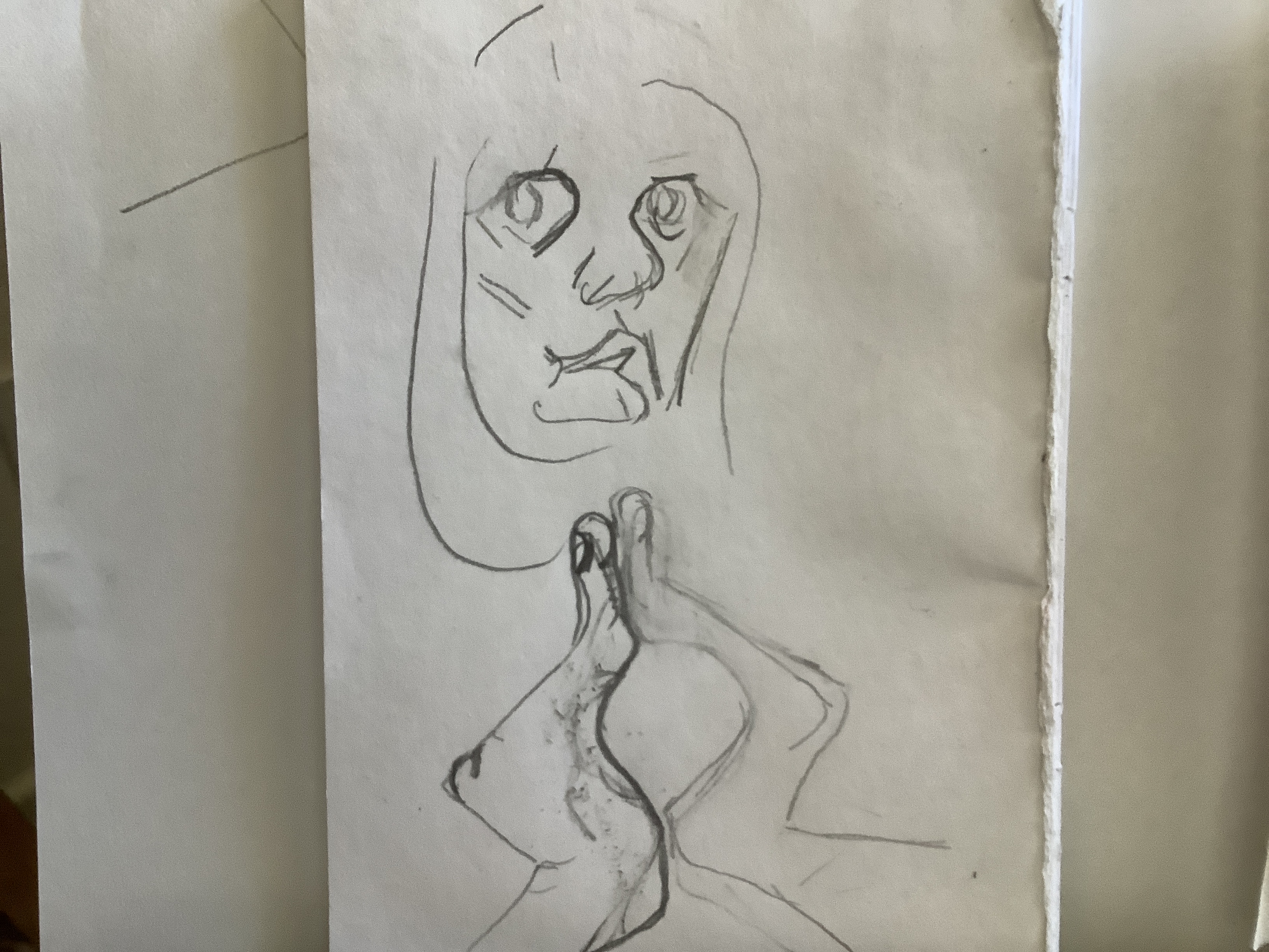
I was not able to enlarge the side profile without sacrificing the shadow shapes ai want to explore. This gives me a further opportunity to expand the project in a completely different way later.
Meantime I moved the head on the same plane to emphasise the LHS- enlarging this side of face and hands and flattening out this side of the nose. ( I chose the LHS as it is most in shadow which is what I want to develop. The Left hand has moved out larger and forward. This will help me to indicate shade and depth in my similar colours ( orange and red).


in pictures 4 and 5 above I increased the negative space between blocks.
in 1 and 2 I played with the classic candlestick negative space that I realised had appeared and is mentioned in a lot of well known samples of optical mixing.
2 shows a diagonal move to suggest different between the blocks but I note that it also show movement?
3 is an attempt to give significance to the space between the cupped hands. I have a notion to use tonal shading in this. Such spaces have been used by artists to represent the heart and also the centre of femininity in the reproductive system. I am still to develop where I choose to go with this!
Doing e recises to show complimentary colours together I can confirm colour theory findings that both are enhanced. The use of complimentary colours to frame a subject is particularly effective. While doing my weeping woman project I have discovered thr even though I like certain combinations eg blue , violet and pink it is of little surprise to see that Picasso’s choice of yellow , yreen and complimentary red wirk much better. Here lies a dilemma for artists!
Still life and still life with colour used to evoke mood.
The best example of this that I have is the kettle oil and tomatoes still life. Here I found it easier than usual to move through a fuller tonal range of red , blue and their mixes. Working on depth and looking at the result from a distance I was able to go back and add lighter and darker shades to give greater depth. Mixing more tones before would help me to make this more effective.


In the fruit study I kept the study small and simple. Using red and yellow tones I believe helped to create a mood of warmth of these summer fruits. This is better than previous studies where I mixed in blues to cool it down unintentionally. This latter picture is not successful in terms of linear perspective. It does use a doorway to frame the scene which is a useful device. AS I struggled with appropriate shades of shadow under the table and worked into it while still wet I muddied the effect.
Where does inspiration come from? – Podcast | Tate
Fly under the radar, explore creative spaces, and discover the importance of drawing a sheep
— Read on www.tate.org.uk/art/artists/pablo-picasso-1767/where-does-inspiration-come
I found the podcast interesting and inspiring, that artists do not just “wait for the creativity to descend upon them”. One contributor described that environment and emotion can be so exhausting that inspiration dries up. It is important to go back to what was found to give inspiration and work to recreate the feelings that gave ideas.
The Tate article also uses Picasso’s Weeping Woman to illustrate his drought period in the 30’s and how he moved on from this. Looking at the Weeping Woman in the context of the colour wheel and optical mixing I suddenly got part of what Picasso may have been saying. Immediately this became an inspiration to make a response and fulfilled the criterion of the still life exercise on P68 .
Project – response to Picasso’s Weeping Woman

An interesting web article on inspiration sources lead me to re-examine Picasso’s Weeping Woman. Wow- finally I am beginning to understand my own sense of something that Picasso is tiring to convey. For me I see his attempt to show the most important shapes in the human form. These are not necessarily allow a linear plane. He moves perspectives of the face so the half of face in shadow is front on and the lighted right side is a side profile. Why ? Perhaps to emphasise what are possibly the more attractive curves and line relationships? For example the shaped curves of shadow encompass the eye sockets, sweep round the mouth and flick down through the cheeks to the chin – creating a slightly different geometric pattern on each side of the face.
His genius takes this further for me as he effortlessly suggests pleasing combinations of colour triads ( two similar shapes in closely positioned tones of cold pale yellow and green matched with an almost complimentary partner purple). This had never occurred to me and took some time to work out as I worked through shape and form drawings to produce this: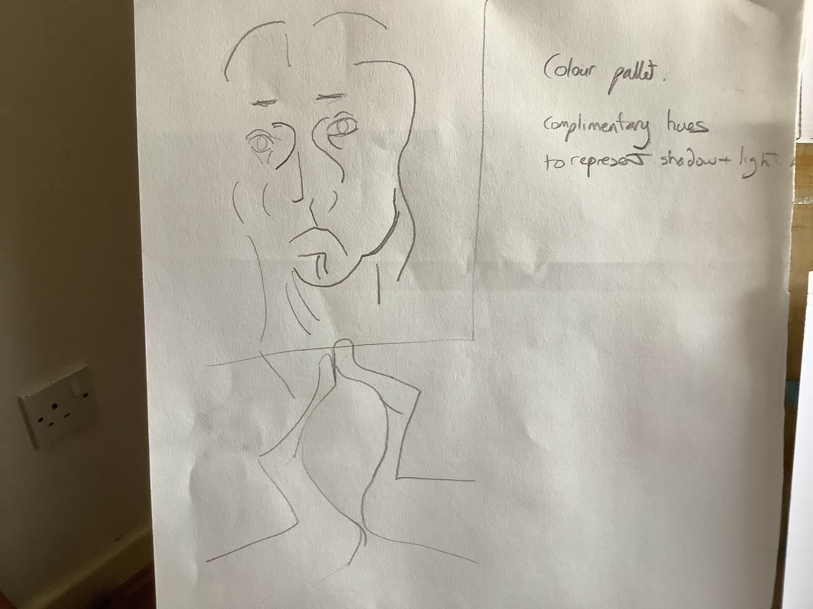
It occurs to me that it has it has vocalised for me an idea that has been forming in my head for the last few years: the geometry and shape that shadow forms on the human face.
Now to add colour. I tried to use oil pastel lines to identify blocks of colour but found that this looked unconnected.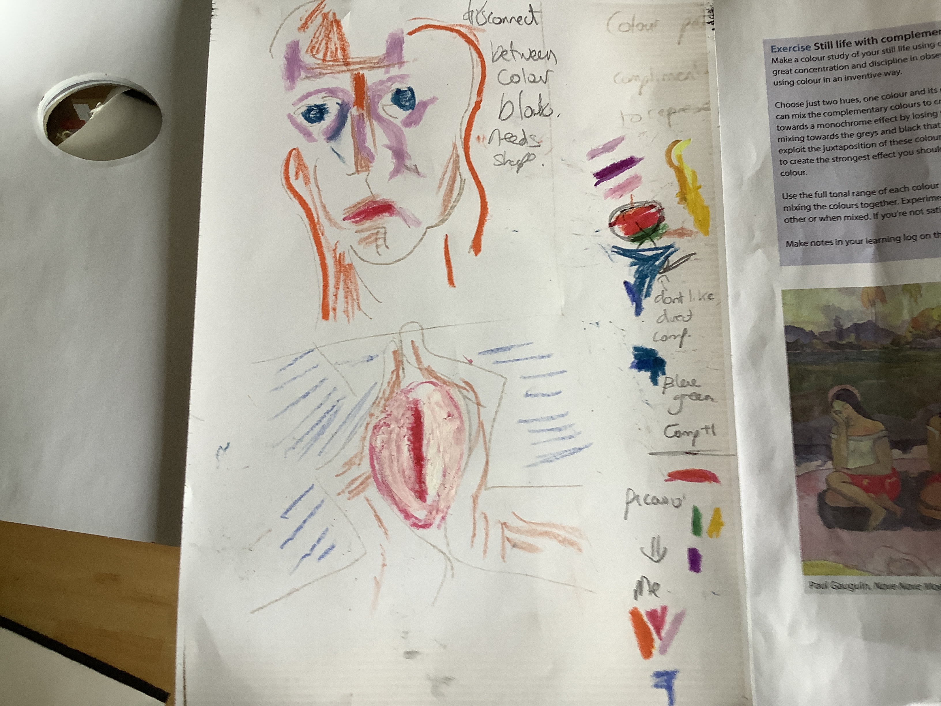
Following a Picasso’s blocking , I worked out my own triad shapes: red for the shadow side space on and orange for the right hand side of the face with the perspective swirled slightly to emphasise the light shapes on the RHS of my face.This is mirrored in the hands.
Using a black out line helps to differentiate.
Next steps:
.add whitened tones to suggest depth?
. emphasise the swivel in the right hand side of the face and hand
. add the third compliment colour blue. Picasso used this as shadow ( small purple triangles) I need to work out my response to this.
05/04/20 Still life. Of flowers continued…

I decided to work from white to dark but made this mistake of using a dark violet to mark out the deepest shadow. In order to cover this I got frustrated, layers became thicker and I fell into the same mistake of using too much paint again! However I enjoyed the plant mark making and like the way that the loose leaves were expressed- one positive point to take forward!


I used my fingers as an experiment with movement marks. I like the tonal values in them but believe that I should have used a fine brush to apply deeper layers of tint between the dark shadow red with added ultramarine and the white set tint. I like the softness and movement achieved by using my finger tip but admit that it is not neat and again touching up with a fine brush would help. Perhaps this softer look is better for mid picture work?

The lamp study used some tonal variation but not enough and I still got the sheep head wrong. I am much happier with my Apple work. This is a simple shape on a piece of white paper . Therefore I was able to concentrate on making a range of tints and tones . I recognise that it is not giving up to go back to basics- I need the technical skills before I can progress! The shadow is wrong in form and colour . Grey would have been better.
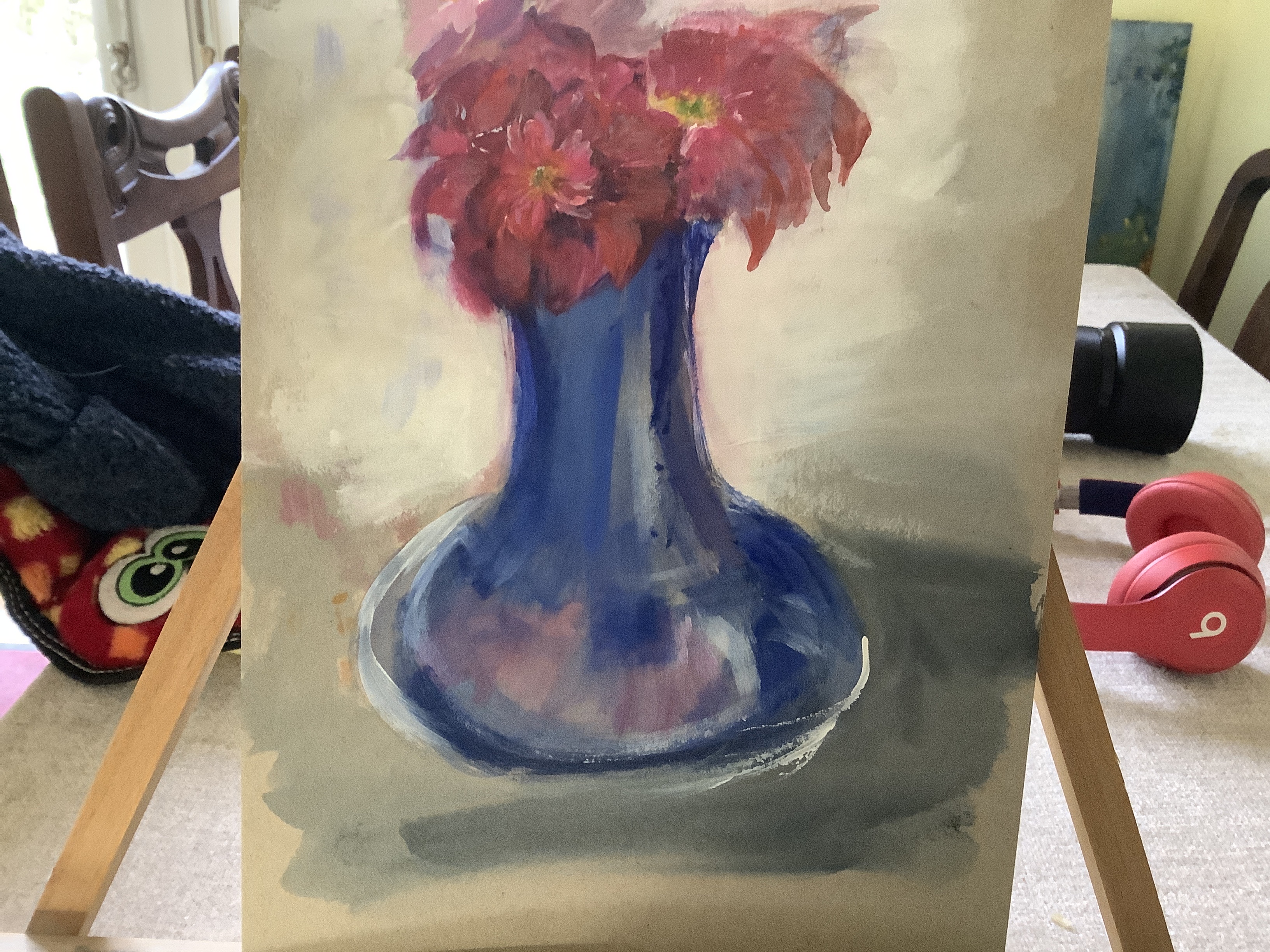
This painting is watercolour on cardboard. I found this medium pleasing to use on cardboard as it flowed smoothly allowing long sweeping strokes.
White gesso was used as the background and provided a good colour contrast to the dark rich blue and pink. In order with colour theory this contrast enhanced the blue of the vase very well. I am pleased with this effect.
The roses that I was painting were double headed and in an attempt to depict this I have lost the fluidity and shape of individual petals. I am quite happy that I have used a variety of tones in the pink petals .
Painting 1 coursework part 2

This is a particularly helpful exercise to concentrate my mind on accuracy rather than my usual rapid draw style. It also gives me a reference point to think about how I use tones in my work.

I found it useful to play around with tints, shades and tones afterwards to visually test out what I had read. My understanding of tints was greatly enhanced by this. I also gained a better understanding of adding warm yellow to make a mixed colour warmer and observed what happens to the hue against different colours. This aspect became important in the next set of exercises. I observed that to create the complexity of colour in a red lamp, I needed to look at the source of the light being added( natural white light) or yellow artificial light as the component colour wavelengths affected what was seen by the eye. Also the toning was not just a case of gradually diluting a colour with white- dark shadows enhanced the brightness and hue of adjoining parts of the lamp and white light tints seemed often to appear as a Matt effect- fuller than the shines bright hue absorbing red wavelengths to ‘pop against ‘ the lighter tone area beside it.


Of course there are still many errors in the work: there is not enough definition of the budah figure and the surface is not accurate in its tone. However I feel it better represents the constitution of the natural light processes in this environment.
I was also happy that I took time to creat more layers of tint, tone and shade and that the construction of the colours was informed by the different natural and artificial light sources. I instinctively added a hint of warm or cool to reflect the environment too.
response to exercise questions:
As I have commented through out part two- I am learning to step back and enjoy the planning phase, realising that this does not need to kill spontaneous ideas. I will have my sketch ideas and have already begun to jot ideas and concepts onto a digital mood board. It is rewarding as I begin to realise that intuition was heading me in the direction of considering colour theory – however now having access to the knowledge allows me to use it in a more effective way.
I selected objects that had strong tonal values-a blue paint container, a red lamp. The small neutral coloured Budah gave contrast as a neutral colour to promote depth and allow negative painting between my two primary coloured objects and it was also something of interest. I placed the objects in front of a mirror with natural light from a window to the right and a secondary artificial light bulb coming from the left as I was interested in the comparison between the two types of light.
my scale was close up- I am aware that I am biased to this rather than wide angles – perhaps something to do with the way that I see the world as I am short sighted! My dilemma is whether it is good to stick to this as my own response or whether I would learn more by taking a different view from a distance. I at least need to try this theory out!
Looking from a distance at my group of objects takes away from the detail of objects like the Budah but may give me a better way of using negative spacing as the objects can be separated more allowing me to use the shadow space between them to greatest effect. This would indeed solve a problem that I know is in my painting: the Budah does appear indistinct and unrecognisable from a distance so negative shadow space would help me to define it more.
as I indicated in previous paragraphs I am pleased that I have the patience and seen the need to use multiple layers of paint in tints . I believe that this is a positive change to my paint handling technique.
Flower still life exercise:
I decided to make sketches of a modern vanitas set up in my work area- thinking about my observation that I “go in too close “ on my subjects. This helped me to select the best position to work from.
( see sketchbook2)
I made a paint quick drawing and began on the work. Unfortunately it was a problematic piece from the beginning. I have not yet grasped whether frustration brings a worse painting or the reverse is true. I ended up changing positions and colour tones of all grew subjects making them less effective. This is especially true of the skull. While I managed to keep paint layers thin and eventually reached a degree of tonal balance and perspective, this eluded next for the skull. Maybe it’s rich layers of very similar tones was too complex at this stage- it ended up being thick layers of undifferentiated colour without depth.
At this point I had my assessment I feedback ( postponed at my request).
main feedback points that I would like to incorporate into my next painting are:
- Pull back from being too ambitious on my subject- use a view finder.
- use thinner transparent layers to make the variety of tones and tints richer

Applying this to my picture:
too much thick paint in the shadow and skull
too little definition in the mug- it would help me to mix up a scale of reds before starting.
making the skull much less complex would be a good idea- put it at the back and concentrate on the areas which work better may help.

Further reading
Michael Raedecker-
Michael Raedecker Presents New and Enigmatic Works: Exhibition “cntrl” at GRIMM
This article shows two of his works: one a mixed media tree house made only from close tones of light blue. Definition is achieved through use of thread to form the tree house planks but it is in readable to believe how much depth and perspective Raedecker achieves from this close tonal work. It is beautiful
the other work in this article is a row of plastic chairs with cushions. Definition is achieved by tonal shading, this time in purple. Both works are extremely effective as realistic scenes but their light pastel colours give the scene a safe, calming atmosphere.
Charlotte Verity
at https://www.charlotteverity.co.uk/work-on-paper uses beautiful washes of simple colour as backgrounds. The flowers that she places in front seem strangely to fit in. The flowers themselves are often made up of long single strokes suggesting rambling movement. Often they seem suspended in space but somehow they work beautifully.
Peter Doig
https://www.newyorker.com/magazine/2017/12/11/the-mythical-stories-in-peter-doigs-paintings
Learning from different media


I am starting to realise the truth of what I have read for so long:my creative expression alters considerably when using different media. Why is this? Perhaps for me some of the answers currently come from technical ability. I can achieve more controlled mark making in acrylics and therefore have more confidence in the range of bold and mor original strokes that I use.
Consequently when using acrylics I relax more into the work and find it easier to experiment and move forward in my process journey eg discovering that I could make interesting textures and introduce more life by combining paint and pouring medium in a new way see sketch book practice of standing stones in primary colours.

I have found it more challenging to achieve this kind of flow and bolder ,free strokes when working in oil. Actually this is a similar pattern to my handwriting. When stressed it is small and contained but when I am relaxed it is large and more ‘eccentric’! Maybe this tells me something about my grip on the paintbrush. I probably need to loosen my grip and allow the flow to take place without thinking too much.
In fact frustration lead me to the point of giving up- until luckily I decided to play with some pallet knife layers on top. For the first time I could see some movement come into the landscape. I ended up getting carried away and have overworked the effect but it was heartening and gave me some encouragement.

The following are some of my oils learning points from today:
1. using an acrylic base layer saves time but be careful as thickly laid down dark colours like blue tend to bond less firmly with the supporting paper and I ended up with a green on applying yellow oil.
2. be even more careful to lay down long single strokes for sky/ sea as strokes remain in the thicker slower drying oil.
3. be aware of drying time of different colours and thicker layers as well as the amount of thinner used as this will affect fluidity of applying layers on top and the overall stability of the paint.

4. for now I love using pallet knives to bring spontaneity that I cannot achieve with brushes. I can do so much more than just add texture with knives, they allow easier manipulation and act for me a bit like a round brush in acrylics!


Part 1

Project 1
Brushes
Often I feel that my drawing is much better than my painting. I have never really bothered to work out why. Until now that is! It has not taken much reading around blogs and information sites to see that my processes are rather removed from the norm. I tend rush and to be rather haphazard in the selection, use and care of brushes . No wonder therefore my results frustrate me.
In fact my first attempt at this mark making exercise left me very disappointed. What was wrong? Are all my brushes past it? Is the paint past it’s best? Why does everything look messy and quite similar?
Time to do some reading!
Learning points:
- Flat, Filbert and round brushes all behave differently and should be loaded with paint and deployed in specific ways to achieve the best technical performance. E.g. To produce petals: round brushes need to be rolled round quarter wise in paint and pushed onto the support before being pulled towards the user.
- longer brushes held at the end are especially good in oil media to allow artists to stand further back. In the same way as pencil grip alters the flow of a drawing- different marks are achieved by altering the position of hold.
- Two colours can be loaded, one on each side of a flat brush to produce an effective blend.
- Maintenance of brushes- including the use of brush soap keep the shape and produce better results. I disposed of at least half of my brush collection and stored according to type. This will focus my mind on correct selection and use until it becomes second nature.
This time I enjoyed the experience, took my time and learned for the first time the basics of brushmanship.
Jackson’s .(2017) How to care for your brushes.[online] https://www.jacksonsart.com/a-guide-to-brushes [Accessed 08/01/20]

Exercise 1: getting to know brushes
I have become very used to sitting down looking up close at sketching work. Helpfully the prompt to use long brushes not only focused me on mark making but also reminded me to observe my work from further back while creating.
The seascape was rather frustrating as my old and misshapen brushes hampered progress. The red lighthouse scene and apple were painted with new brushes and I felt happier and more relaxed using them. I found better results when I loaded the paint brush- there was less dragging , although I did use this deliberately to give some texture to the sea in the monochrome. It sounds obvious but I had forgotten to use round brushes for curved work and I spent time observing how round and filbert handled.
At the beginning of a painting my natural default, I know, is straight lines using the long edge of a flat brush. During the exercises I became more aware of this and changed things by switching brush types. Looking at the completed works I notice that this theme continues and although I love curves and natural leaf shapes I rarely use them. Is this a lack of confidence? Do I avoid them because traditionally I tend to grab a flat brush making it more difficult to achieve these shapes?
I feel more at ease with the sharper, neat lines created by synthetic brushes. Hog hair large round brushes proved less easy to control. Maybe I can use this knowledge to my advantage in later work? I will also be more aware in the difference in movement and behaviour in a brush as the paint dries out there is less bounce and more linearity to marks.

Exercise: working without brushes

Lower – acrylic
I had forgotten the freedom and luscious feeling of working in oil…
I am confident that my new adventure has begun. While experimentation in acrylic has been fine, it is a also safe and my purpose in this unit is to move forward. As I began to experiment in oil a wave of delight hit me. I felt the drive to explore marks and media enhancers with rag, sponge, sticks and various knives. Each is detailed on post-it notes in my sketchbook.
Discoveries:
- Blending allows semi- transparent layering; softening and surface change from shiny to matt
- Adding liquid and impasto medium enhancers allows later soft blending as well as greater flexibility and flow in mark making and creating texture
- colours are more likely not to darken and textured treatments look more natural
- I enjoyed using cards and palette knives perhaps more than brushes
- Fiver free rags allowed me to blend and soften the work at a variety of stages. Leaving time for the drying process to begin allowed a more gentle and natural blending. The drying rate of different coloured oils and the use of medium like liquid in must be considered in this process.
Different media may produce different expressions of me
My overriding conclusions were that this was fun and my strokes on the paper changed from lines to swirls and curves. Is this perhaps due to the greater sense of movement within the paint? It could be coincidence but the oil work provoked a different response in my audience. For the first time in ages my trusty critic and hubby ‘saw’ his own story in the oil piece. This was interesting as it was just marks to me but perhaps the freedom of the medium lent itself to my subconscious working independently to express something?
Reflection:

Project- Transparent and Opaque
I tried this first in acrylic ( see sketchbook) and later once I had gained mor confidence to return to oil it became a part of my assessment practice pieces as different coloured layers over my sky wash.

I also added some white glazes to dull down a few layers that seemed too bright and found that this worked well. I have worked on sky scenes before but not thought properly about how to create them and practising this technique was very helpful in my learning process.
Transparent washes in acrylic alter the texture of the finished work. My feeling is that for white glazing I will have to be careful not to use too thick an overlay or it will detract from the vibrancy of the colour
Eg the bottom of this graduated red is glazed and also much duller.

Monochrome studies

I have always liked the drama of monochrome but not thought too much a lost what it’s use does to the image. in this quick example of looking up into a treetop I think that each produces a different effect. Black on white to me makes the treetop fade more into the distance elongating it while the white on black is more traumatic and perhaps gives a sinister look. This gives me more to play with when creating atmosphere in work. Eg Should the image be a night scene to give more of a haunted or misty look?
Project- working on different grounded colours

Although not an actual exercise I was intrigued to try the impressionist pixilated technique. I like the way that tones feed into the background to improve a sense of depth by tone. I am not sure that my attempt works particularly well as I need to improve differentiation and clarity of the image when viewed from further back. I feel that the darker work shows a more 3D effect perhaps because I have added toned longer strokes .
Exercise- tonal study on white ground
I really enjoyed this exercise. It took me back to basics and allowed me to concentrate more fully on putting depth into my vase using tonal shading and brush strokes.
The end result included a range of tones instead of just a light and dark but I feel the change was necessary to allow me to achieve the depth that I wanted. once again my slow and deliberate oil paint strokes were not blended and this takes away from the overall effect. I feel now after more practise that I could achieve this without the stripy effect!

Tonal study on dark ground

This is a rough work used as a practice for my assignment idea. The grading in tones is simple and only to show the further away stones receding into the darkness. I have also used stumbled marks and added acrylic medium to make a textured effect on the closest stone. I think that the dark background works effectively to show depth of tone and distance as well as being a technique which lends itself to the mysterious haunted look which I liked in the white on black tree monochrome exercise .
Chiaroscuro- my main findings on this technique are posted under research. However I kept this in mind when trying to compose my assignment piece. I like the way that darkness emphasises the lighted features and really for me it is an extension of what has already been talked about in the monochrome and work on dark ground exercises .
I was particularly struck by the image of Paul and Peter in dispute painted by Rembrant. ( see chiaroscuro article in research). Extending this idea to a group of similar light tones surrounded by darkness appealed to me. I have tried to work on this in my later practise pieces.
I feel that I cannot go completely dark as this would take away the stones which are important to the message I want my picture to give. However I have tried to heighten the dark tones in the near ground and sky. As the article says this technique means that less detail can be shown on objects in the darkness it accentuates the light areas.

