Part 5 – research

Part 5 Research part 1 some of this page has been altered post formative assessment.

Applying paint

Camille Pissarro (1830-1903) worked in several styles through his painting life: moving from Impressionism to pointalism and back again. 

Pissarro used a wide tonal pallet . https://www.camillepissarro.org/the-cote-des-baoeufs-at-lhermitage.jsp In this example worked paint into the work , over layering the impasto leaving small parts of brush marks . It is also full of interwoven trees in the foreground giving an authentic feel and hiding the figures in the mid ground from initial view. In contrast , https://www.camillepissarro.org/boulevard-montmartre-at-night.jsp , one of few urban scenes that he painted the view opens out wide using the street angle to allow simplified contrasting tone perspective. The brush work in this one is much looser and it is suggested that this was because there was a time pressure to catch the light on the damp pavements. Both of his techniques use textured paint to create perspective.

https://www.artistsnetwork.com/art-history/pastel-drawings-famous-artists-time/ shows techniques used by twentieth century and current artists. Ordin Redon applied pastels in a way that mimicked oil work. Use of contrasting hues and close tonal shades appear in heavy overplayed areas resembling paint applied with a spatula. Yet in some areas there is only a thin tint and leaving white areas and pencil markings.

In contrast Mary Casset was well known fir creating fine tonal work. She was able to blend in some areas like clothing but achieved a mottled skin effect by allowing marking lines in blues and pinks to stay distinct on arms and faces. Strands of hair where chiselled into the paper distinctly and a reflection in a mirror shows distinct over hatching to identify it.

Recommended artists to research

Joan Eardsley-https://youtu.be/2t8HAAFLfWw. And https://www.theguardian.com/artanddesign/2017/feb/10/joan-eardley-the-forgotten-artist-who-captured-scotlands-life-and-soul

Eardley painted coastal seascapes and landscapes at a fishing village called Catterline. She painted large works in situe and often in extreme conditions. Her work was full of bold and loose mark making, impasto , ground additives and scratching. She used quite a muted storm palette most of the time but could introduce translucent pinks and yellows to convey a change for the better in the weather. The energy in her work really inspires me as does the semi abstract quality of her paintings. They convey the power of nature .

Joan Eardley- behind the canvas

While her street children are perhaps equally or even more iconic I intend to concentrate on Eardley at Catterline where her sea scape work and insight from the late 50’s till her death in 1963 . Here her loose and impasto technique appeals greatly to me and I aspire to the same passion for a simplistic representation of the magnificence of the natural costal environment.

Second research notes

In the 19th and early 20th centuries certain artistic disciplines, like sculpture, were regarded as unfeminine. Similarly, certain types of art were considered to be more appropriate for women: in 1860, French art critic, Léon Lagrange wrote of female artists: ‘Let women occupy themselves with those kinds of art they have always preferred… the paintings of flowers’ for example. However, have things have moved on for female artists today?

In this film contemporary artists Julie Roberts, Graham Fagen, and arts journalist Jan Patience were invited to discuss whether an artist’s gender affects the work they create or the subject matter they choose. ‘

Julie Roberts and Graham Fagen discuss pre 1980’s thinking on appropriate subject matter for female artists. They agree that Eardsley’s street children were a product of what she had access to paint ie not the life room or celebrity portraiture. (Fortunate though for social history that it forms a record though of a disappearing way of life!)

Around 2:30 in the video Eardley is shown working in her studio in Catterline. Her body language portrayed tension and an urgency to spurt out her work. She held large brushes and a pallet knife in both hands and applied the beginnings of a painting with large loose marks, possibly dark ( black and white clip) onto a mid – tone board support .Here work on seascapes became large and hosted longer, looser markings which apparently she painted in groups mainly outside no matter what the weather was, even strapping down boards in storms.

https://www.youtube.com/watch?v=KXPZk35FhwM&feature=emb_title

Description of ‘The Wave’ 1961

‘This work was painted in Catterline, a village on the East Coast of Scotland where Eardley owned a cottage. It suggests something of the power of the sea, with the wave approaching the shore like a wall of water. The artist has described the circumstances of the painting: ‘It was painted during February 1961 – entirely outside – as is the case with all my sea paintings. It was one of four paintings which I had in progress during a stormy period of weather. I worked on all four together – or rather from one to the other according to the tide’.

https://www.nationalgalleries.org/art-and-artists/485#related-media-anchor

https://youtu.be/MOof0SdNsMI – Eardley’s technique in 1959 described and paired with Anne Redpath from a similar period. Both are influenced by the strong bold abstracts emerging from America. still uses a and realistic colour pallet for sea scales – odd as she uses Freudian surreal pallets for her street children. It is commented on that her bold and confident style was influential on Redpath , an artist with many more years of experience. She illustrates swirls and impasto techniques and pallet knife spreads of paint along the canvas .

‘There are several late oil paintings whose subject remains enigmatic, where the abstract quality is dominant, where the paint itself seems to the as much the subject as the view. The title, which derives from a Roland Browse & Delbanco label, has assumed we are looking at a waterfall but can we detect the form of a beehive (a favourite Catterline motif) with the light illuminating a path beyond? What is certain is the energy inherent in the paint, a determination not to let her picture become a topographical record that she shared at this moment with Auerbach, Kossof and European Tachist painters like Antoni Tàpies.’P38 TSG catalogue

See shape , form and colour for Trees and Haystacks. Paint etched out possibly with the end of a brush as described elsewhere. P29

‘For Eardley there was enough inspiration for a lifetime of painting and more and this drove the urgency in her work, the sense that nature would not be tamed or oblige with the same conditions ever again; her response was to work tirelessly’

P28 from Joan Eardley – Restless talent TSG catalogue

Sourced at http://s3-eu-west-1.amazonaws.com/sgall-assets/pdf/TSG_Joan_Eardley_Restless_Talent.pdf

A Carter and His Horse, which the Government Art Collection bought in 1952 and then loaned to the British Embassy in Tokyo for decades. It captures the carter beside his horse, lighting a cigarette while he waits for goods to be unloaded from the harbour glimpsed in the background. Yet the 4ft-wide picture has an impressive scale. Eardley carries the eye across the surface by means of small connecting passages, without forcing the interest at any point. The brushwork is brusque, almost nonchalant, suggesting a confidence that feels no need to impress.’

‘…The North East, – it’s just vast waste and vast seas, vast areas of cliff – you’ve just got to paint it. I very often find I will take my paints to a certain place which has moved me and I’ll begin to paint there and I find by perhaps the end of the summer I haven’t moved from that place. My paints are still there. I’ve worn a kind of mark in the ground – no grass left! – and I just leave my paints there overnight and eventually it seems to have built up this other table and generally a studio seems to have arrived outside and that seems to be how I work. Once I’ve started in a place I don’t find I want to move, because I’m trying to do something and you’re never really satisfied with what you’re doing, so you keep on trying and the more you try the more you think of new ways of doing this particular subject and so you just go on and on.’

Joan Eardley by Christopher Andreae, Lund Humphries, 2013, p57

Three large canvases all worked throughout the day from my front door or thereabouts. It has been a perfect painting day – Not as regards climate! (I wore a fur coat for the first time). But for beauty quite perfect – A big sea – with lovely light – greyness and blowing swirling mists – and latterly a strong wind blowing from the south, blowing up great froths of whiteness off the sea, like soap suds onto the field behind our wee house – And towards evening the sun appeared shrouded in heavy mist – and turned yellow and orange and red, with great swirls of mist obscuring her every now and again – I wanted so much to paint the sun but it meant turning round and leaving my sea – or else running round paints and all to the other side of the bay. And I just hadn’t time or energy to do this – Tomorrow perhaps there will be the possibility of this sun again and I can take up my position, the other side, by the minister’s house. I think it could be good there.’

Joan Eardley, extract from a letter, Joan Eardley by Christopher Andreae, Lund Humphries,

2013, p21 TSG -Joan Eardley in context

http://s3-eu-west-1.amazonaws.com/sgall-assets/pdf/Joan_Eardley_In_Context.pdf

Ohttps://www.scotsman.com/whats-on/arts-and-entertainment/art-review-joan-eardley-sense-place-1460207 shows intensity and urgency esp the ground blhs – colours showing winter light.

‘I don’t think there’s anybody else that has painted two completely different subjects, in the same way, with the same passion, and caught both of them,’ says Eardley’s niece, Anne Morrison, who grew up in Glasgow, and knew Eardley when she was a child.

As Anne observes, Townhead and Catterline actually had quite a lot in common.

They were both communities on the edge. Catterline is still there, still much the same, but Townhead has been bulldozed – replaced with high rise flats and a new motorway. Her haunting portraits of its children are all that has survived.

https://www.bbc.co.uk/programmes/articles/1290R2hMbnhYfz7pJNKZkmz/how-the-unflinching-art-of-joan-eardley-captures-scotland-at-its-rawest

Oliver describes her late landscapes as an urgent need to find expression ‘for a heightened response to the experience of all of her senses – the angry roar and tumult of the sea, the silence of the snow-bound village, the sussuration of the wind across the barley field, the scent of the wild flowers and the hum of the bees; all these are implicit in her paintings’.16

And also describes as “‘non linear’

https://www.studiointernational.com/index.php/joan-eardley

When I first saw one of Joan Eardley’s street kids pictures I was struck by the freedom of her mark-making and her bold colour choices. Solid blue rings around a child’s eyes is not conventional- and yet it works. It is spontaneous and says something of the plight of the impoverished children that she knew so well from the streets around her Glasgow studio. The colours of the clothing are bright and used repeatedly as a complimentary colour technique to make her work ‘pop’ and to draw attention to the poverty of the residents – the same items of clothing appear again and again on different siblings . As one of the artists for recommended study in this unit , I returned to her work . New amazement hit me- as I felt the frenzied energy used in a breath- taking manner to portray storms she observed from the small fishing village that she spent a great deal of her latter years living in. She worked outside with huge canvases lashed down to prevent them blowing away in gales and apparently worked quickly and loosely to paint in the same spots again and again, claiming that the more you studied a site the more detail and feeling you got from it. I greatly admire Eardley’s bold mark making, impasto, application of sand in her ground and scratching into her work. This conveys the urgency of her paint application and therefore her passion for the subject. In her work I can detect the joy that she must have felt in her paintings and realising this I felt more able to try to loosen up and experiment in my assignment . I commented in part 4 that I realise I retreat into convention and lose the sense of what I am trying to paint. Therefore Eardley inspired me to be bolder in this submission.

Ellis O’Connor says that “ on stormy days the sea and sky converge” and this is what she tries to bring to her work.https://youtu.be/U6SZjQgeZIc

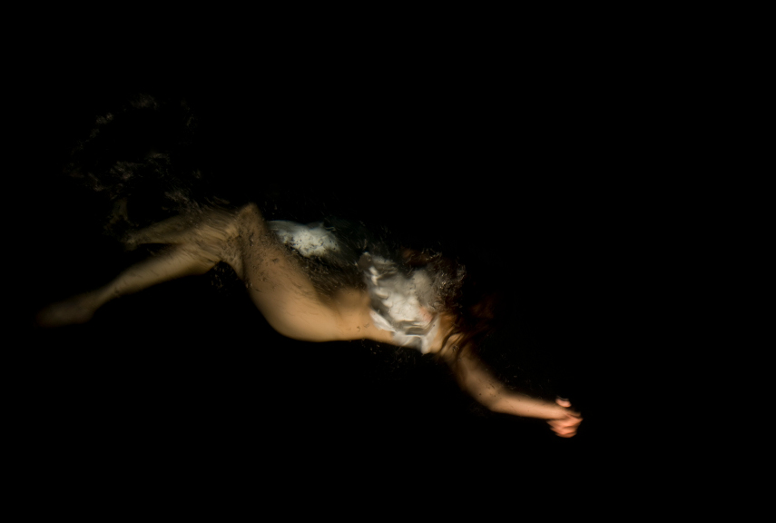
I have taken Ellis’s words very much to heart and sat for many hours absorbing the moods and tides of the sea. I best love the bubbling white mass of foam as tall rollers crash in from the Atlantic and smash many miles worth of built up kinetic energy into stacks of outlying rocks or collide with rip tides bouncing of the bay. This wild caldron is imprinted on my mind to the point that I must try to describe it using colour,texture, splashes, pallet knife marks and anything that I feel will develop my depiction of this amazing and dangerous sight.

Until very recently I felt a sense of defeat when I picked up a brush or chalk to record this scene. It has taken technical ‘light-bulb’ moments as referenced in ‘Personal Development’ at the start of Part 5 ) and without a doubt the research into the work and emotions of artists like Joan Eardley to encourage me out of my previous artistic paradigm . It may sound over dramatic but I am convinced that discovering the level of passion and self belief and observing the mark-making that Eardley used in her seascapes opened up to me the possibility that I did not have to paint as a photorealist. My journey in art is to represent the energy that I feel in a subject through urgent mark-making and development of my emotional response to the subject and my evolving work.

A sketch from Part 1 painting. Looking back I can remember my frustration. I wanted to break out from a traditional path, not because it was wrong, just not right for my personal development.I have tried to interpret the anger in the sea with random broken lines and a dry brush technique. The sky shows a little development as I have tried to layer paint here but on the whole after an initial application of acrylic I gave up , disheartened at the impotence of my artistic voice. I did not know how to apply paint in a loose style or have the confidence to go with bold hues, tones and more daring expressive mark-making. The piece came from scant childhood and holiday memories but there was a complete absence of observation of the sea which I feel contributed to the lateness and lack of energy

This is a final image from Assignment 5. Eardley’s influence, I think can be seen in the choice of pallet , use of texture including impasto and sand and free mark -making that I have allowed to direct the way that my painting has finished. I hope that it shows the energy and passion that I observed in the sea. This is now the beginning of a long artistic exploration but I hope that my comparison with P1 shore scene illustrates that at least now I have metaphorically put on my boots and left the house!

Kurt Jackson-https://www.kurtjackson.com/exhibitions/. Jackson paints landscapes in thick oils. His mark making is not quite as loose as Eardsley but the splashing and dribbling of bright highlites really makes it pop.Thinking about how he uses perspectivehas been a revelation to me- that while hue fades into the distance, the shadow that forms behind or on the furthest hills, trees etc can be as dark or darker than closest points. See kJ sea picture s-Sea on horizon much darker than closest.

Barbara Rae-https://www.royalscottishacademy.org/exhibitions/barbara-rae-the-northwest-passage/ Rae uses simple semi abstract form and lines and blocks of bright colour. The colour is used effectively to show perspective and convey ideas but fir me it does not have the same feeling of energy as Joan Eardsley’s workBy 1942 Nash has added bright hues to his pallet. The yellows and soft pink/browns change the mood of the landscape adding warmth and cheer to his work. This is ironic as WW11 is still raging on and his Heath has deteriorated greatly before his death the following year. The strange tones and more abstract shapes are reminiscent of the dreamscapes that he is well known for. It is easy to trace the development of Nash’s work throughout his painting life. He sticks to themes that he is passionate about but within this his techniques and emotional awareness of his subjects develop his work.

Research altered 12/01/21 after formative assessment to include passages read but not included and explanations of Nash’s effect on my work.

Paul Nash – amended review of artist’s influence on my work

One of Paul Nash’s great strengths was his sense of place- feeling that there was an emotional connection to convey as well as the physical image. He returned over his life time to The Clumps ,Wittenham, Oxfordshire. (Brains & Dillon, s.d.) record his response to this landscape

1912- an early almost graphic work. The colours are muted and the movement in this work comes from pen and the well executed shadow work. This is before the Great War whose effect he never shook off physically and mentally according to his wife.( Haycock ,2013) To me it lacks the urgency and narrative developed after his life changing experiences.
1935- I love this painting and have seen a similar version in Aberdeen Art Gallery which to me is even more effective as it has impasto and scratching effects on the trees which bring out the perspective even more effectively. The furrows in the field and the body of the tree suggest a rhythmic motion and are reminiscent of sea waves, illustrating both Nash’s fluidity of stroke and his surrealist ability to make objects resemble something else. This feels a strong piece and draws me into its narrative.
Tote Meer (Dead Sea) a WW11 oil painting is another good example of his surreal imaging where a store of a German aeroplanes resembles a choppy sea.
By 1942 Nash has added bright hues to his pallet. The yellows and soft pink/browns change the mood of the landscape adding warmth and cheer to his work. This is ironic as WW11 is still raging on and his Heath has deteriorated greatly before his death the following year. The strange tones and more abstract shapes are reminiscent of the dreamscapes that he is well known for. It is easy to trace the development of Nash’s work throughout his painting life. He sticks to themes that he is passionate about but within this his techniques and emotional awareness of his subjects develop his work.

I share Nash’s sense of place. In assignment 5 prep and the assessment work itself I have stated how much I have been affected on a deeper level by the seas and coastline that I now call home. I have spent much of my time since observing and getting to know how my local beach areas respond to different weather and tides. I have sketched the same parts of the coast line again and again looking forward development of my technical skills and experimenting with media methods to illustrate the sea in all its moods. It is a compulsion and connects me to my environment. As the shapes , forms and colours become second nature , I find that my style relaxes and I can look out for marks and textures to develop my understanding further.

Nash used trees to describe his work: whether the clumps of Wittenham or the awful blown up stumps of the aftermath of Passiondale. I have taken this to heart and see the sense in using shapes the I love and understand to convey a message.

nashclumps.org produced by Christopher Baines & Anna Dillon.: Paul Nash and the Wittenham Clumps s.d. At https://www.nashclumps.org/display.html (accessed on 11/01/21)

David Boyd Haycock (12/03/2018) – Paul Nash: The landscape of modern war” from HENI Talks on Vimeo At https://vimeo.com/259680856 first accessed on 12/20.

Research for ex1 – view through a window or door

Blue is the only color which maintains its own character in all its tones it will always stay blue,” the artist mused. “Whereas yellow is blackened in its shades, and fades away when lightened; red when darkened becomes brown, and diluted with white is no longer red, but another colour—pink.”
http://www.artnet.com/artists/raoul-dufy/
As his observation suggests Dufy does seem to have a passion for blue and uses it frequently as the predominant colour in his Mediterranean work. It appears in its primary hues and as cool blue toned reds and greens. This gives a harmonious feeling to the paintings. Sometimes he uses a little darken yellow but this is less dominant . I have not been able to find examples of where the cool colours suggest shade inside. The only one that I could find showing the window has dominant areas of empty canvas inside and out and the interior is only suggested by angles slat marks fir the window shutter.https://www.tate.org.uk/art/artworks/dufy-open-window-at-saint-jeannet-t03565 Open window at Saint Jeanette

Most of the time he paints loose gestural watercolour works resembling pen and ink sketches: leaving large swathes of empty white canvas. The white space adds to the light and warm atmosphere of the region. Meanwhile his trademark scrawly free marks indicate movement and emotion. I am interested that Dufy also manages to produce oil on canvas versions which viewed online look extremely similar to the watercolours. This to me seems unusual and possibly much harder than it appears as the temptation with oil is to fill the canvas with colour. Occasionally there are instances of this artist using a conventional oil style ( throughout the years that he paints) which often takes on a heavier , darker appearance altering the mood completely.

Research point 1 p111

Erie ,dream-like Surrealist landscape eg. Salvador Dali, Max Ernst and de Chirico

The development in Dali’s landscape style is astonishing. By the early 1920’s there is evidevidence of change in his early impressionistic scenes of Spanish ports as he begins to introduce brave pinks and reds in unexpected places. In one short decade. His rather rough and rustic canvases have transformed to flights of imagination in photo realistic finely painted detail eg perhaps his most famous persistence of memoryhttps://www.moma.org/learn/moma_learning/salvador-dali-the-persistence-of-memory-1931/

The landscapes are often deserts of orange with bright blue contrasting big skys. The absence of foliage and space are dreamlike and unsettling as I am sure he intends. The sky blends softly with clouds into nothing at the horizon and contrasts with the hard contours of rocks and foreground objects of nightmare.

De chirico landscapes again depend on the element of shock- his landscapes are sparse with a few significant man made objects in the foreground shown in harsh angular shading. His landscapes in the background are simple scene setters; a blue sky meeting a stark single toned grass or sand earth. His work is stark and hard to creat effect I think.

Emotional and subjective landscapes eg Paul Nash and Graham Sutherland. Nash, still a surrealist painter is famous for his First World War work as a war artist. He uses sharp angles and simple sky’s but now the landscape is the art work rather than being the backdrop for a dream. This and his sensitive use of dark torn up earth colours make his work much more emotional and give a credibility to him. Unfortunately his job is to communicate very real horrors and he earns respect from the viewer by the honesty in his scenes.

Sutherland has fallen out of favour with critics but I have always been fascinated by his work since I saw Black landscape at the Tatehttps://www.tate.org.uk/art/artworks/sutherland-black-landscape-t03085

Similarly to Nash Sutherland is affected by war- in this case the treat of the Second World War and the gloomy black in his hills darkens the pink ominously. In other works of the welsh hills he builds rainbows of colour into the stark shapes of his mountains. Several articles including the Tate referenced above describe how he developed a unique system of finding natural objects that he liked , drawing them in situ and then in his studio he ‘humanised ‘ them in his paintings. I admire this approach.

German expressionist landscapes( de Boucher-exaduration of and distortion of line and colour to express the spirit of life and nature.)eg Emil Nolde and symbolises Gustav Klimt, Gustavo Moreau, Leon Bakst, Friad Kahlo. Nolde is quoted as saying ,”colour is strength strength is life.”https://www.tate.org.uk/art/artworks/sutherland-black-landscape-t03085 . His landscapes are filled with bright colour applied possibly by palette knife in an impasto format.

Research point 2 p 113 –

The golden mean – found in nature and derived from Fabinachi.

The rule of thirds and foreground, middle and background- basic rules for locating focal points to lead an observer into a painting.

Research artists recommended by tutors :

Yan Pei Ming- impasto and conveying character- paints using large decorating brushes in monochrome.

He says if his style” it is between abstract trying to create a work between abstract and figurative trying to create a confusion between reality and imagination”. His emotional connection to his work becomes apparent in this interview- whether he is painting endangered animals or humans in positions of power he uses colour ( often black )mark making and size (often 4-6 m tall) to allow observers to ‘penetratrate’ into a figure.

Cohort, A. “ invisible man’https: //YouTube.be/Ed2nIPvUvkQ . Accessed 13/11 2020

Egon Schiele- ambitious poses with suggestions of marks

Blackshaw (2007) raises an interesting theory. Proof has been found that in 1900 photographs ( courtesy of a photographer called Jean-Martin charicot ) in a medical journal allowed Viennese artist access to pictures from the city’s psychiatric community showing “ the body in pain”. It is already understood that Schiele ‘s life contained much poverty and illness so it makes sense that this psychiatric ‘pain’ would be relevant and must have inspired his work.

Blackshaw,G. ‘The Pathological Body: Modernist Strategising in Egon Schiele’s Self- Portraiture’. Oxford Art Journal Vol .30.No. 3 (2007), pp.379-401 . JSTOR,www.Katie.org/stable/4500071. Accessed 1 Nov.2020

Nechvatal,J.”Egon Schiele’s Quivering Line Tells All. An exhibition full of drawings shines light on the history of the line in this artist’s work”. Hyper allergic,Art. https://hyper allergic.com/467484/Egon-Schiele’s-quivering-line-tells-all/.Accessed on 1 / 11/2020

The author recognised Schiele’s drawing and painting is enhanced by “quivering” lines. There is debate as to whether this is down to the artist’s anxiety or to a connection to Art Nuevo ‘s sexuality , however it gives a sense of humanity to figures as does his tendency to leave parts of the work unpainted.

Glen Brown – working with heavy brush marks and alternative tools. He puts his own slant onto famous images. I have struggled to find anything relating to his technique.

Agnes Cecile- using mark making to bring dynamism to the work.

Agnes Cecil produces beautiful dreamy watercolours. Watching a you -tube video of her process I can see that she uses a combination of photographic and fluid painting. She starts by painting in key facial features in fine detail and then works in the hair and extra details using wet on wet in quick loose strokes.

Zandbergen,J.”The Sensual Watercolours of Agnes Cecile” Beautiful Bizarre.2015, o3, 28.https://beautifulbizarre.net/2015/03/28/the-sensual-watercolours-of-agnes-cecile/ Accessed 1/11/2020.

Recommended Artist research

Impasto- Ernst Ludwig Kirchner

https://www.britannica.com/biography/Ernst-Ludwig-Kirchner described his art as an “ immediate, powerful inner conflict into visual terms”. Unsurprisingly his influences included Drurer, Van Gough, Munch and artists of the Fauve movement. Angular, sweeping brush strokes in Swiss landscapes (1930’s) and the Berlin street series are iconic to his style. The street series really attracts me: colours are bold and his brush technique add so much to the post WW1 energy and captures the mood of the city. His subjects tend to be outlined in dark ( often black) bold sweeping lines. Inside this the deliberately obvious diagonal brush marks bring movement and along with the bending street views and elongated figures suggest a sort of malevolence as prostitutes mingle with passing smartly dressed men.

An exhibition at New York’s Neue Galerie ( January 2020) includes a quote from the artist about his work across a variety of media including textile collaborations, pastels , wood cuts and oils as “a tightly woven, organic fabric, in which process and completion go hand in hand and one aspect drives the other on.” ( unfortunately original source of quote unknown) For me this sums up his approach to creativity: no matter what support or material he uses all that he learns by working through the piece adds to his understanding of the subject he is trying to portray. Perhaps he is using his learned wood block skills as he carves expression out of oil paint squeezed directly onto the canvas and worked possibly with a variety of tools he sculpts his emotional message .From the freshly squeezed daubed strokes of skin tones in ‘Two nudes’ to the urgent agonised sweeps of them street’; each are a true hands on processes – each are experimental and tactile and each are expression of his take on life rather than fine art reproductions of a classical subject.

Ernst Ludwig Kirchner

I been unable to locate the original source for a Kirchner quote mentioned in several review articles for an exhibition in New York .

  • Dry brush- Lucien Freud- layers to create depth.

  • Henry Moore’s sheep drawings- for the essence of the characteristics of the subject.
  • John Marine- use of cold colours to evoke mood in a landscape-https://www.redraggallery.co.uk/showInventory.asp?iId=12151&title=Valldemossa&artist=John%20MARTIN. Martin has found a way to turn colour mood theory on it’s head. Instead of the meloncoly of Picasso in his wonderful blue period; this contemporary artist uses his technical knowledge to bring out the fresh and calming side of blue. While he does not appear to use as many clever tones, by placing it along side complimentary shades like terracotta the blues of his Mediterranean skies pop. It is interesting to note that white alongside a powder blue makes light on a tablecloth or building wall look equally radiant – again showing an experienced use of colour theory. I find this use of colours quite breathtaking ( even though this is a little ironic as blue is thought to lower BP and make breathing deeper

Gerhart Richter- Look at his ‘Atlas’ works so you can see the considerations of marks on semi-abstracted subjects.

  • Michael Raedecker- use of subtle colours which are atmospheric.
  • https://issuu.com/grimm_amsterdam/docs/mr_doc_issuu/22?ff – much of the commentary on Raedecker’s work acknowledges the strong atmospheric gloom in his works. He uses subtle tonal changes mainly hues of grey and a slightly washed out blue with strong black and green/ grey outlines. This contrast and strong markmaking hi lights his simple forms beautifully and somehow awakens all of the viewer’s senses to the gloom and smoky ashen world of his works. However, I also love how he uses the texture and contrast of white , pink and yellow embroidery on top to make the images pop.

  • Peter Doig- working with atmospheres and landscapes. Doig has worked all round the world and spent much time in the gloom and snow and dark of American forests and the bright colourful world Trinidadian . He uses these influences in the environment around him to produce an abstracted landscape- sometimes impressionistic dots and sometimes a tangle of lines and circles in transparent layers over scenery. For a long time this has evoked a sense of mystery and deeper meaning in the work- as if the viewer is there in a snow storm or voierism peering through trees at the back of someone’s home- there is both a peak in interest and a feeling of something sinister to come!
  • Charlotte Verity- working with textures and expressive marks on natural subjects- a wealth of delicate flowing marks that feel like thin and delicate stems and petals.

Research Part 3-self portraits

Albrecht Dürer, Self-Portrait 1498 and 1500


Zucher S. and Harris B. 2020: Khan Academy.Albrecht Dürer, Self-Portrait, 1500 (Alte Pinakothek, Munich) Speakers: Dr. Steven Zucker & Dr. Beth Harris. Created by Beth Harris and Steven Zucker

https://www.khanacademy.org/video/albrecht-d-rer-self-portrait-1500

accessed on 13/06/20

Credited as the first artist to produce a recorded self- portrait, Durer turned against the traditional tide of religious subjects. His reason was that of self promotion in a time before artists were seen as important. He depicted himself : initially as a confident young man wearing the apparel of man of wealth ( promoting the idea that artists were much grander than the Renaissance craftsman around him) .Two years later he revisited his self image portraying himself on this occasion as a figure of power, face on ( an angle of portraiture reserved in those years as the sign of Christ). Again his intention was to suggest for himself power and knowledge ( through his clothing).

In the 1498 picture he has long well painted curves and a very detailed features. The skin tones give perspective and show lighting from the right side. The way his head is tilted high and his sharp features suggest proudness in the stance rather than the usual sad or thoughtful poses of many self portraits.

The second portrait , face on ,show the same strong features and sparkling eyes. The skin tones differ greatly as it is painted in candle light showing only the forehead and hand bathed in rich yellow light. This is used as a powerful imagery of Christ and inferring for himself a status of power.

Judith Leyster – self portrait in 1663

Zucher S. and Harris B. 2020: Khan Academy. Judith Leyster, self portrait. On line.

https://www.khanacademy.org/humanities/renaissance-reformation/baroque-art1/holland/v/le

Accessed on 13/06/20.

This is an important and essential work for Leyster and is believed to be an audition for entry to her local guild of painters I particularly like the way this has been painted as a moment caught in time as the artist turns to the front to talk to the viewer. The hi lights on the skin are beautifully painted in pale skin tones and the mouth is slightly open almost in a smile. I feel that these points make it very engaging. She has chosen to portray herself in fine clothes with a portrait in progress to prove to her peers that is is their equal. She is leaning casually back suggesting that she is happy and relaxed using a chair as a prop.

Later in life another self portrait shows her more serious this time- sitting straight back in her chair. Perhaps now she has a reputation as an established elder to maintain? This time there is only muted colour as a background ( she needs no clues to suggest who she is) and the colours are more muted perhaps again to give the feeling of seriousness. However that work is still engaging as the subtle tones do all the perspective work required.

Both of these artists use colour tones applied in a practised and skilful classical fine art technique. Backgrounds are painted in strongly and are photographic in quality. Interestingly no portraits by other artists have been found.

JM Turner

Although better known for land and seascapes, this Self portrait (1799) as a young man, is classically produced showing light powerfully hi lighting the front facing head and shoulders portrait, strikingly against a plain dark background.

He appears not to have painted himself in later years meaning there is no real comparison with the portrayal of other artists. It is interesting that others such as Thomas Smith choose to portray Turner from the side- profiling his rather large nose.https://www.tate.org.uk/art/artists/joseph-mallord-william-turner-558. Smith also uses impasto in a rather unflattering heavily applied manner suggesting a roughness not present in Turner’s own work.

Van Gough

Van Gough painted many self portraits throughout his life. I especially like the movement and emotion created by use of strong complimentary colours and impasto mark making. His strokes are thick yet achieve much definition. He paints head and shoulder pieces and rarely adds props – the most famous exception to this is the famous bandaged ear painting. This leads me to believe that he was trying to evoke personal internal emotions rather than making a statement about power or artistic accomplishment like Durer or Leyster.

Gogain paints his contemporary in a completely different manner: much flatter in perspective and seated at his easel painting his trademark sunflowers to identify him. Is this because Gogain may not be so confident in his likeness? Like Van Gough he paints in free sweeping strokes but the darker hues and flat less toned

Work somehow lacks the energy summoned by Van Gough himself. It is interesting that Van Gough felt Gogain is making fun of him- perhaps the overhead slightly stage angle does suggest the “ mad man” that Van Gough feels he is being portrayed as?

Francis Bacon

https://www.metmuseum.org/art/collection/search/489966

His late tryptic is striking. The heads stand out from the thick black background and as each is an angle to the left, centre and right of Bacon’s head they suggest something in-nerving. This is perhaps not surprising as in this article Bacon is quoted as saying he hate to look at his image. This may also be reflected in the unfinished appearance and slightly muted colours. However I spite of this the centre image is a clear resemblance to the artist and very similar to the version painted by fellow artist and muse Clare Shenstone. As her mentor she paints him in a more serious way- not poking fun as Bacon himself does. Shenstone chooses to direct his hands and posture sitting in a chair to show him thoughtful or relaxed. She also picks up the light in his face with some impasto and flecks of cream hi lights.

John Singer Sargent | Wineglasses | NG6670 | National Gallery, London

View: John Singer Sargent, Wineglasses. Read about this painting, learn the key facts and zoom in to discover more.
— Read on www.nationalgallery.org.uk/paintings/john-singer-sargent-wineglasses

I was introduced to this painting through a NG social media post which talks about how light is used to produce colour contrast. Sargent understands so well how the light diffusing onto the table cloth is reflected showing shades of the surroundings. He also uses negative space to accentuate the shape of the table and panels in the outdoor room.

Still life interiors

My insight into this genre has moved on from my understanding while studying this topic in Drawing 1 unit 2.  Then I imagine that I ranked it

s importance as minimal – simply a study tool to practice technique. Now however I have come to agree with Sontgen (2007) in her assessment of it’s importance in recording art culture and history. Further She quotes the art commentator Hegel to describe how interiors painting is not a soft option. It lays bear someone’s home and gives a snapshot into their life and difficulties in a deeper way than a landscape work could. I might also add that if the artist allows it to it will expose them as a person and such vulnerability has added greatly to the work of modern artists like  Van Gough. Reading letters to his brother alongside looking at his bedroom and living room interiors shows that he has put his circumstances and his passions into paintings. He describes aspects of furniture and what he wants to capture about it as colour shape or texture- all the better because he lives with it and knows it.

Other artists have used it as a tool. Pieter de Hooch uses windows and doors to frame parts of the picture and lead the eye, in the case of ‘ interior with Woman beside a linen chest’ out to the exterior world through the far off front door. ( from Songet again). It is a piece about so much more that a domestic chore:the clothing and contents show the status of a household at the time and give clues to the rest of the building. I wonder if it also suggests tensions perhaps between the adults working and the child wishing to play outdoors? Light an dark are used to creat beautiful contrast : window light at the front of the work falls onto the clothing and gives opportunity to show depth in the drapes of her dress while shadow in the mid-distance hi lights the open door at the back of the painting and pulls the viewer through the work.

Since being introduced toGwen John’s  drawings I have long admired the simple beauty of her art and how she translates this into her painting.During her later life in Paris, her interior still lives reflects her need for solitude and simplicity of life at that time . It is often portrayed as the consequence of rejection by Rodin but it is refreshing to see McCabe (2020) argue that it was actually sstrength in her conviction to dedicate herself to art. Therefore she worked and reworked paintings showing corners of her studio and areas of a local religious order who interestingly held the same principles of uncluttered life! The result in Interior 1924 is a glorious feast of light. Only one small corner of one of the Nunnery rooms is shown. Walls, tablecloth and tea setting are all bathed in dappled shades of white with a single lightly glazed red tea pot popping out as a focal point. In the far ground lie the unmistakable clues to the room’s identity:a crucifix outlined in grey shadow against a high cell like an alcove arched window. The sole source of the room’s light comes from this window and a simple triangle shape shaft of the lightest grey glaze directs both the light and the viewer’s eye into the mid ground which is in deeper shadow as a second arch jutting into the room which must be a support for the building ( the inside of an external flying buttresses structure perhaps). have sat and marvelled at this simple work for a long time and my eye is repeatedly drawn back to what for me is  a touch of genius.Whatever the mid ground structure is  it is , John uses this light shaft as a tool to emphasise the feature and suggest depth in the work. She uses yellow glazing in divisionism style to suggest window light and shadow in the foreground on the tea set. This to me seems unusual as traditionally to conform to perspective laws foreground objects should appear the clearest. However this departure from ‘ rules’ worked very well here to suggest a haze ( as in Seurant’s Bathers painting). The teapot is again the only foreground exception- it is painted traditionally in a rich crimson (?) to suggest its simple curved form with white light patches to show light and depth.

Light areas in the room are glazed in white and the darker area of the floor is glazed in a warm pink which feels the right atmosphere as I believe that John is saying that the message is warmth and beauty in nature rather than the austerity of a hidden religious life?

References

Sontgen, B. (2007). Inner Visions, London :Tate . available at https://www.tate.org.uk/tate-etc/issue-10-summer-2007/inner-visions# [accessed 17/94/20]

McCabe, K. (2020) Art UK London: Public CatalogueFoundation. Available at solitude#https://www.artuk.org/discover/stories/what-gwen-johns-portraits-can-teach-us-about-solitude# [ accessed on 19/04/20]


Understanding Linear Perspective in Art : A Guide to Types of Perspective

From linear perspective to one point perspective, learn how artists leverage mathematical laws to create the illusion of depth and space in two dimensional art.
— Read on www.invaluable.com/blog/understanding-linear-perspective-in-art/

From the fifteenth century onwards artists began to understand how to bring a third dimension into their previously flat work by incorporating perspective. Da Vinci, in the article above, is quoted as comparing the result with looking into the real world through a window . This must have been revolutionary for artists and viewers alike. It would seem that this all happened around the same time as colour theory began to emerge- I imagine as science began to develop. To me the path has been a journey ever since back towards feeling and true expression of idea. I feel this because the natural order in everything is to concentrate on the new to improve but this comes at the expense of totally valid ideas from the past.

I have been restudying the history of cubism and begin now to understand how the necessary progression through colour theory and perspective lead to Impressionism at a time when the world was especially in need of a change from the clutter and fuss of the rich Victorian era- artists began to strip back ideas with the knowledge of technical methods behind them and began to look for the mystery and aesthetic aspects of art that had become so masked by the desire for perfect realism.

The three types of perspective used to bring depth to a work are:

. Single point or linear perspective where parallel lines in the scene ( railway lines, straight paths etc) can be traced back to a single vanishing point on the horizon

. Two point perspective is seen in architectural work where the corner of a building is seen with walls regressing back to two vanishing points on the horizon.

.aerial perspective is achieved by use of lighter tones and blurred edges on the horizon line and in the furthest recesses of a scene with the closer parts of the work being darker sharp shades.

Gale Academic OneFile – Document – Art of the Everyday: Dutch Painting and the Realist Novel

Gale Academic OneFile – Document – Art of the Everyday: Dutch Painting and the Realist Novel
— Read on go-gale-com.ucreative.idm.oclc.org/ps/i.do

Although the above reference is a Journal article comparing Dutch 17C Realism art 19 C realist Novels , it notes that the reviewed author , Ruth Yeazell, has a good understanding of this genre of art. Yeazell believes as others do, that this form of genre art specialises in small scale every day subjects lit spectacularly by light . However she also feels that it’s proponents place figures against uninteresting backgrounds or “fractionalises’ them Agassi a large plain landscape to achieve the moral Protestant message of the times by depicting anonymous middle and working class people.
commentators such as Hegel (1) argue that artists such as Vermeer tried to simplify and control what the viewer looked at . It’s  subjects ‘verging on boredom’ were only looked at as  their technical portrayal of light and therefore we’re capable of ‘eliminating thought’ . I don’t agree with this as anyone from any era  can interpret art as formulaic symbolism or as a creative spurt ways according to the way their brain picks up information and their previous experiences of the world around them. Despite the chastity of thought required by the age history shows that in science and art some did break through the mould and produced new and innovative ideas.


ref

1 Angela Vanhaelen in Art History

Volume35, Issue5

Special Issue: The Erotics of Looking: Materiality, Solicitation and Netherlandish Visual Culture. Edited by Angela Vanhaelen and Bronwen Wilson

November 2012

Pages 1004-1023

quotes the Cri

looking at specific examples:

Jan Vermeer- girl at a window

Typical to the genre in subject and style- anonymous girl captured in a domestic and ordinary scene. The most striking part of the painting is the bright sunlight from the window and how this reflects off the girl’s forehead. Skin tones on the face and In the mirror show very detailed tonal difference giving depth to the skin. The simple hi miler hues in the dress and wall suggest that the attention is only in the light from the window. However similar light tones do not look as flat as colour theory might suggest. However the compliment between light and dark areas in the dress is very distinct.


Gabriel Metu’s painting ‘ man writing a letter’ shows a male figure seated at a desk with light shining from a side window. The light reflects on a fold in the table cloth and this gives most of the detail in the work in some respects the man’ s plain black and white outfit blends into the background.

Salman Toor’s Intimate Paintings Are a Salve for Our Isolated Times – Artsy

Advertisement
— Read on www.artsy.net/article/artsy-editorial-salman-toors-intimate-paintings-salve-isolated-times

I am intrigued by Salman’s unique use of colour and mark making.

Colour

He is unusual in that his paintings are works of limited pallet but he achieves amazing interaction not through complimentary hues but by using 3-4 tones from the same area in the colour wheel. By the laws of colour theory theses should make each other more dull , however they don’t. This may be because of the subtle use of light and dark. It may also be due to his particular form of mark making.

Brush work- mark making

Salman intentionally leaves brush marks in his work and blocks of colour are expertly broken by his trademark style of movement marks. Walls take on shadow achieved through choice of tones; cloth appears to shimmer with a few crucially placed squiggles in a contrast colour and a spectacular pink wool jerkin has all the texture of a real jacket through shading.

Personal thought journey from Impressionism to pointillism

I have been reflecting on the way that artistic education moves every creative who indulges in it from naive use of colour theory to conscious exploration of the science of optical mixing.

This is demonstrated by my reaction today to a Tate virtual exhibition of Andy Warhol’s work. It has always fascinated and attracted me without knowing why. Now one look at his pop art and especially the series ‘ ladies and gentlemen ‘ show how clearly he understood and applied contrast and optical mixing.

In one work in the latter series the model’s skin is depicted in orange with red gloves on a yellow background. Thus the figure melts into the background ( detail and shadow are provided by single lines of complimentary blue). The most striking part is the model’s head scarf. Black and white swirled lines suggest movement.

https://www.tate.org.uk/whats-on/tate-modern/exhibition/andy-warhol/exhibition-guide?

…. incidentally I also now recognise that the iconic Tate insignia is a nod to Bridget Riley!

Mastering the Art & Science of Optical Mixing

During the Impressionist era, the public had to learn how to recognize the value of the Impressionist technique. Initially they were unaware of the uniqueness
— Read on www.dmitriwrightworkshops.com/single-post/2016/07/25/Mastering-the-Art-and-Science-of-Optical-Mixing

This article gives a more illuminating explanation of Impressionism than I have previously read. Impressionists used complimentary lines of colour to produce beautifully expressive depictions of light. While paintings look disjointed up close the mind joins up the suggested picture when viewed from a distance. This is why sunsets look especially realistic, because the natural behaviour of light is shown through aspects of simultaneous and successive contrast.

While the consensus is that Impressionists used this theory intuitively, it is agreed that new Impressionists and in particular the Pointillist movement started by the french artist Seurat and his colleague Signac used colour theory intentionally to enhance their painting. Their work was the first example of mixing colour by perspective the brain rather than add mixing on the pallet. This is of course of increasing importance as digital art becomes more prevalent and explains some of the anomalies to colour theory seen in printing and online .

https://www.metmuseum.org/toah/hd/seni/hd_seni.htm shows various examples of Seurant’s work. I especially like ‘ calm evening’- a beautiful suggestion of the shadowed light of early evening is suggested through interspersed use of blue and orange carefully arranged to depict may more subtle tones to the viewer.
There is a definable time line, traceable from Chevreul’ s colour theory influencing many movements through to today. Pointillism and indeed Signac’s continuation of Seurant’s work through Divisionism in turn influenced Cubism, Furturism and later the Op artistic movement.https://www.nationalgalleries.org/art-and-artists/glossary-terms/op-art explains how British stylist Bridget Riley made mainly black and white illusion all works in the 1960’s. She was aware of what is called Seurant’s’ heat haze’ – a shimmering effect in his bathers painting. It was influential in he experimentation with line and colour and how the human brain perceives the edges of colour blocks to interpret movement where there is actually none https://www.nationalgalleries.org/art-and-artists/glossary-terms/op-art explains this.
Riley’s work is clever and provocative, however this and fellow Op artists using colour make me feel rather nauseous and I find it difficult to study. I also see successive contrast effects in Riley’s work and again this is too harsh for me.

Thinking what I would wish to use from 19th-20th C optical mixing techniques :

  1. Adding depth to hue by placing complimentary colours next to each other
  2. consciously employing impressionistic strokes and divisionism to contrasting colours could assist the effects that I want to achieve in my work

Flemish still life

Still life painting originates from the Flemish lowlands

…in the 16 th and 17 t centuries.

For the first time it gave the wealthy a chance to express themselves in subjects other than traditional Religious depictions and portraiture. It began as displays of flowers and ladened tables of food to reflect the prosperity of Dutch traders . Soon though symbolism became a significant part of still life scenes : skulls, clocks, fruit and insects inhabiting the flowers represented the transience of life and death itself while books suggested art and science. The style became known as Vanitas. https://www.britannica.com/art/vanitas-art

Looking at images , I can see evidence of colour theory in the rich lustrous reds and yellows of flowers against light reflected in silver and neutrals of vases and fabrics.

The influence of Vanitas can be seen in the centuaries since ; famously through post impressionist work right to today where visual and digital artists still throw back references to it https://wsimag.com/art/20372-contemporary-vanitas

Chiaroscuro | Artsy

The term chiaroscuro stems from the Italian words chiaro (“clear” or “bright”) and oscuro (“obscure” or “dark”), and refers to the arrangement of light and shade in a work of art. Renaissance master Leonardo da Vinci is said to have invented chiaroscuro, discovering that he could portray depth through slow gradations of light and shadow. A century later, the Italian Baroque painter Caravaggio spearheaded a new method of chiaroscuro, using a single light source—such as a lit candle or an open window—to dramatically brighten his figures against a dark background. This emphasis on tonal contrast quickly spread across Europe, with followers of the style named “the Caravaggisti.” Still today, artists like Donato Giancola and Gülin Hayat Topdemir work in a “Caravaggesque” style, evoking the aesthetic of the European Old Masters through intense contrasts of light and dark.
— Read on www.artsy.net/gene/chiaroscuro . This is taken from the Italian fir light and dark and was originally work on coloured paper with tones of light in gouache and graded tones of black in ink. The theory is that shades of white on a black background become more three dimensional. This brings a new level of meaning to my I understanding of why paintings like Rembrant’s nightwatchmen ( single candle source) and peter and Paul disputing ( areas of light tonal shades)are so appealing. The artsy article explains that Rembrandt ‘ sacrificed detail’ but gained striking realism through the dramatic 3D effect.

https://www.widewalls.ch/chiaroscuro/- shows how this is done in modern work.


Christy Lee Rogers - Pagliccia - Image via ilovetexasphotocom
Olivier Valsecchi - Home - Image via oliviervalsecchicom

Aberdeen Gallery visit 2

Aberdeen Gallery – Part 2

My favourite piece in the gallery turned out to be byPeter Howson. He is an artist who takes on tough subjects and portrays them in a raw but sensitive way. He uses groups of dark tones with most of the bright coming from skin and white hi lights. In this image the background is light rather than his usual black, perhaps to leave us in no doubt what his troubling subject is. 

The figures are inter-twined in a mass of unnatural black and green which is in itself disturbing. Only after looking for sometime is the viewer able to pick out details one by one. I feel that this is a device to echo the sickening horror of the scene. When eventually I identified the woman’s eyes ‘ locked in an upward fearful glance do I understand the full impact. The sparse use of flesh colour around her face and arm  emphasise this.

Howson uses big bold strokes and furious scribble strokes – to me this suggests the violence he is trying to put across. For the same reason the background is roughly applied and the strokes change to denote this. Effective linear brush marks in black hi light features such as joints on the hands. This is simple and effective.

I only discovered Howson,s work recently but have come to love it. I would not have realised before seeing it how well what appears at first glance to be rough and perhaps even ‘crude’ is actually extremely poinient in it’s narrative. This is the one picture that fills my mind on leaving the gallery. The woman’s eyes are rough dots but yet they haunt me!


The blocks of colour suggest a feeling of single strokes and as most are sweeping the painting seems alive. A deep grey is used to denote areas of shadow and human features. These devices give a stark contrast to the colour books making them stand out.

The figures are of a ‘naive’ style and shadows shown in sharp contrast of tones rather than using subtle layering.

Angles are sharp, limbs are bent unnaturally and the perspective is deliberately wrong suggesting an awkwardness. I wish to look at more of his work to see if this is is his style at the time or whether it is specific to this piece in which case it could be a narrative for the uncomfortable exploration of youth, health or even portraying a dream?

I also find it interesting that although the figures size and rich bright colourings dominate the painting my eyes are first drawn to the paler horizon. Here the colours are more closely matched and there are gaps in the outline colour which makes it different and softer.

I love David Bomberg’s use of a wide palette. His bold strokes (probably achieved by using a thick pigment medium to keep them distinct ) show perspective through indicating   different  angles of rocky outcrops and reflected sunrise or sunset  on the mountain and swirls in the paler background sky.

described as ‘brutal ‘ possibly because of the black background contrasting strongly with the white over glaze on the face. Brush strokes are left observable indicating movement around the sunken dark eyes and dabbed areas across the scull area looking like mist.