Category: Assignments
Response to tutor assessment I and how it has influenced my work in unit 2.
I fully concur with my tutor’s comments and feel excited to move on as the feedback has hi lighted areas for me to work on.
We had a discussion about treating paint layers as a kind of sculptural process to build up colour without it becoming muddy. This visual image was really helpful to me as I tend to approach art making in a tactile way. This has encouraged me to look at painting in a new way. I am always concerned that I mess up work when I paint it because I have little training in technical ability making painting rather a chore than a joy. Turning it into a sculptural process makes sense and frees me up to try new things. This also has a positive effect on my mark making allowing me to try using different tools. ( again a suggestion from my tutor) . In turn using my fish tail brush in certain sweeping areas allowed me to express my love of curves and addressed another goal from assessment 1 – to work on shape and form.
I feel that I have begun to address depth and simplicity in my work ( see assessment 2 last paragraph) which were the other recommendations from Assessment 1. I am pleased that I have a developing awareness to address these problems which will help me to continue improving in these areas.
Assessment 2

I find still life challenging and recognise that I need to find a simple scene allowing me to demonstrate growing understanding of use of perspective and colour theory.
Aims for inclusion:
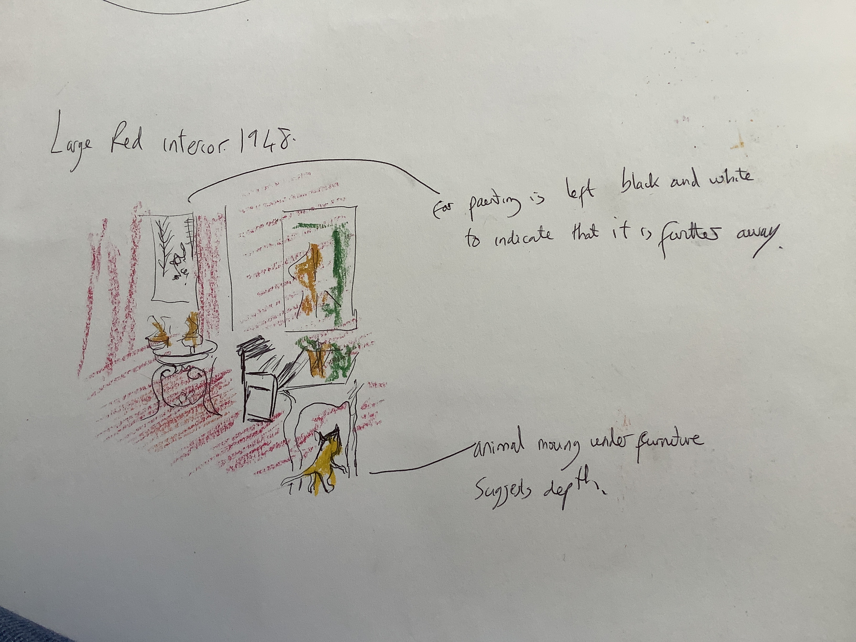
I am drawn to use sweeping and curved objects in my work. This can be used to show aspects of optical mixing – eg the black and white optical illusion in a diamond grid top of my patio table.
I enjoy using blocks of colour with tones and shades to suggest depth.
I love how artists like Gwen John use tonal light to suggest perspective.
I would like to incorporate elements of how Picasso and Matisse use complimentary colour in small adjacent blocks ( eg Picasso weeping woman which I used to experiment with complimentary colour)
rough drawing of proposed scene, selected as the best through a view finder card to simplify the picture. I used a viewing frame card to help me limit how many objects I put into the scene as I have a tendency to choose to many which will make the view too complex and therefore less effective.
simplicity through blocks of colour and a few objects that tell a story is my aim.
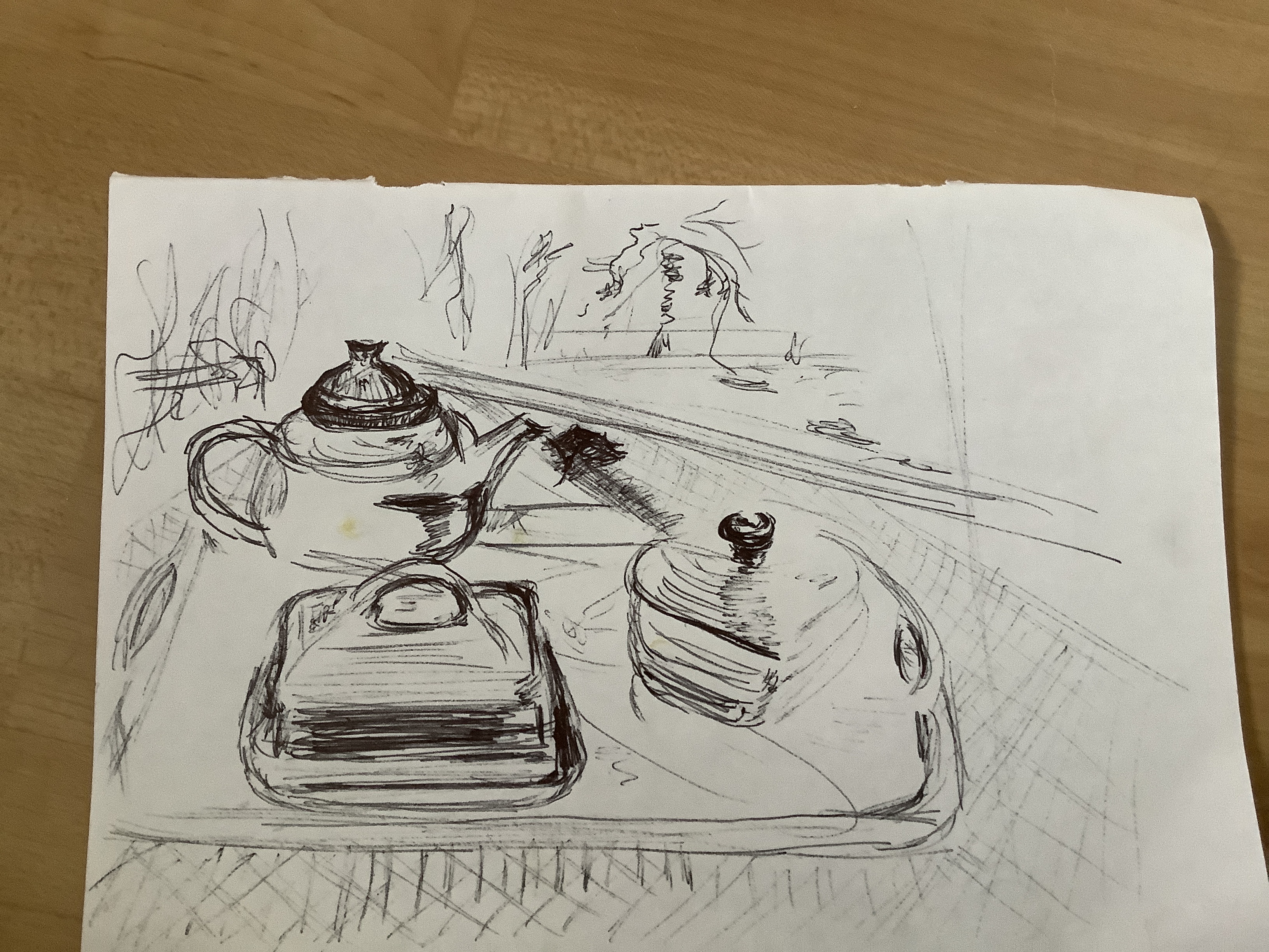
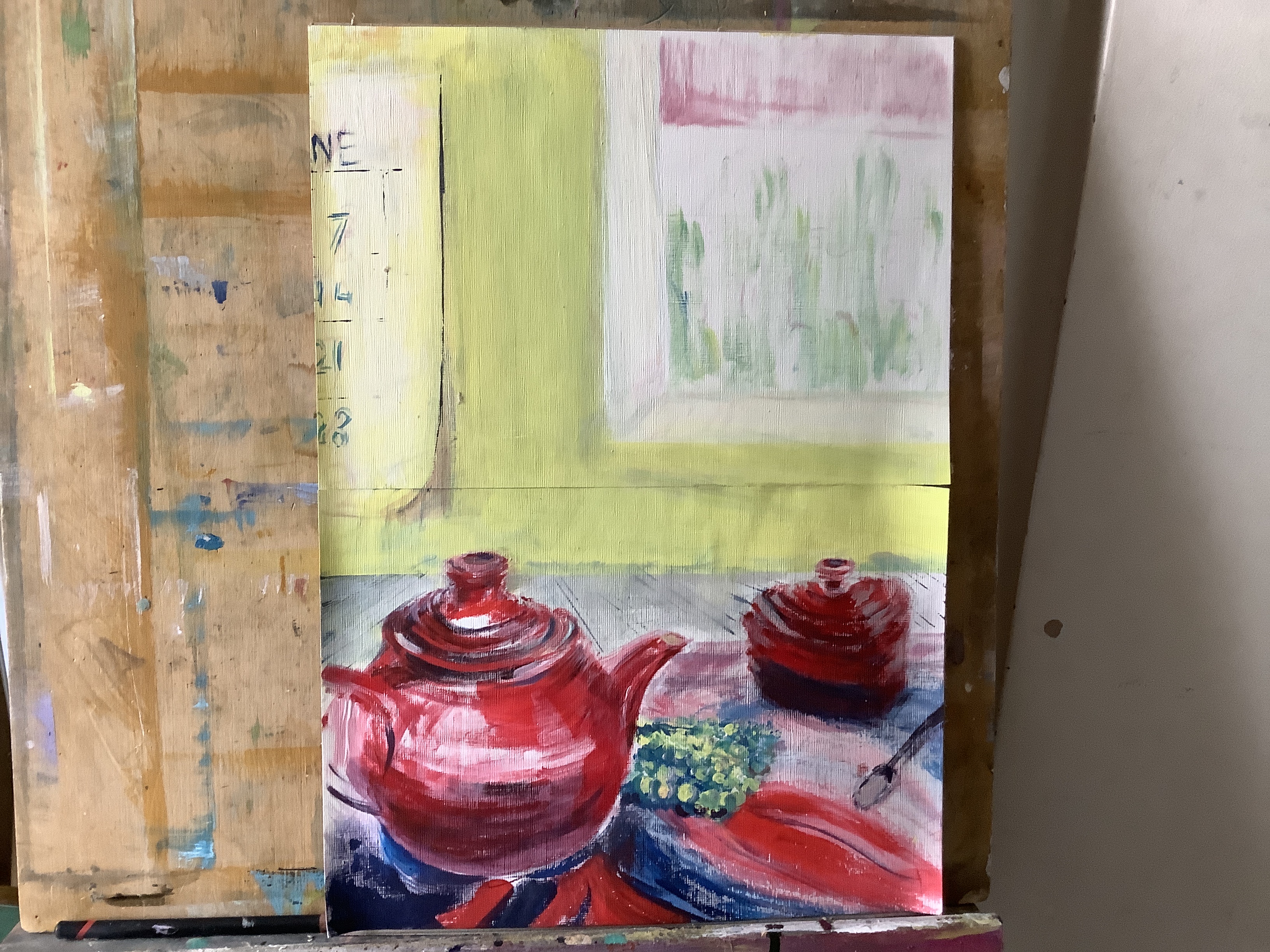
I like the arrangement of these three red pieces. The plan was to include greenery behind the garden tablet as a backdrop giving a complimentary block of colour for the red tea wear. I was also struck by the lines of light caught in rims in the pottery and thought this would be effective to show how light enhanced the scene.However on rereading the brief I found that it had to be an interior setting. I like the large areas of reflection produced by overhead light and want to keep this. Therefor I propose to use a small shaded window at the back of the table to give interest but far enough into a recess to suggest it would not complicate the scene with secondary side lighting. I then hope somehow to indicate that most of the light is from an interior overhead source. I am not sure how to achieve this other than by having a lampshade at the top which is not subtle? ( question to tutor please.)
Rough plan of perspective and colour blocks
While using a 1/2 inch decorating brush to make exploratory perspective marks , I noticed how much I liked the curve and sweep in the teapot and heart shaped sugar dish. Using this decorating brush allowed me to loosen my drawing and get a better idea of how I wanted the shapes to form in this assessment piece. Using this type of brush is a new technique for me and definitely one that I will use again. It also helps me to play with different angles of view and how these affect the sweeps and curves seen to create the composition that best suited my purpose.
I want to show how the strong overhead light falls on my objects reflecting their shapes and curves and opted to view the scene in a seated position which would allow me to show the pattern and tone on the side of the teapot.
I found that I had several hues of a ‘primary’ red acrylic that helped me to show tone without flattening the colour by adding too much white or water. I realise that this does not conform to how the unit has looked at tonal production, however in this case the strength of red in the hue seems important to maintain.To produce the darker shades on the lower part of the sugar dish I have used methods practiced in the unit producing tones by added varying quantities of blue.
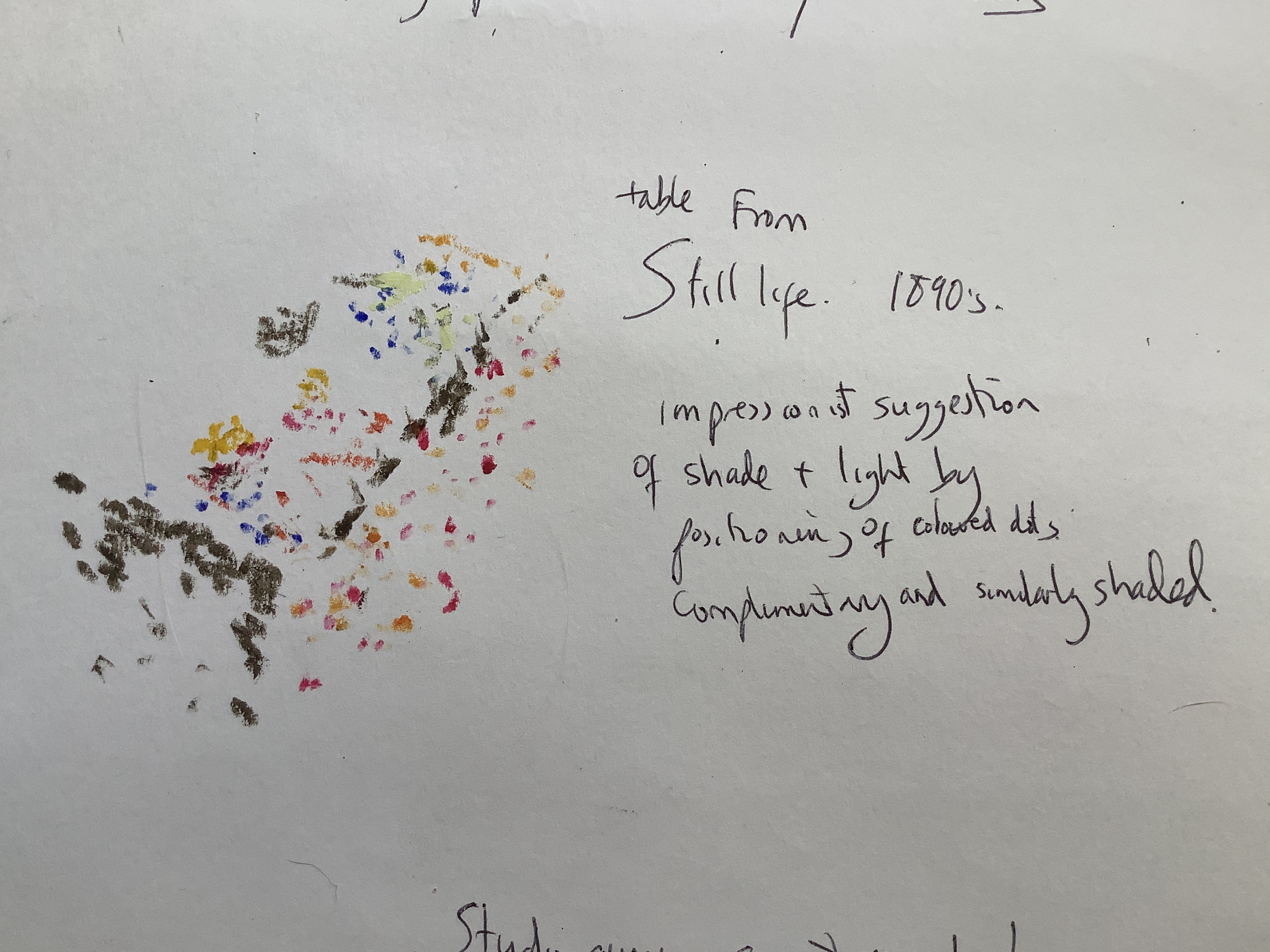
Later I decide to practice this effect with a closeup of the sugar dish. This also allowed me to explore light falling on it and study different tones present in the red. I was also able to echo the curves by showing the pattern of a similarly coloured flower tray underneath the objects.
I want to introduce complimentary colours so made sure that the yellow centre of the flower is in view and matched this to a blue suggesting shaded areas. Note that this is an artistic choice to maximise colour theory and blue was not actually present in the tray.


The main lines were drawn with a medium filbet and the sweeping pattern below the dish with a fish tale brush using long single sweeps.

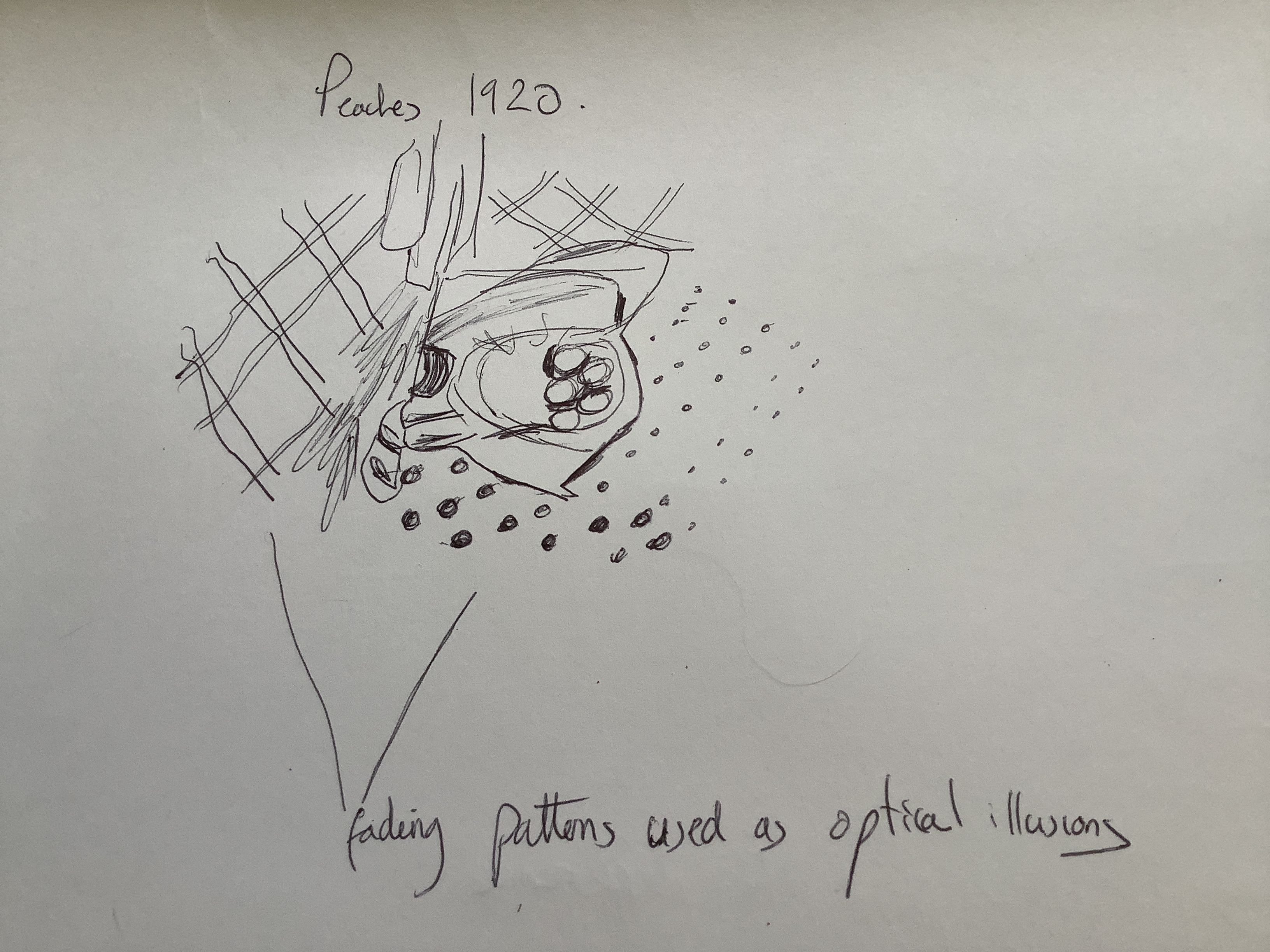
Experiment above is with wet in wet as background for the table lattice pattern. I liked the softened pattern but decided that it didn’t really work with the strength of hue and curves that I wanted to concentrate on in the objects in my work. Next I tried using the edge of my paint knife with varying pressure and amount of paint. I liked the fading out effect that this gave and decided that I could use this as a tablecloth to suggest merging perspective lines at the back of the table (demonstrating a very simple element of optical mixing).

Looking back at my objectives, I wanted to examine how an artist using modern techniques would tackle the tricky topics of perspective:
I chose to look at the work of Matisse as he uses free style and bright colour rather than photo realism which I like.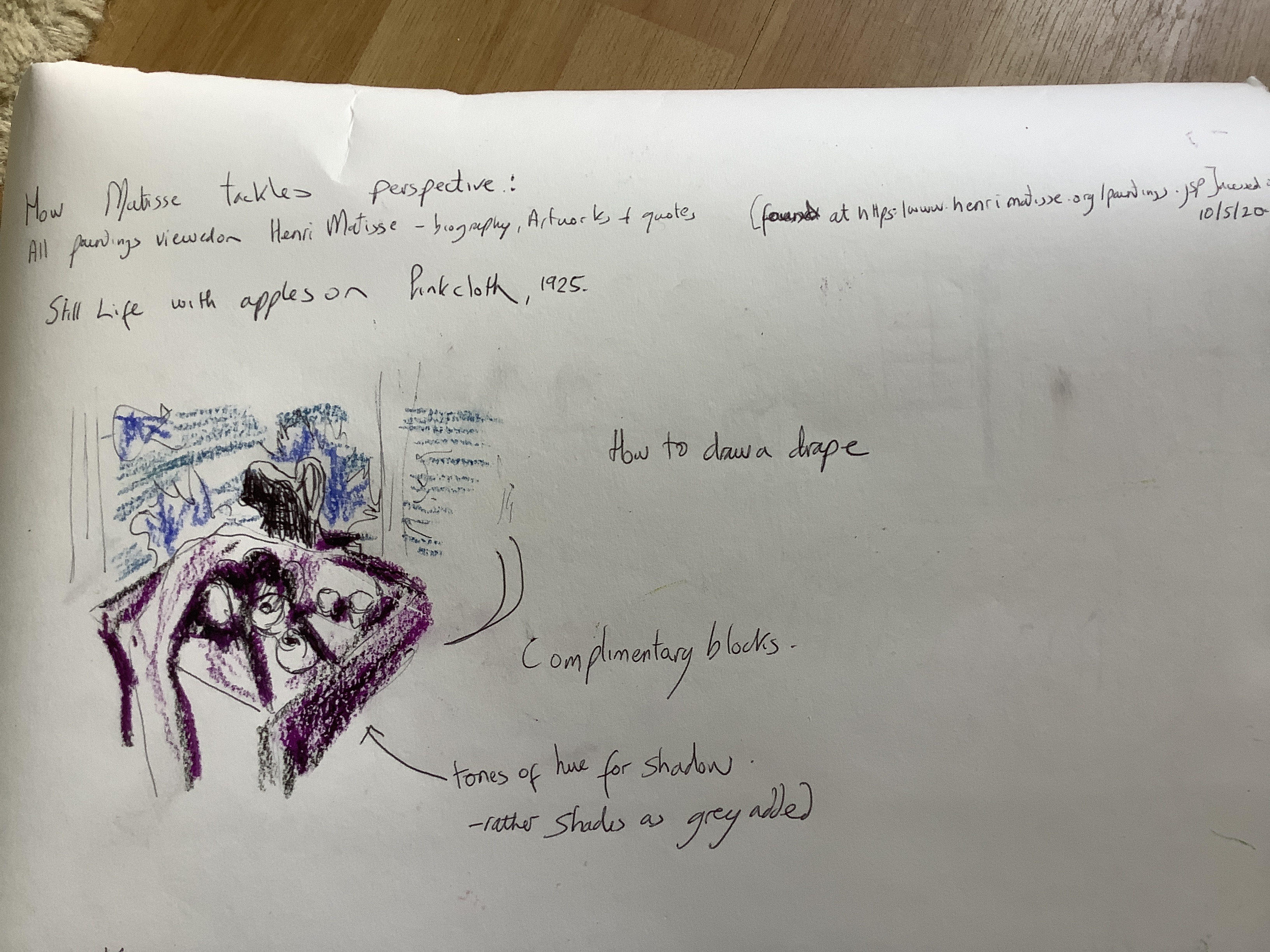
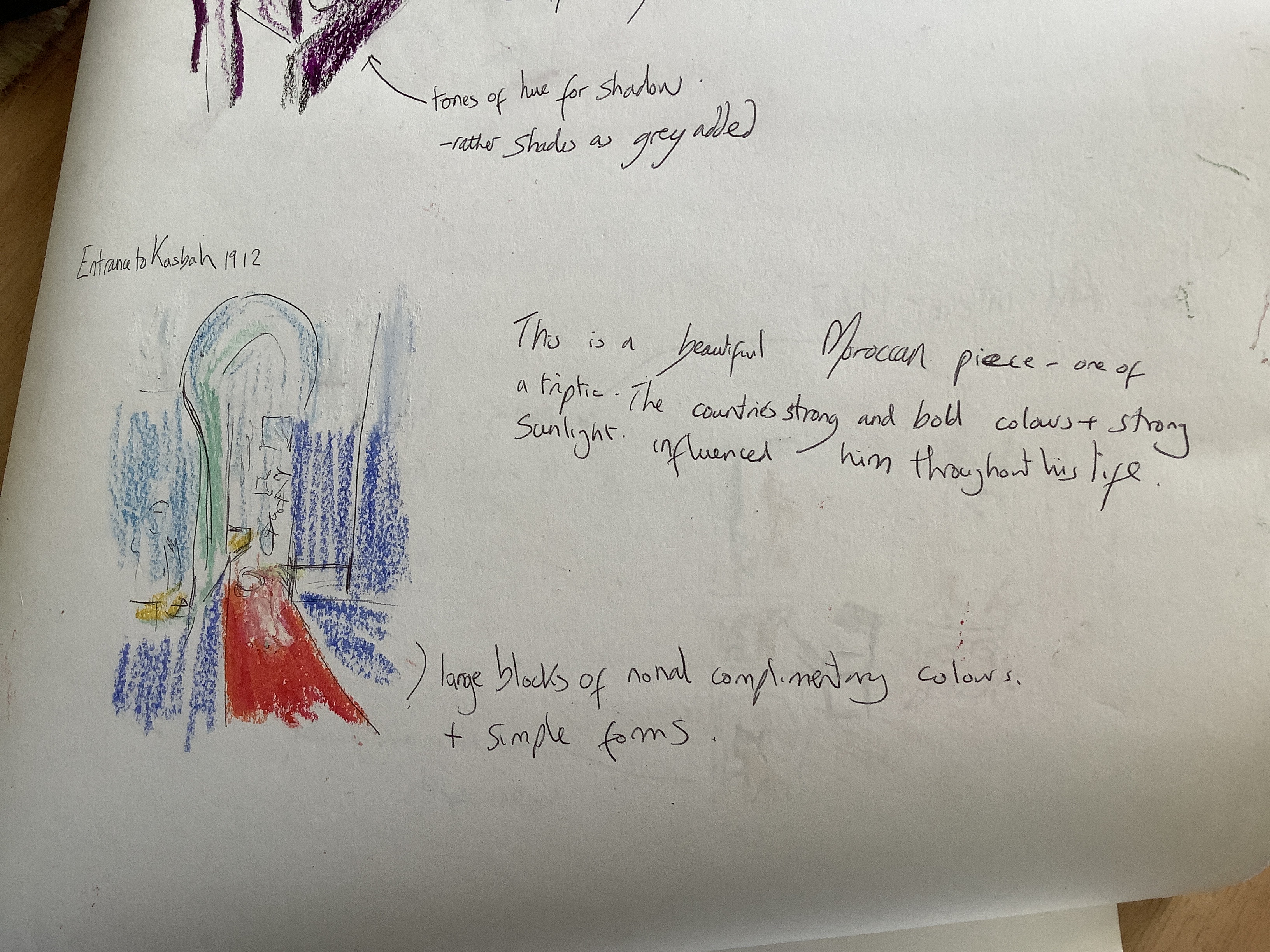
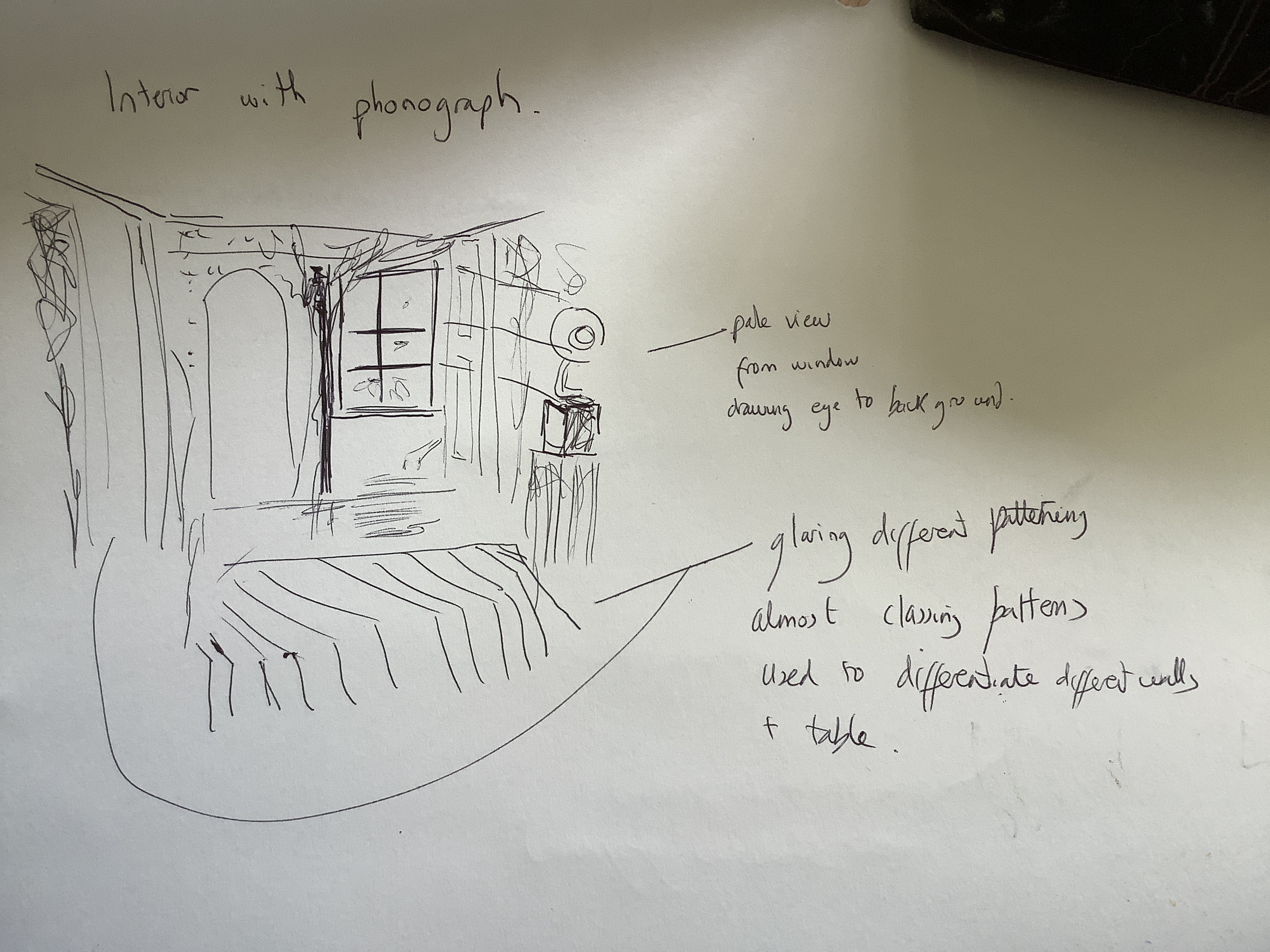
The Matisse techniques that I can take on in my piece and assessment of points that worked and did not work in my painting.
1. Strong bold patterning to indicate different surfaces eg the table top tray and tablecloth.
2. the use of optical mixing theory with the diagonal line pattern of the table cloth retreating into the wall worked fairly well and I was please by the true straight line produced by using a ruler dipped in paint. I was able to show some distance by ensuring that the paint began to run out on the further away lines. In a further attempt I would practice this technique using more accurate techniques like a perspective viewing guide to get a more accurate vanishing point. This is a big step forward for me as I am typically quite impulsive and find measuring is something that I rarely do!
3. large blocks of colour in complementary hues eg red teapot and sugar which guide the eye through the painting to the window above which has greenery behind it works fairly well. Sadly the window and calendar are a bit contrived as I had to change from my planned far ground content.
4. lighter colouring in the far distance eg the receding window where I have tried to suggest a wide sill Going back into the distance by using grey in the cream colour at varying strengths to make lighter shades going towards the window pane. Also the greenery outside is a block of complimentary green but I have made this a much lighter tone of green as simplified the greenery pattern into vague shapes to indicate distance.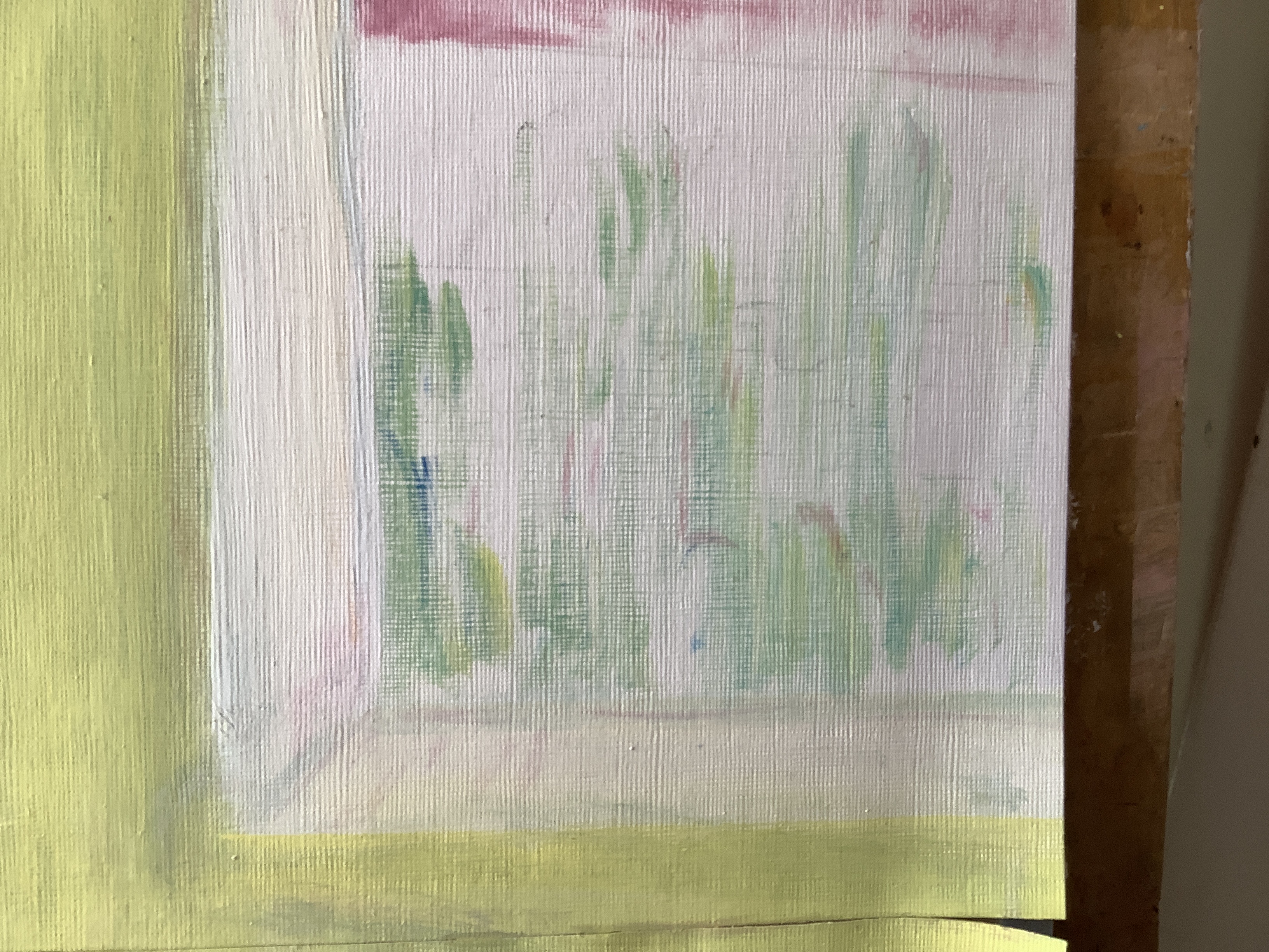
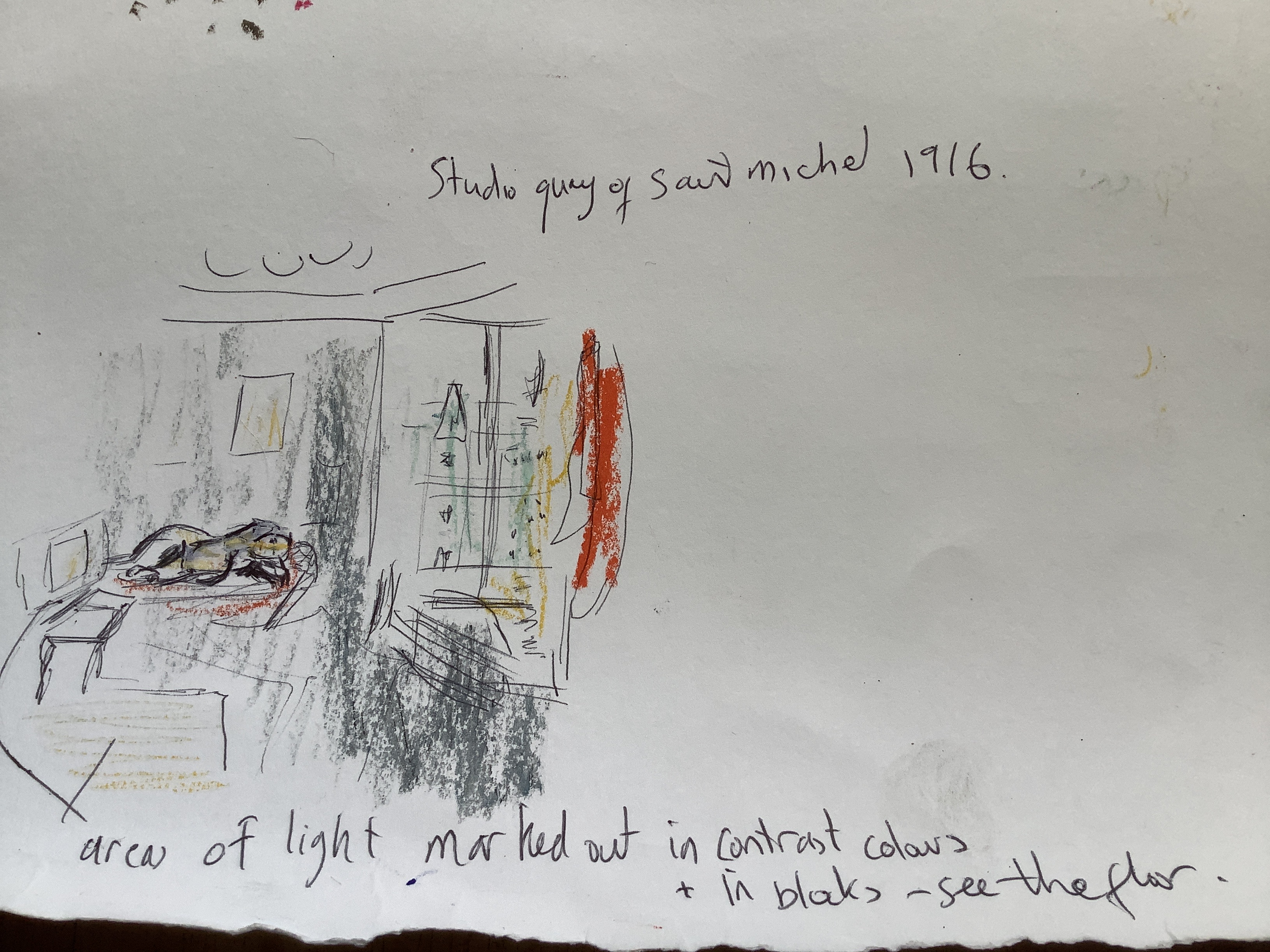
5. I ran into problems with the credibility of light from above ( see my reasons for trying to do this above in italics) . It didn’t feel as if it worked as how is the viewer to know that the light is above if the window is the only visual clue of light suggesting to the mind that light comes into the painting from the back. Therefore I tried to use a diagonal of light coming in from the window as Matisse did in the studio painting referred to in my notes. Sadly this came out looking wrong so I painted over it again. So far I have not come up with a good solution.
other learned techniques to suggest depth:
1. I have tried to emphasise areas of negative space to show distance. Eg the empty space behind the teapot nob at the narrowest part which attaches to the lid. Instead of putting definite division lines to show the red border of teapot I have kept this broken in shaded red and white light. The definition is made by an area of shadow behind it.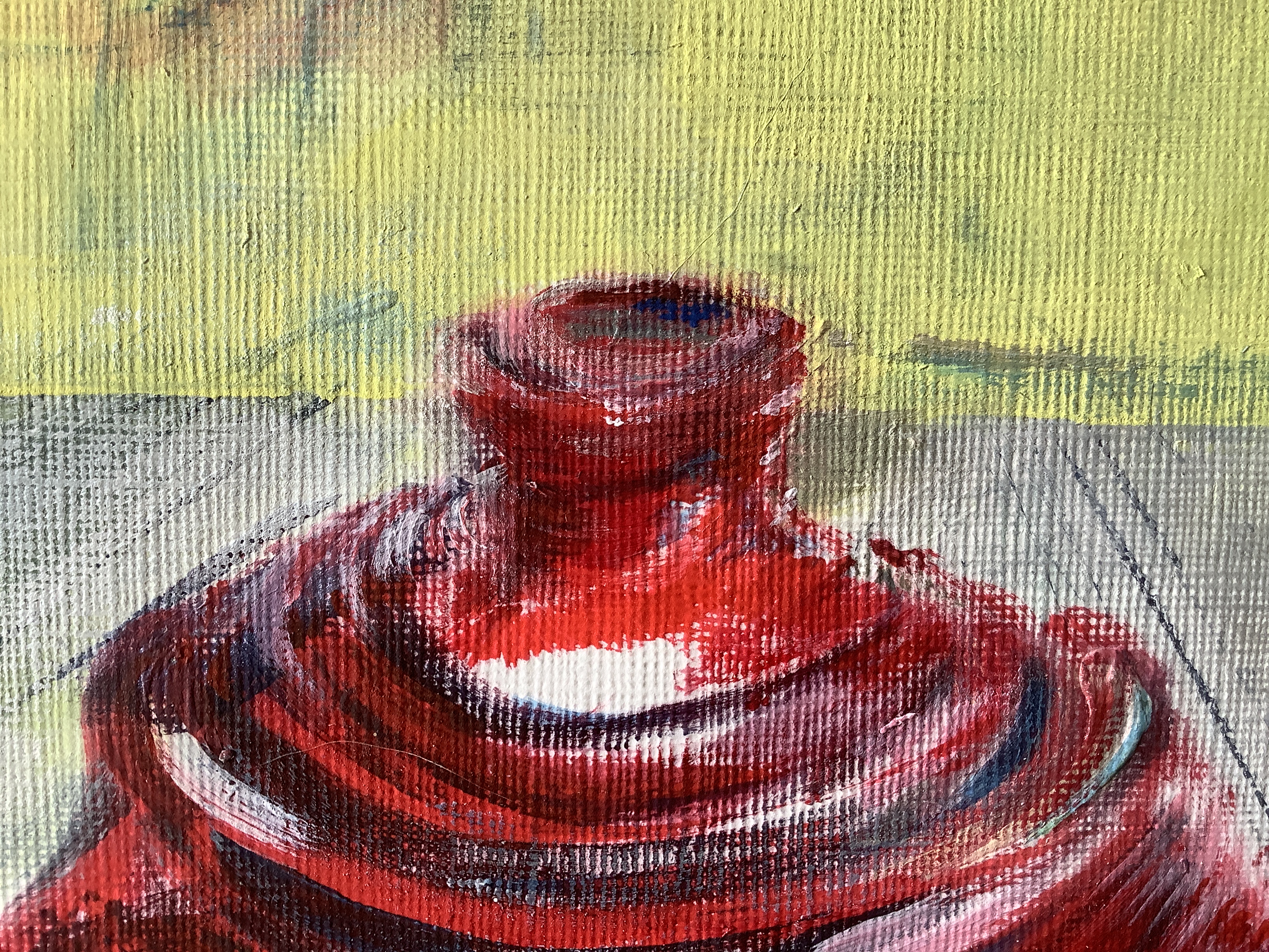
2. Colour theory suggests that light and dark allow both colours to look stronger eg. the hues of red – a light pink designating the back of the tray meeting the red of the sugar dish. The bottom of the sugar dish was a dark red due to shadow but I deliberately lightened the tray red with white and darkened the dish with blue. I believe that where they sit next to each other this suggests the narrative of distance.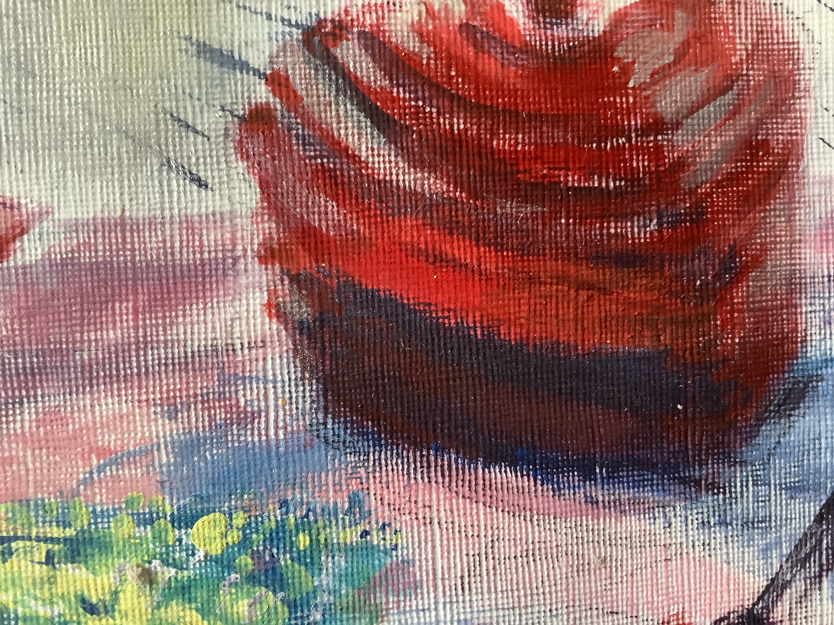
Also with the spoon. I lightened the opaque silver in the curves where light is reflected and deliberately made the shadowed darker to Payne’s grey parts of the edge and handle of the spoon and its shadow to emphasise that the spoon was not flat.
3. I used long sweeps while painting the teapot curve and the sweeping forms of the tray flower . I intended this to suggest movement in the work and feel that this has worked fairly well.
4. the movement and addition of a calendar on the wall are meant to suggest a time narrative to suggests my emotion and artistic commitment to the piece.
other errors:
1. Due to the time of painting taking place during lockdown I could not get supplies of larger paper than A3. I had to use two of these sheets and glue together on a card backing. I am not happy that some of my paper fixative spray has not stuck down well and the paper line is very visible.
2. While I have achieved some degree of depth which shows best in the tray, the teapot and sugar dish really would benefit from more layers of red tone. I tried to introduce this but felt that I was using shorter strokes between established shading and it looked forced. I should have had more shades of red premixed to use during the initial painting.
3. The lid of the teapot looks lopsided. Standing back more often during painting would have allowed me to spot this and make better adjustments at the time of painting.
4. The yellow walls and calendar look rather distressed and perhaps grubby. This originated for two reasons: shading for contrast to the square of light that I later removed and then further darkening to the walls and calendar to suggest that light from the window was limited and must have come from above as the white was only on upper Surfaces of the teapot and dish.
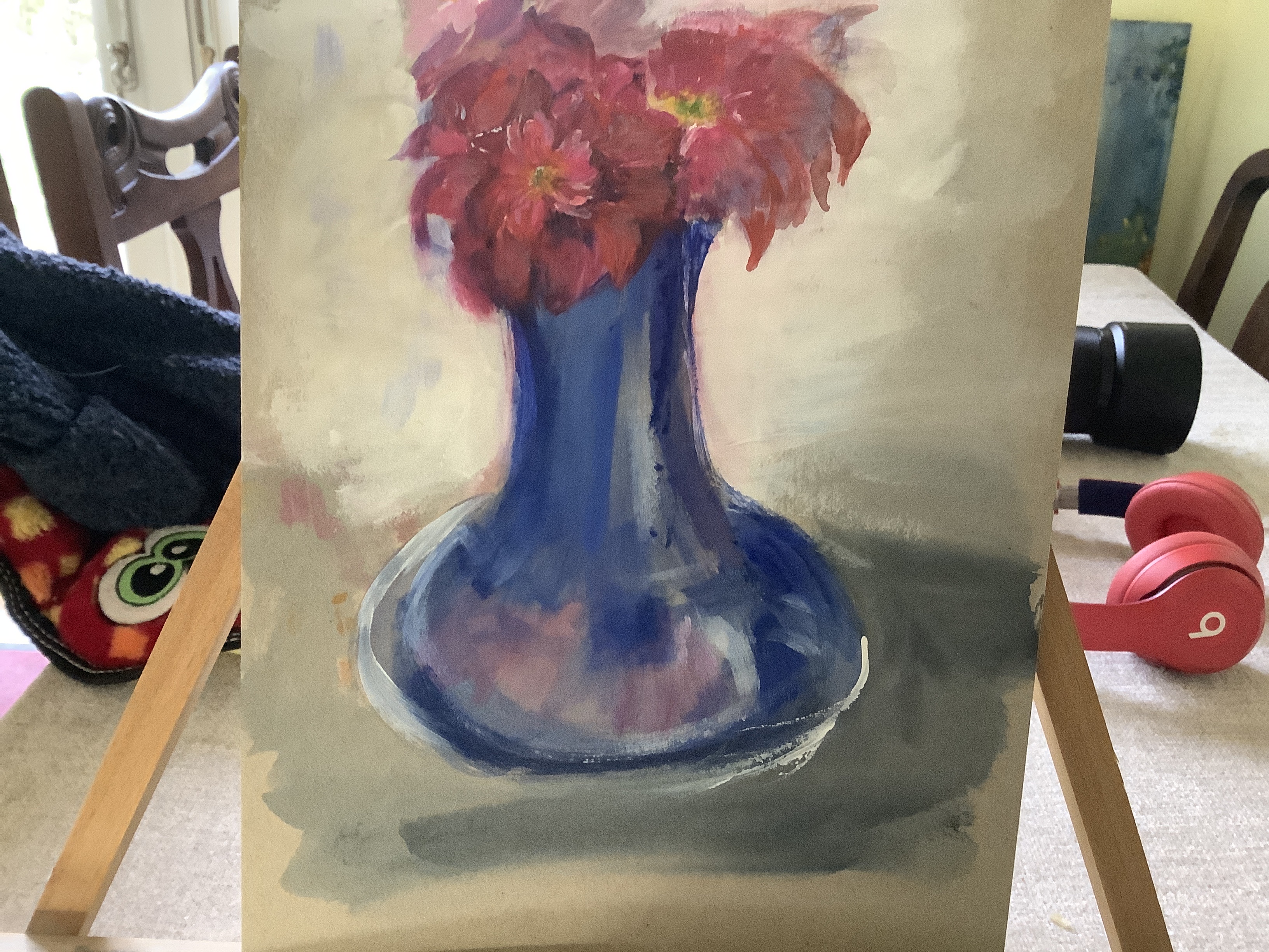
5. I was fairly pleased with the rich hue of red in the teapot body- this is not quite as balanced as the blues and red in my watercolour on cardboard flower and vase. In future I want to work more on balancing complimentary blocks of colour throughout the painting. Maybe I should have chosen green for the painted wall.
Fit to assessment criteria:
. Development of technical and Visual Skills Materials, techniques, observational skills, visual awareness, design and compositional skills- I have tried to use techniques practised and learned in this unit . In particular I have chosen to use areas of complimentary colour and a range of red tones ( especially) to indicate my growing understanding of colour theory and perspective
.Quality of Outcome
Content, application of knowledge, presentation of work in a coherent manner, with discernment. Conceptualisation of thoughts, communication of ideas.- I am learning to use a process of thinking, planning and exploring to inform my final piece. In this case I have used previous paintings , sketches and tonal and colour studies to gain understanding of the subject before I began to paint. I have found this a difficult but rewarding development as my natural response is to get started and make things up as I go. For me it was a clear statement of intent for me to use a small view finder before anything else to refine downwards the complexity of what I chose to paint. I also thought about what would convey my desired message- in this case how light played on large curved blocks of colour producing shading and tonal hues.
.Demonstration of Creativity
Imagination, experimentation, invention, Development of a personal voice.
Context– I have had to simplify what I chose to portray. My tutor helped me in Assessment 1 to look with fresh eyes about what I can portray as simply as possible without clutter and techniques that I have not yet had time to master. I am pleased that I have been able to focus on a simple and small group of objects. It could be argued that fitting your imagination to work within your skill set is an appropriate use of creativity? Wishing this simple idea I found that I had more time and confidence to experiment with different brush strokes and mark making. (The fishtail for the sweeping flower on the tray and the side of my paint knife to print a fading straight line pattern on the table cloth. This is a learning point from Assessment 1 that I have tried to take on.)
It is also interesting to note that in simplifying , it gave me confidence to experiment and I feel that the marks and tools that I have learned will become part of my evolving style.
.Reflection, research (evidenced in learning logs). Critical thinking (evidenced in critical review).
I have enjoyed researching how artists have used colour theory and perspective. I feel that it has allowed me to experiment with their ideas and begin to plan to try some of these ideas in my own work. For example, I have been particularly influenced by the bright complimentary colours that Matisse used in his work ( see my drawings above ) and this encouraged me to use bright red and yellow in my painting. Also Matisse worked in a free expressive style using a variety of techniques to bring perspective to his work- often showing table scenes such as in this assessment. I have always avoided table perspective as I find it challenging. Studying Matisse’s method’s has given me new confidence to try. I have tried to pick up on elements of optical mixing and tonal hues to develop my table top perspective. I recognise that I have a long way to go with this and need to have courage to loosen up and paint free and single long strokes to achieve Better shape and texture in my work. I also need to take time before starting to have a wider variety of tones pre mixed before I start. ( Looking back at my Assessment1 feedback I note that my tutor mentioned this so Sadly I find it is something that I had not fully appreciated and Ai hope that pre mixing will prompt me in the future.) Experienced artists can do this as they go along but I need the visual prompt to discipline me to use a larger variety – in this case especially of my reds. I have tried throughout my commentary to look objectively at my work and assess what and how I can improve. I now also realise that having a mirror to look in or disciplining myself to step away from the painting much more frequently would help me greatly to influence what needs to be changed and do more of what is working well- before the paint dries and it is much harder to correct.
supporting work:
To illustrate colour theory: contrast in hue and tone

colour study- exploring blocks of colour and how light affects them

study exploring shape and tone affecting perspective


Oil study- sunset at the stone circle

Sunset photos which inspired my thoughts:
The colours aware a sunset pallet: yellow to orange/ yellow to pink; then blue graduating to grey and black. The foreground is in almost complete shadow giving a large tonal contrast to the lights of the sunset sky behind. The stones themselves are black and without much feature. This is a little bit of a challenge as I had hoped to use them as a feature to emphasise depth. Therefore I will have to work on building up tonal difference in the mid ground and a the ‘front’ of the sky to give perspective.


This is my second attempt at an oil sunset. This time instead of adding thick layers and overworking ( see coursework 1) I used a light yellow/white background and thin transparent layers of yellow, orange , rose , mauve and blue. This worked better. The foreground was lighter than intended to add detail to the stones. However I felt that I would like to try darkening the foreground and sacrificing detail to add more to the chiaroscuro contrasting light effect.
Here is my next study in acrylic which I believe works better. The painting is roughly worked so there are still white areas in the foreground. It allowed me to explore tones for the land .

My final piece


Assignment idea 2

Assignment idea 1 shows the technical ideas that I want to include in my work. I thought about a sunny blue sky with could sand water showing reflections using glazed layering. To create some interest and a story in the piece I thought about showing some rubbish in the water to represent the paradox between man and nature.However it strikes me that to include a narrative idea into this setting I would have to make the scene quite complex.
While on holiday on Shetland and Orkney I began to wonder if I could use the sky itself to create my story. The drama of the setting sun against a stone circle would be simpler and would allow me to demonstrate an aspect of chiaroscuro- the darkness around a glorious sunset.


Assessment ideas – part 1

I Want to include some of part one learning points eg:
- Tonal washes and overlay glazes in sky; sunset+ water
- Coloured ground / negative drawing to emphasise space,perspective or bring objects closer or fade into background with mid colour as ground
- Impressionist style dots as brain suggestion of movement and shape? Develop this idea?
-
Translucent wash


