Part 5 course work and assignment 5

Personal development reflection

My favourite projects so far are those which have allowed me to work with loose mark -making and bold colour. In particular ‘ Painting outside’ and ‘ working from drawings and photographs’. The way in which they were written and structured inspired me to go outside and take notice of my surroundings again .’ Painting Outside’ began to allow me the luxury of a long time to contemplate the scene and consequently I began to plan properly what I was going to include. Furthermore I was inspired by the atmosphere and sense that I could engage with what to put into the painting and how to allow my self to progressively develop work. Building on this, time spent appreciating and noticing the energy of the sea at the lighthouse where I chose to paint the ‘squaring up exercise’ meant that I really ‘felt it’ before starting to plan the composition and early sketches. This helped to boost my confidence and marks flowed more loosely . In addition the process -skills behind all of the previous disciplined exercises in the course were finally beginning to make more sense and they were becoming more natural for me, further allowing me to relax a little and loosen up.

Through conversations with my tutor I have been able to identify and paint more towards my natural strengths to increase my confidence and understanding of what a more mature painting process might involve. We concentrated on exploiting my natural instinct to paint quickly with large loose marks and to experiment with mixed media to incorporate texture.I recognise that at certain points in the life -long learning experience of anyone who wishes to be a visual artist, there are light- bulb moments. This could be compared to learning to drive. A learner’s three -point -turn performed inexpertly and jerkily suddenly becomes a smooth process because the brain learns to perform it automatically. This frees the mind to work on other important driving procedures.Of course the skill is still quite elementary but each time it is used, it improves. This is how I have felt since painting my first light house ( squaring exercise Part 4 p 120).The squaring process allowed me to make a better composition with more accurate perspective.With the pressure off this ‘problem’ I began to relax, painted looser larger marks and managed to notice how to exploit the developing energy and movement in my painting .Initial studies of artists who work in this way has been revolutionary for me. On videos I have watched, Joan Eardley working fluid thick marks onto a large board with urgency and passion. I have studied photographs of her sea scapes, exploring the marks and textures left by her frenetic painting process and felt this movement coming through her work. Each painting and letter describing her views and emotional response to her work encourages me to try this style because I feel this urgency and passion to record the power of the natural environment. I need to keep practising technical skills and improving my use of tones and contrast but at last I feel that I have started my own journey influenced by the marks and textures that act as my vocabulary.
Projects requiring linear perspective and fine detail were difficult but having said that it is rewarding to understand where some of my weaknesses are coming from and what I can do to improve. ( see the flow chart at the start of my course work in assessment- review of assessment 2 . I took a lot of time consciously trying to apply this checklist to my work in part 3 which was demanding and hard going.The portraits were not particularly good in terms of quality, my work became tight as I tried to concentrate on linear perspective. Texture, colour and impasto would have been a better was to approach this. Then I lost heart and didn’t develop the layers through tone and detail. To go back to my learner driver analogy, I was still at the beginning of learning and I could only concentrate on one aspect at a time. By mid way through Part Four I began to notice a change as I have described in relation to the squaring exercise.
I can see development of a checklist and squaring my work as key events in developing my process but I cannot exclude the study of individual painters and artistic movements.

Project- Different ways of applying paint.

Exercise- Impasto p130

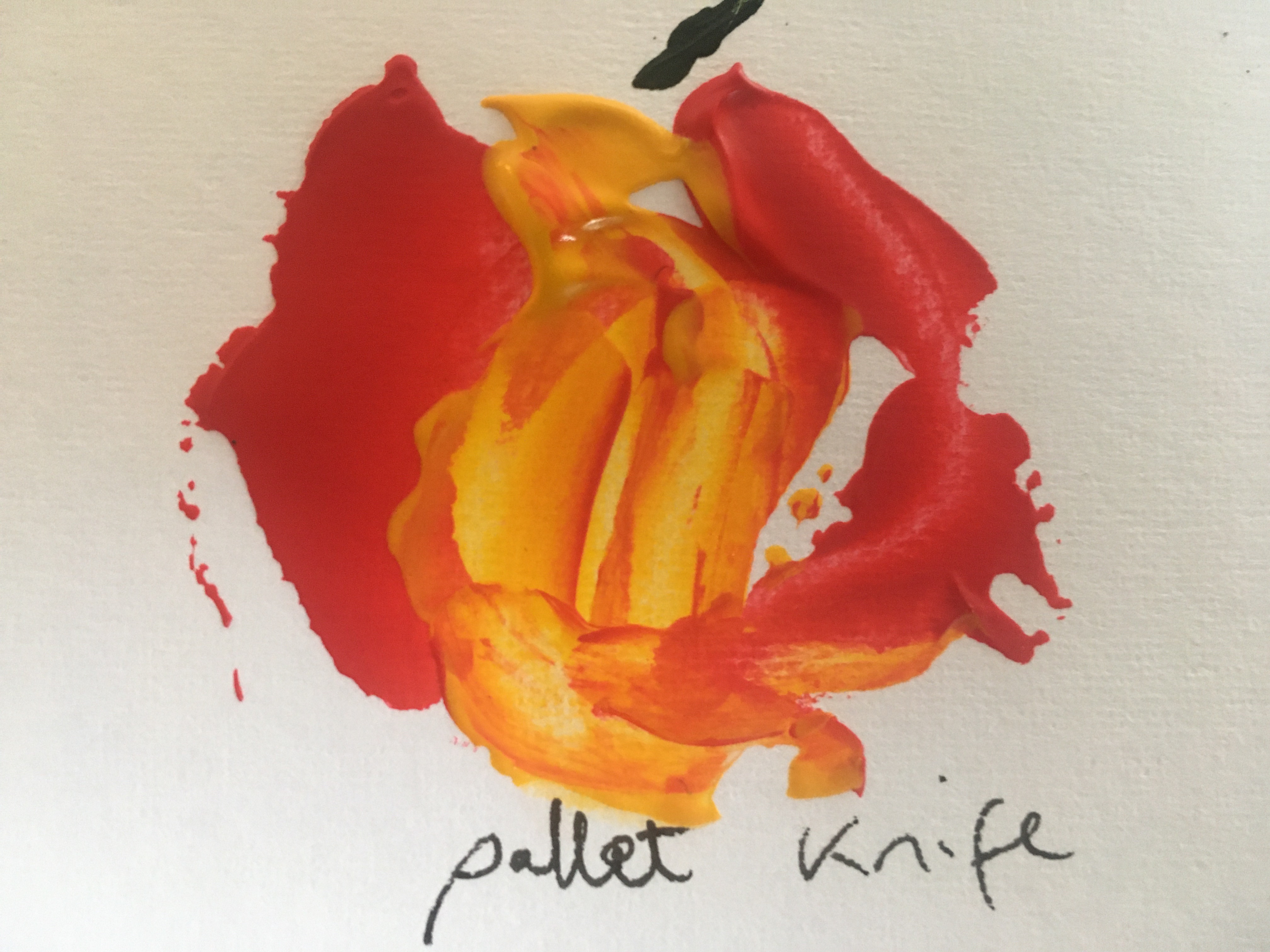
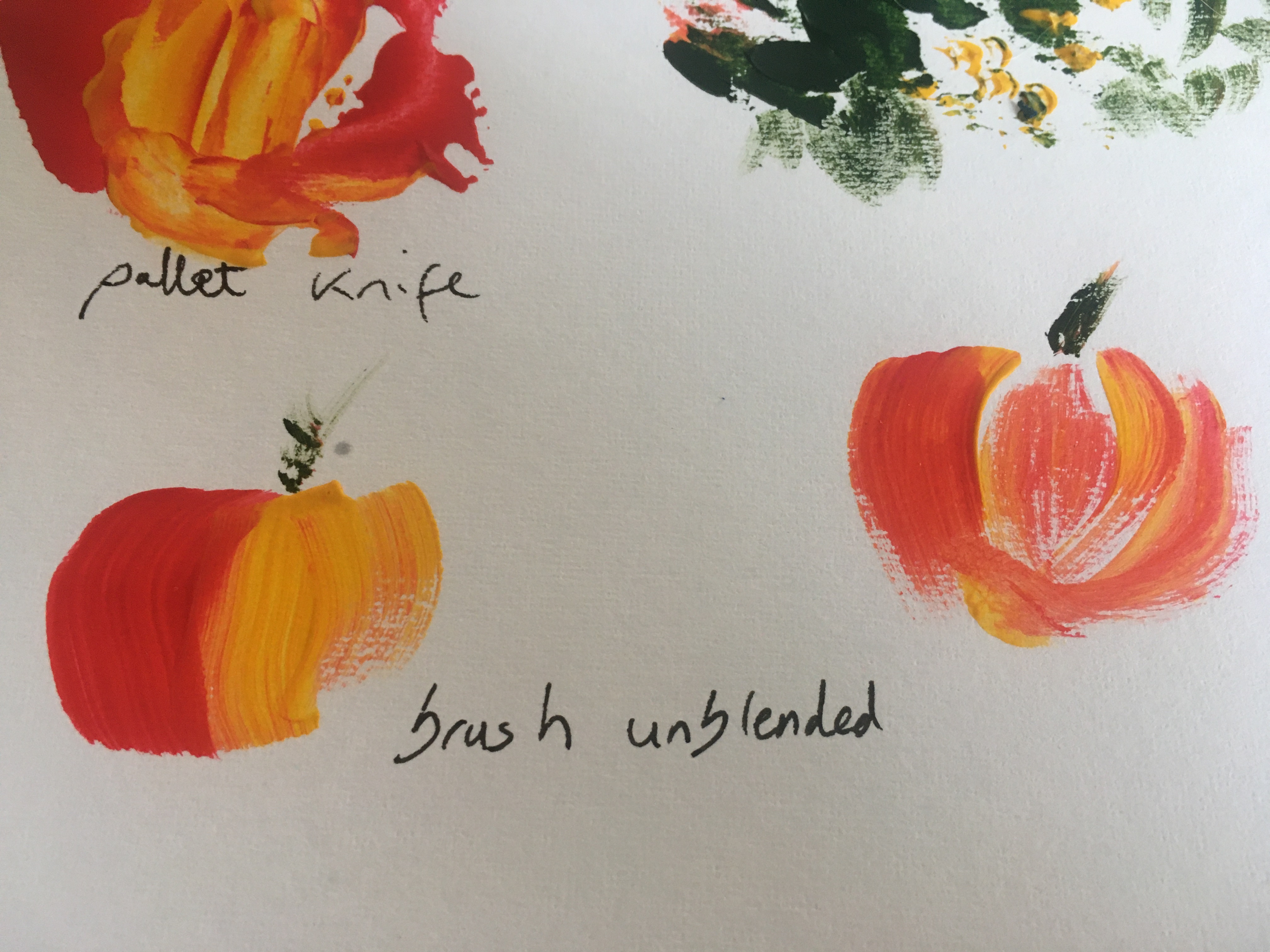
I spent some time experimenting with different methods of applying the paint by knife, card etc . This is useful to be aware of in different settings. It may seem quite trivial but a big discovery was taking the time to experiment and find the best ratio of medium to paint . Also my mixing technique was a bit slap dash previously- mixing away from the pallet in a tub and almost beating in the medium had a much better result. I think applying thick medium -assisted layers with a pallet knife would have brought much more drama to my portrait exercises.

Impasto gesso clouds and impasto acrylic reeds and horizontals on the water surface using the flat edge of a kitchen knife. Adding a metallic blue to the water have a kind of glassy still water effect
I really enjoyed using a coiled rope dipped in white acrylic to form a fossil like impasto shape and underneath a thick layer of green has had a knife pressed into it leaving a fern like pattern. I really love these effects and being thick heavy impasto they remain after drying instead of disappearing.
Pallet applied impasto is pressed out at the edges with a metal pan scouter to suggest spray from the waves. The rocks and sea wee painted thickly to give a loose feel to the work
I have been lucky enough to be spending time by the sea and have had time to observe the mechanics of how the tide and waves move the beach ‘furniture’ about.

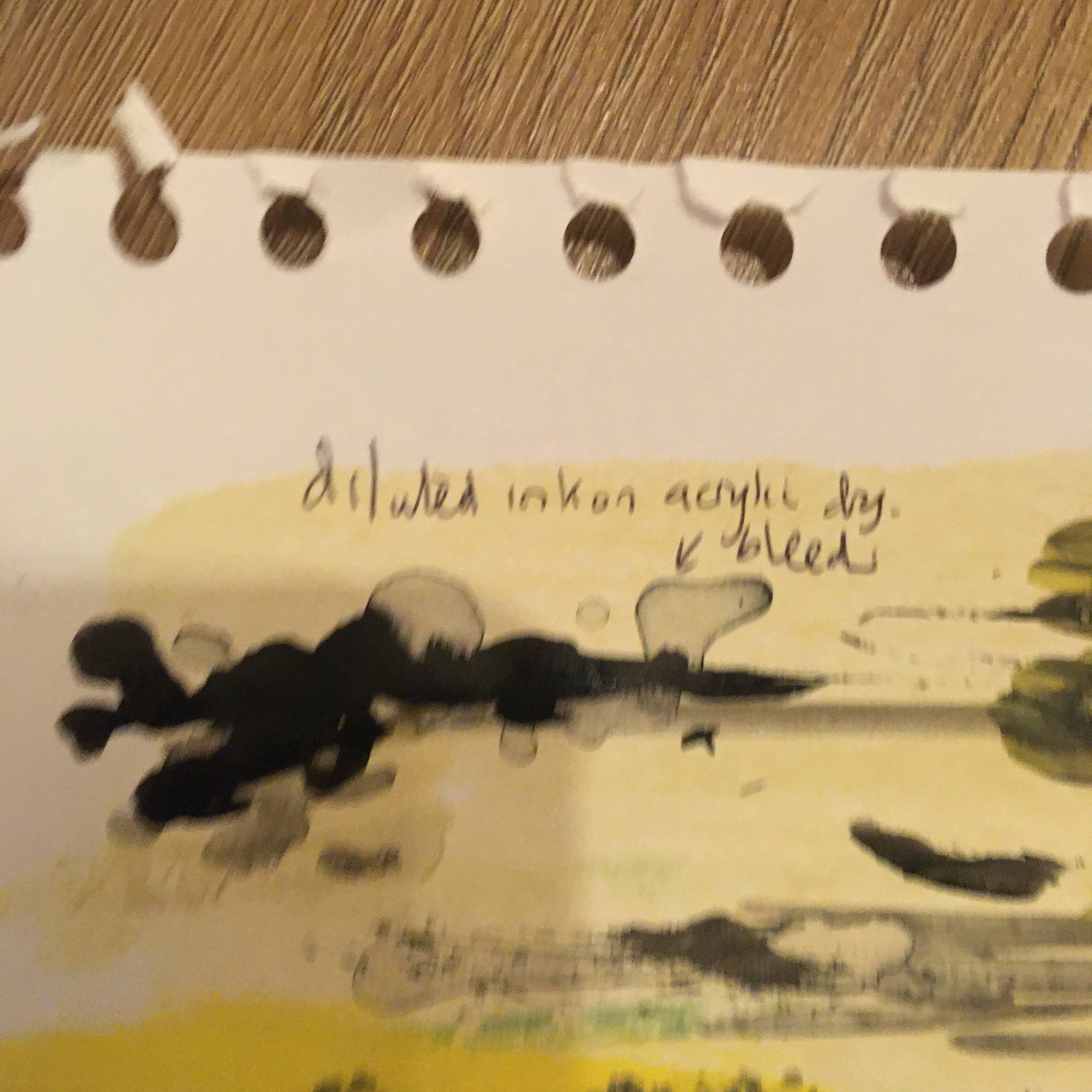
At the bottom of the picture is a thick layer of stiff blue acrylic- pulling it away at the top into a layer of wet paper allowed me to try to show how the sand moves when water is sucked back off the beach into the sea.

Exercise- Dripping , dribbling and spattering p 131

It is curious that while I love making big dramatic sweeps and curves, I do not find it easy to create good splatter work! My efforts below feel a little stiff and lacking in spontaneity. I think I am subconsciously worried about spoiling my work entirely if they are uncontrolled. I was working away from home in a limited space so didn’t embrace the Pollock inspired kinaesthetic dripping fully. I will try this in the future in a large area and following his idea to almost dance around a the painting while making the marks. I can see why this looks less stiff. I have also seen videos of paint cans pierced at the bottom attached to string which act like the fulcrum of a pendulum. I think that this could add energy to a landscape or a seascape work. I think it is possibly a case where more than 3 colours would become chaotic. Also stopping while I could still see lines and track marks would be important. I watched a Tate interactive exhibition which illustrates both of these points. The artist Yayoi Kusama is of course well known for her trademark dot work. In this installation she invites visitors to create the design using provided Ed stickers to place in a white room. The overall result is for me well past the optimum point but it is fascination to watch the time lapse video showing the installations progression over a period in time. At several points a really beautiful result is produced and then changes completely as different marks are laid down. This is a learning point in itself- if it feels like the work has gone too far, it may be that it just needs a fresh direction and it is not necessarily healthy to stick to an original idea. Here flexibility and courage to go in a different direction produced surprising and beautiful results.

Bloomsbury /Tate shots: Yayio Kusama ‘s Oblitteration Room accessed on 3/12/29 online at https://youtu.be/-xNzr-fJHQw

Project- adding other materials

Exercise- preparing a textured ground p134- Rough sea

This is my finished painting for this exercise using knife applied paint and shaving foam effects. I really love the random waves produced using shaving foam.
This shaving foam wave gives depth. I tried to introduce a faded colour behind to suggest further perspective by reusing the mixture. This didn’t work so well as the pattern produced is random and did not fit in with what was in the foreground
Tissue paper was added between layers of acrylic. I had intended to use a transparent layer on top and would like to see if this produced a better visual effect. The mixture now contained glue and several layers of paint plus tissue. This was a good surface to scratch into and tho move the paper to produce thick areas and crinkles. I found that on decrying only the thick crinkles remained visible. Disappointingly The thick stack of tissue did not really show up.
This is the summary table of my experiments – shown as photo as I can’t transfer the document

Exercise – mixing materials into paint p135

These exercises have been really informative and I can use the results to improve my perspective techniques eg using texture lines and patterns to suggest distance especially in the foreground.

Project Towards Abstraction

Exercise abstraction from study of natural forms p137

I spent time looking at natural patterns in nature as I already find these fascinating. Eg looking at the light reflection ( rather than pigment) on butterfly wings and on bird feathers that produces their spectacular patterns.

This lead me to review my understanding of naturally occurring patterns in nature that can be described by mathematical formulae. The Fininache or golden ratio occurs in shells , seed -heads, petals and countless other areas and is copied in a basic form by artists to find the most impactful place for focal points. The Manderbelt Theory has been worked out and programmed digitally to show repeating patterns. Both of these formulae produce amazing and pleasing abstract like patterns. I decided to sketch broken shells from the beach as their abstract patterns make beautiful spiral shapes which I feel could be incorporated into abstract painting.

This led me to complete a small piece I had started for another exercise as a ‘ fantasy’ landscape where the twisting cloud looks a little like the interior spiral of the shell. On the beach this usually remains in some form as it appears the strongest part of the shell. The colours are influenced by the work of Giorgio de Chirico whose stark modernist works where full of bold colours. He managed to change the feel of a work by positioning of the subject using realistic objects placed out of context which triggered a feeling of unease in the viewer. In my quick sketch I can relate to his aims – the cloud symbolises the broken shell I drew above and is intended to reflect a brokenness in the landscape, further suggested by colour use – only tonal hues without a contrast. To improve this idea I would have to chose a more familiar symbol which any viewer would recognise

I became so carried away with the theme of painting shell curves that could form parts of abstract paintings that I hardly started on the man made forms. I did identify one repeating shape that I liked that reminded me of the mathematical formulae involved in art: the fabinachi series proves the correct ratio to position a focal point in a picture and can be seen in shells and sunflower seeds as well as a whole host of man made designs. A second formula produces a set of numbers which can be plotted on a graph. This is often shown digitally as a beautiful coladascope of repeating patterns. One example can be seen https://www.youtube.com/watch?v=NGMRB4O922I
I also became fascinated by the patterns created by reflection of light to produce wonderful fluorescent patterns that change with the angle of viewing eg in feathers and butterfly wings this is produced by scales sticking up at different angles to reflect light differently. At some point I would love to creat a project based on this finding in nature and how it can be mimicked

Assignment 5

Assignment 5 – reflection on studies and coursework to date

My path to Fine Art has been through self exploration and internet assisted discovery rather than the discipline and technical skills which I presume are taught during recognised academic art qualifications therefore the very necessary technical skills projects in Painting one have been tremendously rewarding but have required a great deal of concentration and I am aware that in doing this I have become tight and less confident in my process. Advice and encouragement from my tutor has kept pushing me back towards a looser style which allows me to compensate somewhat for my lack of technical skills in fine detail and linear perspective. I feel that I have had to start from the very beginning on most projects and worry that this leaves me completing exercises at a very rudimentary level.

Picking my topic

Although this does not disillusion me, I was delighted to feel that I may not be starting quite at the beginning for Part 5! It is inevitable then that I enjoyed exercises involving impasto and mixing techniques and believe that I have managed to loosen off my style more than in previous parts of the course. Therefore using the skills practiced in Part 5 on the topic I most enjoyed in the course- the sea felt the right area for me to develop my work for Assignment 5.

I mentioned earlier in coursework 5 that living on the coast I have become intoxicated by the rhythm of the sea and tides . Coincidentally I have been studying the effect of gravitational pull and lunar cycles on tides and sea conditions in relation to safety swimming at sea, so this naturally influenced my painting subjects . I have found myself looking more and more at the difference between high and low tides and how this and the local environment ( eg rip tides) affect the beach. [ Reflection and contemplation prior to undertaking a project was something that I learned to develop in Part 4, ex . Each new tide has an impact on the ‘furniture’ of the beach, making it into a constantly changing muse. Throw in the weather and light and the coast has become a place of amazing beauty and variety. Like so many artists I now find myself compelled to record its changing nature.

Aim

I want to try to express some of the many natural phenomenon that I see at the same stretch of beach over a few days.

Technical skills practice

I spent a great deal of time watching the waves from the body of the sea right up-to the tideline and the beach beyond. I wanted to try to reproduce some of the effects I saw so got to work experimenting with different tools and ratios of paint and media.

Of all of the effects I produced in my sketch book- I felt that this last and more traditional bleeding and dragging method worked best on a paper and acrylic primed support. It was perhaps a long way round to find this- but I desperately wanted to use one of the new techniques that I had learned. This teaches me that it is right to practice and experiment- and at the end to choose the process that works best in each individual situation.

Observation

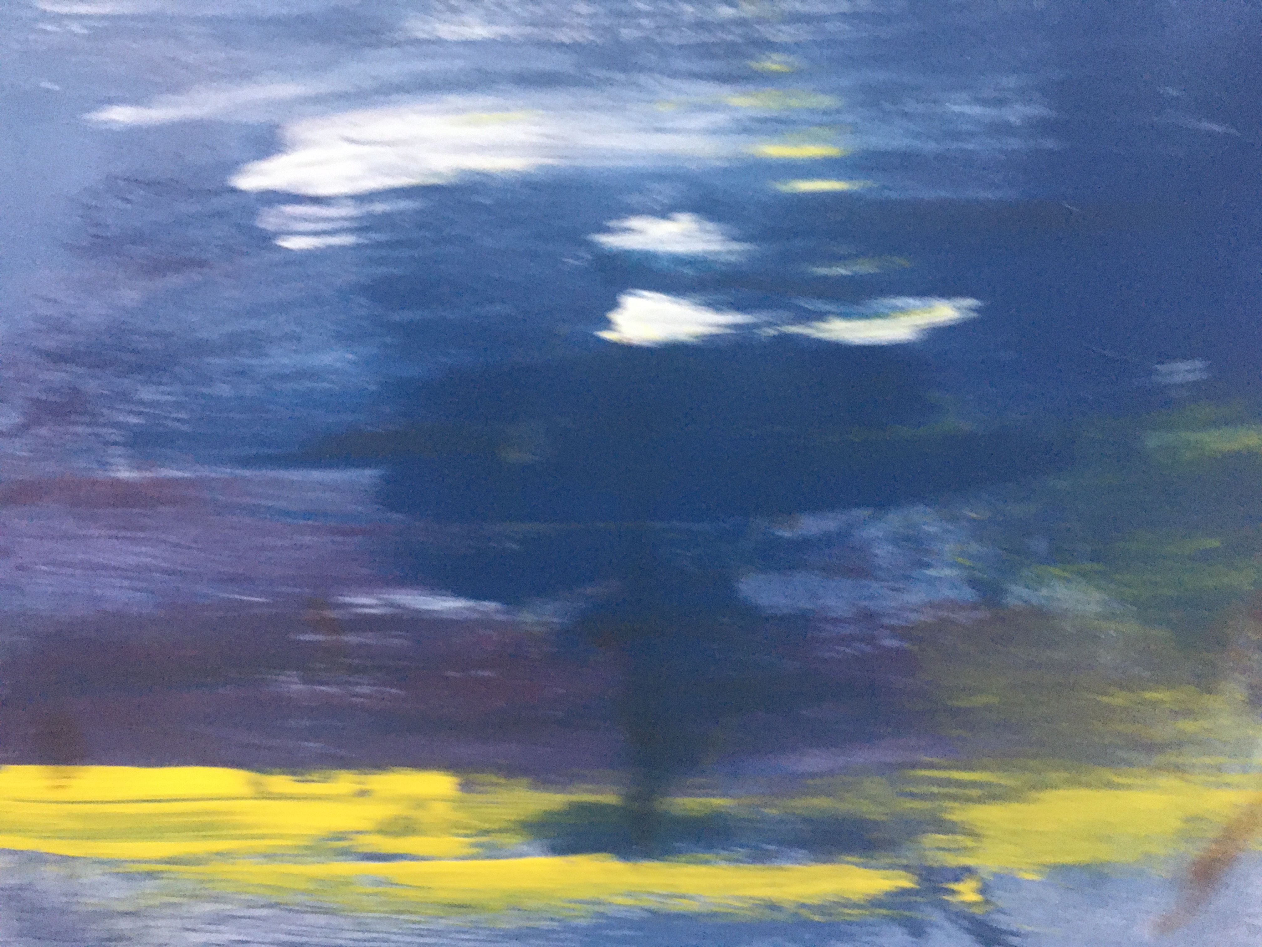
The wave is usually blue behind and turquoise underneath the wave before becoming white and frothy at the end.Next I wanted to look at wave formation. This study shows some of the different hues in the sea. Most waves come in sets and break as they reach an object or the shallower water of a a sand bank or when waves meet water being driven in an opposing direction ( rip current). I began to notice a pattern : a wave begins to fold over at one end and the white crest forms diagonally up the wave in a chain reaction like a line of dominos each being knocked over by the fall of the one in front.

Next I wanted to look at wave formation. This study shows some of the different hues in the sea. Most waves come in sets and break as they reach an object or the shallower water of a a sand bank or when waves meet water being driven in an opposing direction ( rip current). I began to notice a pattern : a wave begins to fold over at one end and the white crest forms diagonally up the wave in a chain reaction like a line of dominos each being knocked over by the fall of the one in front. This produces the effect that is sometimes illustrated as running white horses. It is not easy to see but in the study below I had a go at doodling horse heads and front legs into patterns that I saw in the white already laid down.

Emotional response to work

During time spent over the last month with a local Uist artist Ellis O’Connor, I learned the importance of engaging with your subject. I spent time sketching the sea and painting in watercolour and acrylic on the beach to capture the energy of the waves. To recreate this when not in situe she told me that it is helpful to recapture feelings by looking back at sketches and a plan air work before starting work indoors. In addition I have looked back at photographs and videos from an emotional aspect rather than as a reference.

While studying this I thought about the domino wave effect where the white surf is sometimes illustrated as free-running white horses. It is not easy to see but in the study below I had a go at doodling horse heads and front legs into patterns that I saw in the white already laid down. This really engaged my sense of connection to a wild sea and is one that I used in the exercise using impasto white gesso and a steel wire circular pad.

I had previously practiced blending layers of blue and green with a pallet knife
A water colour study sitting on the beach
Some studies with tissue paper to see if I could build in perspective for the rocks and sand

Next I looked at how to show the ridges and ribs in shells

Interpreting the style that would best illustrate my understanding of place.

Composition and Style

I am extremely fortunate and have to appreciate the serendipitous timing of relocation and personal learning and feedback from part 4 .I have begun to realise the importance to me of a sense of place and how having an awareness of the ‘soul’ and history of a place can help me to find a narrative for my work. I have spent the last 6 weeks absorbing the natural environment and social history of the Outer Hebrides. Talking to local creatives has encouraged my sense of awareness of the ancient and modern influences on the coasts that my beloved sea beats upon.

I wish to quote some local and international artists who have affected my development of process and style as I have worked through this assignment.

Pauline Prior-Pitt from Shore Sequence

today the sea has left skeins
of treasure on the sand
each wave ebbs a necklace
seaweed threads, broken shells,
feathers, straw and fine peat grains

Recently I have become aware of how much my personal health and happiness is connected to nature around me. It gives me a sense of grounding and the raw power of the sea demonstrates so clearly that humanity is just one small part of creation. I want to share my delight in the sea’s changing moods, it’s energy and paradoxically the security that the constant rhythms of the tides brings to those who study it.

Sense of place is important in the work of both Joan Eardsley and Paul Nash and I have been influenced in how they communicated it.

When I first saw one of Joan Eardley’s street kids pictures I was struck by the freedom of her mark-making and her bold colour choices. Solid blue rings around a child’s eyes is not conventional- and yet it works. It is spontaneous and says something of the plight of the impoverished children that she knew so well from the streets around her Glasgow studio. The colours of the clothing are bright and used repeatedly as a complimentary colour technique to make her work ‘pop’ and to draw attention to the poverty of the residents – the same items of clothing appear again and again on different siblings . As one of the artists for recommended study in this unit , I returned to her work . New amazement hit me- as I felt the frenzied energy used in a breath- taking manner to portray storms she observed from the small fishing village that she spent a great deal of her latter years living in. She worked outside with huge canvases lashed down to prevent them blowing away in gales and apparently worked quickly and loosely to paint in the same spots again and again, claiming that the more you studied a site the more detail and feeling you got from it. I greatly admire Eardley’s bold mark making, impasto, application of sand in her ground and scratching into her work. This conveys the urgency of her paint application and therefore her passion for the subject. In her work I can detect the joy that she must have felt in her paintings and realising this I felt more able to try to loosen up and experiment in my assignment . I commented in part 4 that I realise I retreat into convention and lose the sense of what I am trying to paint. Therefore Eardley inspired me to be bolder in this submission.

Ellis O’Connor says that “ on stormy days the sea and sky converge” and this is what she tries to bring to her work.https://youtu.be/U6SZjQgeZIc

The next paragraphs about JE have been added after formative feedback. 12/01/21

I have taken Ellis’s words very much to heart and sat for many hours absorbing the moods and tides of the sea. I best love the bubbling white mass of foam as tall rollers crash in from the Atlantic and smash many miles worth of built up kinetic energy into stacks of outlying rocks or collide with rip tides bouncing of the bay. This wild caldron is imprinted on my mind to the point that I must try to describe it using colour,texture, splashes, pallet knife marks and anything that I feel will develop my depiction of this amazing and dangerous sight.

Until very recently I felt a sense of defeat when I picked up a brush or chalk to record this scene. It has taken technical ‘light-bulb’ moments as referenced in ‘Personal Development’ at the start of Part 5 ) and without a doubt the research into the work and emotions of artists like Joan Eardley to encourage me out of my previous artistic paradigm . It may sound over dramatic but I am convinced that discovering the level of passion and self belief and observing the mark-making that Eardley used in her seascapes opened up to me the possibility that I did not have to paint as a photorealist. My journey in art is to represent the energy that I feel in a subject through urgent mark-making and development of my emotional response to the subject and my evolving work.

A sketch from Part 1 painting. Looking back I can remember my frustration. I wanted to break out from a traditional path, not because it was wrong, just not right for my personal development.I have tried to interpret the anger in the sea with random broken lines and a dry brush technique. The sky shows a little development as I have tried to layer paint here but on the whole after an initial application of acrylic I gave up , disheartened at the impotence of my artistic voice. I did not know how to apply paint in a loose style or have the confidence to go with bold hues, tones and more daring expressive mark-making. The piece came from scant childhood and holiday memories but there was a complete absence of observation of the sea which I feel contributed to the lateness and lack of energy
This is a final image from Assignment 5. Eardley’s influence, I think can be seen in the choice of pallet , use of texture including impasto and sand and free mark -making that I have allowed to direct the way that my painting has finished. I hope that it shows the energy and passion that I observed in the sea. This is now the beginning of a long artistic exploration but I hope that my comparison with P1 shore scene illustrates that at least now I have metaphorically put on my boots and left the house!

Paul Nash connected again and again with environments that were of great significance to him : a hillside near to his home in Oxfordshire and the war torn landscapes of Europe in both world wars.

David Boyd Haycock gives an interesting incite into his process in a recent Heni Talk, revealing that Nash wanted to show the unseen psychology and feel of a place as well as how it looked. It is interesting that he often chose to do this by using trees as a metaphor: in his Great War paintings he uses the blown up stumps to describe what humanity has done to the world and in late paintings he returns to his favourite clumps of hilltop trees in Oxford to convey his feelings about the passing of life. Reading about this has made me think a lot about more deeply about how I can use the coasts around me to convey my message.

Donald Smith another artist originally from the Isle of Lewis uses colour in a powerful way. He chooses a limited pallet of similar tones and adds one complimentary colour – using a technique from colour theory rules that part 2 taught me to be aware of. In the untitled Stornaway harbour image below orange/ yellow tints form the main body of the painting study made to ‘pop’ by the inclusion of a single splash of blue winding across the scene.

Stornaway harbour study, p 63

Smith also uses a simple block pattern outlined in thick black to create landscapes that really stand out. See his image below.

Stornaway harbour P59

Joan Eardsley’s seascapes are full of understanding and abandonment to the wildness of the sea. In my reference work I have detailed sources explaining her plein air work and her love of painting the coast around her part-time home. She talked of the importance of painting it again and again to really know her subject. I have come to appreciate the importance of this point of view. For me knowing every inch of the rocks and how each storm and ebb tide interacts with the beach leaves less to get wrong in composition. It also develops a kind of muscle memory allowing me to relax into my painting , enjoying it and working in a looser manner. As my painting is my main recovery tool from long term depression this experience of losing myself in the work is key and as such I feel this the only subject that I could use for my assignment at this time.

Project paintings

Image 1 night sea- rejected

I like the impasto and the composition of this piece but feel that it does not quite capture the movement of the sea or the feeling of night.

Image 2 – wild sea- rejected

I am pleased with the energetic feel of this piece but feel it needs more definition.

Image 3 -Alone on the beach- rejected

Alone on the beach- to demonstrate the patterns in the sand and vast sand expanse as well as showing ridges in the sand by the sea and black water lines throughout. I feel that this gives a feeling of expanse and I like the abstract effect of the red sky but feel it is too simplistic.

Image 4 – The storm

Image 5 – Sunset

Basic colour shape blocked in. I added more layers of sky colour to depict the blues and pinks left after the sun has almost sunk. I observed that the balance looked lopsided and spent time blending in more blues and pinks to create layers of clouds for perspective in a more symmetrical way. I have learned that it is not always possible to pain5 just as you see and adjusting to something that is more pleasing to the eye can be a wise decision. I applied some squiggles of PVA glue to the middle layers in the mid ground to give some difference in texture to the tide line where water was running back into the sea. A white tinted was helped to make this look more like a transparent layer of water covering the sand of the tideline.

Image 6- alone on a beach 2

I wanted to develop the theme of expanse that I first explored in Image 3. My main learning point was to add drama to the expanse .

Images taken from the section of beach I wanted to paint showing the topology, cloud structure, sand texture associated with different parts of the beach and around the seaweed , a guide sketch plan I made earlier of typical beach structure . I spent a long time observing the sea. It is not obvious from the pictures but the area on the left is an estuary and the beach sweeps round to the open sea at the top RHS. For this reason the fore and mid ground sea in this work will be slightly calmer and the splashes and energy comes from hitting the sand and small rocks. The sea state is choppy rather than sets of rollers. The sky is grey with rain clouds some passing quickly over head and one dropping its rain visible as a grey sheet stretching down into the back ground Atlantic. Clouds not clearly visible on a mobile camera device.

Image 7- sea eye view of the lighthouse

Shaving foam to add energy to the waves in a top layer

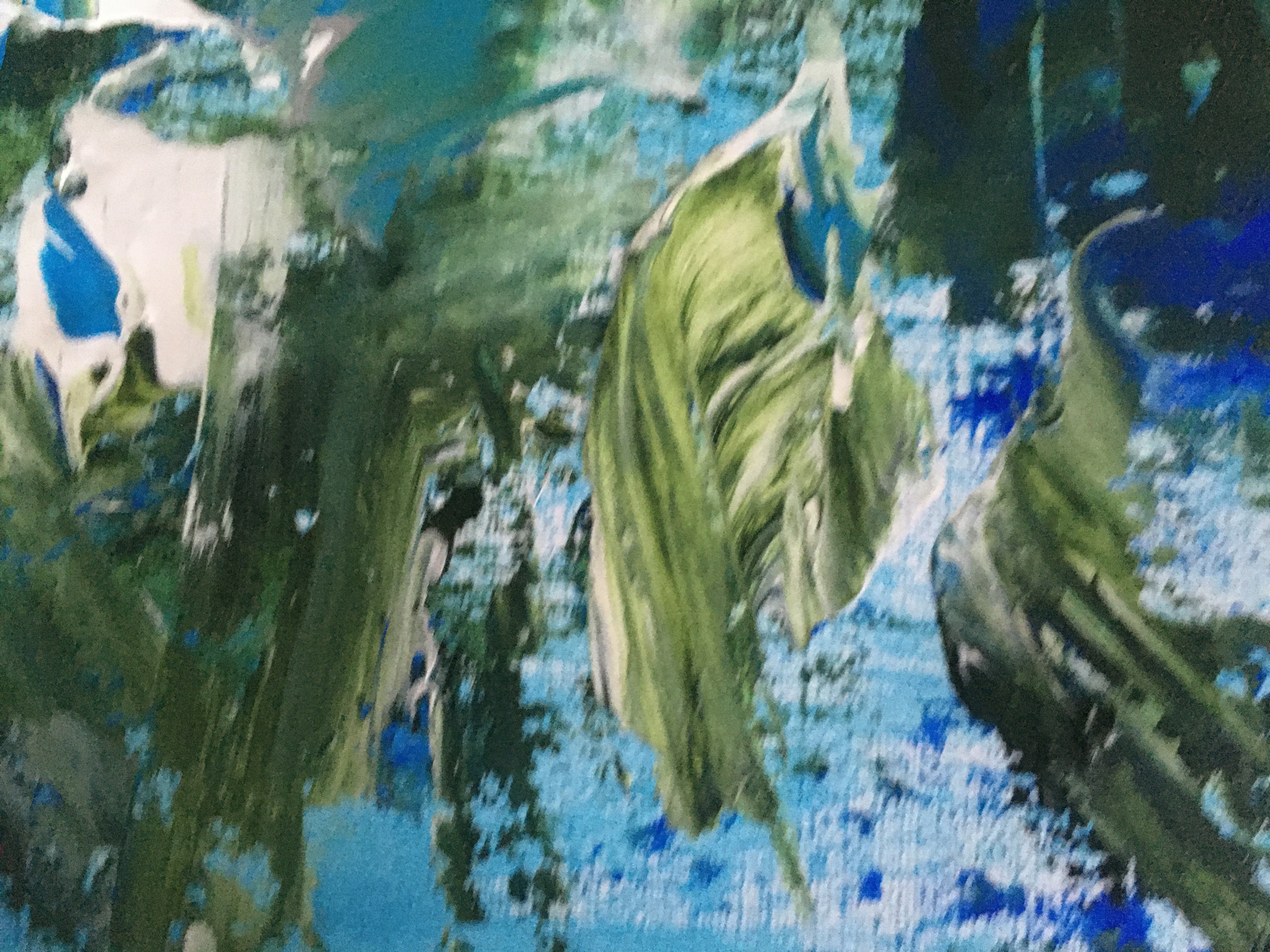
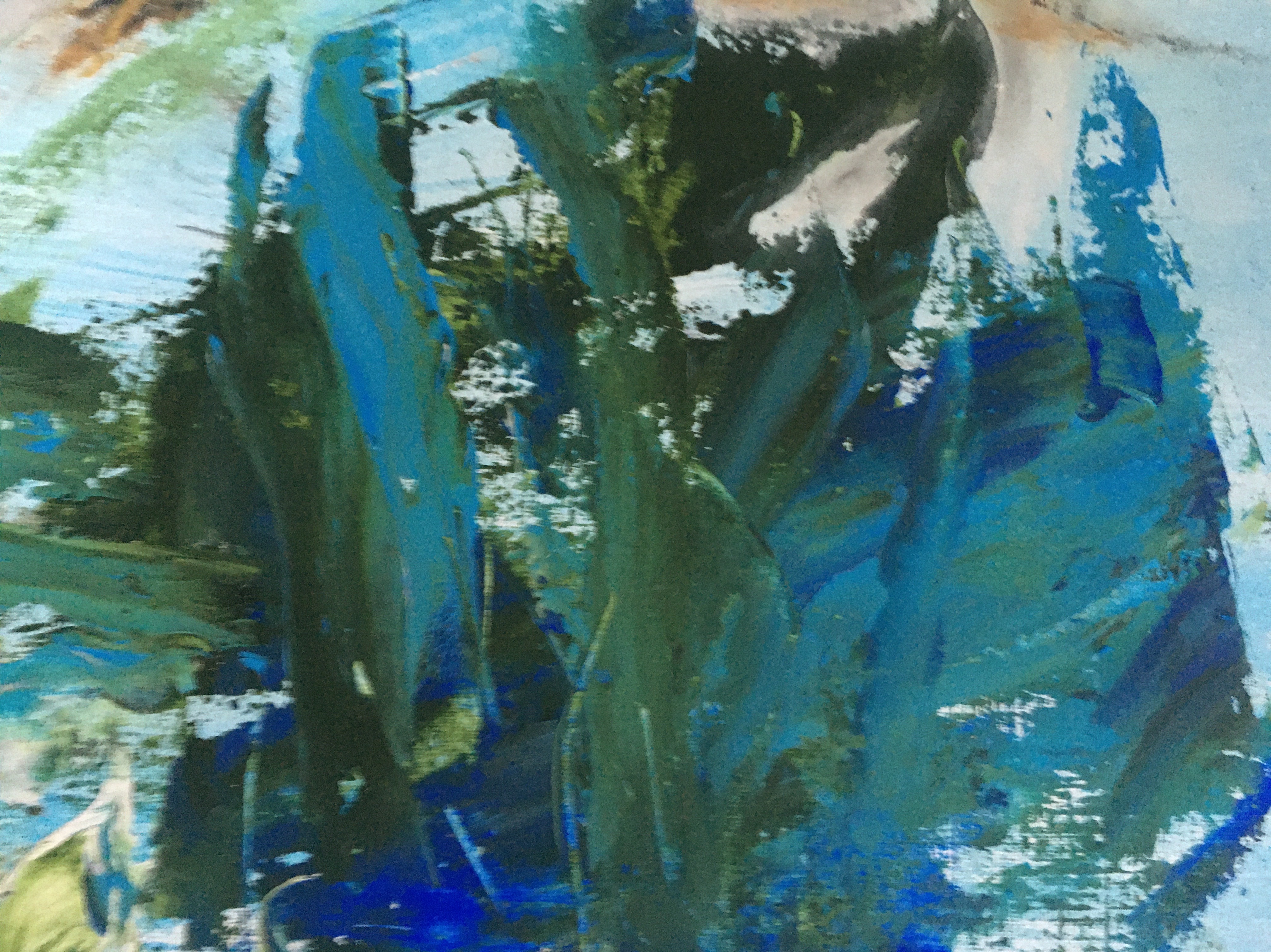
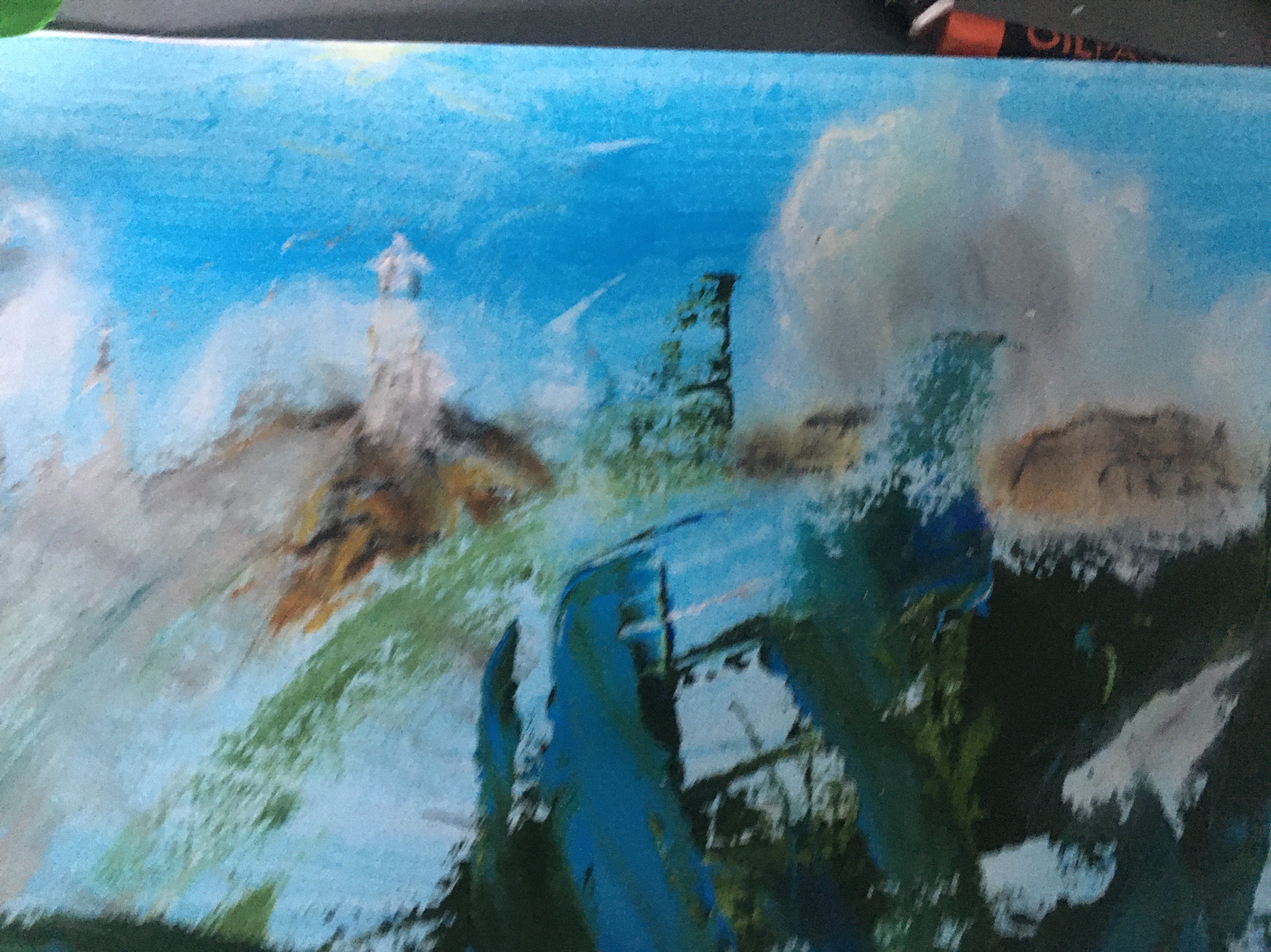
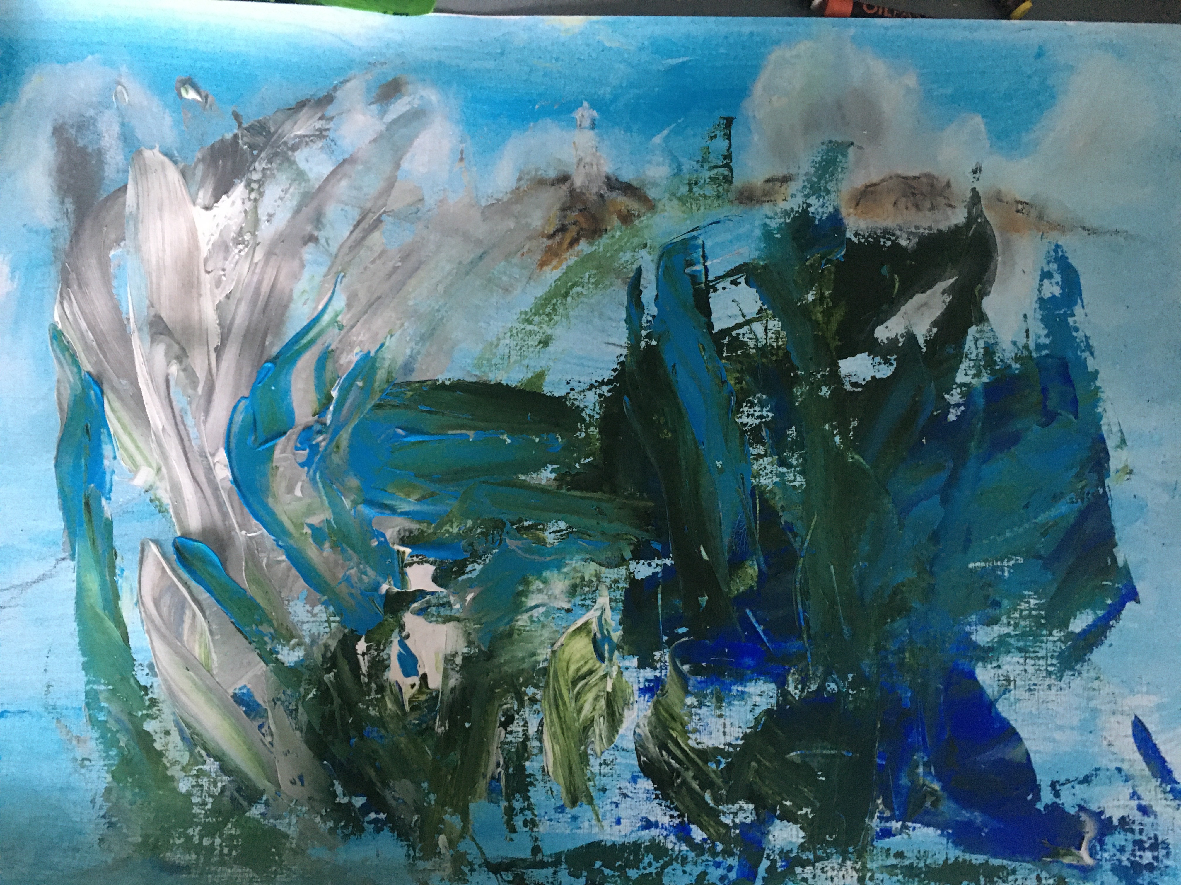
Image 8- Semi-Abstract seascape- fishing boat heading out of the harbour

So far I was really pleased with the development in my energy , use of texture and mixed media and loosens of my style. To push myself further I felt that I had to move more towards the work of the artist whom I admired most in my research for this course- Joan Eardsley. While the resulting work is not my most accomplished in terms of composition or technical skill, I feel that I must include it in my painting selection as it shows a turning point- my first semi- abstract landscape.

Eardley worked in fast vertical marks . I am not quite so confident to do this and find that for now I have found freestyle working from dribbled PVA glue and having foam patterns. This time I wanted a larger abstract form representing a wave so I decided to try an acrylic pour onto my primed support.

Reflection

I have really enjoyed this assignment project more than anything else that I have done in Painting 1. I think this is partly because I am finally beginning to understand some basics around painting technique. Perhaps more importantly I have begun to pick up on recommendations and artistic good practise that I have read about I’m my research. This confidence has in turn inspired some looser work and combined with finding a subject that I am really passionate about, I feel that I have been able to explore my topic in an artistic way. I am pleased with the development of my surface preparation and the incorporation of grounds and the use of impasto and a wide range of tools to give texture to my work. Noticing the techniques applied by artists like Donald Smith and Joan Eardsley’s has allowed me to become aware of limited pallet and blocking, perspective through colour and expressive energetic mark making.

I cannot afford to lose sigh5 of the technical skills that I need to develop such as fine detail and linear perspective. However I have more confidence now to work from the areas that I have developed and have more confidence to explore new techniques.

Proposed order of viewing

The final selection and viewing order

I feel that this semi abstract work has given me greater confidence to develop this side of my work to incorporate more technical perspective and fine detail. However I feel that I have really pushed myself in the whole project and especially this last work. It has been a challenging but very rewarding process. These works best represent this development towards awareness of my surroundings: The voice of the Hebridean Seas.

Bibliography

Th Artist painting the climate change she sees on the horizon/Loop: BBC Scotland on You Tube, 24 April 2019. online at https://youtu.be/U6SZjQgeZIc Accessed on 08/12/20

Shore sequencePauline Prior Pitt: Performance Poetry. Online at https://www.pauline-prior-pitt.com/2017/05/20/shore-sequence/. Accessed on 08/12/20

David Boyd Haycock on Paul Nash. The landscape of modern war/ Heni Talks.online at https://vimeo.com/henitalks/davidboydhaycock .accessed on 08/12/20.

Le Eileanach, D. Donald Smith the paintings of an Islander, p63. Acair:Stornaway. 2019

Review of Part 5 Assignment feedback

1.I am encouraged that mark – making and layering has improved my painting perspective and have gone back to some of my assignment 5 work to see if I can improve this further.

2.Thinking about my tutor’s comment re improving use of paint : medium. I have been able to go back and identify where this has worked and notice where my every has overridden planning to make it too heavy and laboured. I can see the importance of adding this to my pre painting planning. I have started to think about including oil work in my project .The amount of medium to paint used in oils has to be planned before starting and this will give me an opportunity to put this skill into practice in a measured way. I love the greater potential to blend oil tones and make more changeable responses as each layer develops. I have looked back at the flexibility of Joan Eardley’s waves, the flick of the foam on the rollers and the scratching into areas that added energy to her work are to me more achievable in oil.

Seascape(foam and blue sky) 1962

Elliot,P with Galastro,A.Joan Eardley.A sense of place.National Galleries of Scotland.2016.

Assessment 3

Assignment 3

Assignment 3

Listing of the development aims and criteria that I will follow in this assignment.

Repetitive engagement with learning objectives has been integral to my development during Unit 3 . As I have has lists of general and personal objectives it has been challenging to keep all fresh in my mind. Therefore I feel that it is right to list them and record my responses to each.

A. General aims and objectives

Assignment instructions P 97

show how skills in handling paint have developed

    • [the skills that I currently want to demonstrate development in are: applying more layers of paint to increase detail and perspective; using a variety of brush marks and tools to suggest texture and movement and using inspiration from suitable artists. I have enjoyed researching recommended artists ‘s work more than ever this time, possibly because the more that I am immersed in the painting process the more I can begin to appreciate about individual style and technique and also how the social history and knowledge of the time informed artistic creation. Freud in his portraits used a lot of impasto texture which seemed to record his rapid brush work permanently on the canvas, adding a sense of urgency and intensity. I like this technique and wish record the speed and excitement which I feel when painting. As I am working in acrylics I feel that I can best do this by applying fast loose strokes in a variety of ways. For this painting I have been practising with different sizes of brushes and using both wet and dry brushes. I have noticed that the manner of application and the unique characteristics of each type of paint can be exploited to produce different effects.I also want to use thinner paint application to allow more tones and detail by working in many layers.]

      show development in interpreting the subject

    •  [Earlier in the unit I observed families on a beach and drew a selection of family groups. I learned to observe the quickly,watching each how each gesture or change in posture affected the whole body and the dynamics and positioning of the rest of the family. I reused a selection of these sketches to work out the best pose for my model and how to notice the effect her grin had on all of her body.]
    •  Consider and explain lighting, sitter consideration, medium selected and landscape positioning of my paper instead of the more conventional portrait.

    [I have begun to notice how artists use aesthetic as well as technical skills. For example; interior, background and colour can be used interpret the subject by suggesting emotions such as warmth in Van Gough’s sunflowers or the melancholy of Picasso’s blue period. My tutor has recommended the work of E Kirchner as an artist who uses colour and sweeping shapes to give a particular look to his subjects. I particularly like his simplified moody dark backgrounds which pop with what appears often to be distorted suggestions of pavements and buildings in complimentary bright hues. I admire his figure work which is sweeping and elongated giving an unsettling allure to the street girls in his Berlin 1910-13 series. His paintings appear simplistic but are hugely illustrative . I tried ,with partial success, to employ his thinking to a background in the ‘ telling a story’ exercise in unit 3 to suggest the close bond of a family grouping. However for my assignment piece I drew back a little as I didn’t have the confidence to go completely into blocks of colour background and elongated shapes. I did feel able though to attempt his uncomplicated colourful palette. One more artist whose paintings I used as comparisons throughout the unit was the contemporary oil artist Clare Shenstone . Her version of simplified backgrounds are monochrome spaces that are given depth by tonal variation which seems to both anchor and hilight the subject on the canvas. Initially I hoped to work more towards this style in my work. I intended to show dark water stretching out to the suggestion of branches on a far off river bank .]
    make preliminary studiesshow how skills in interpreting the subject have developed 

        • [

      I decided on an outdoor theme knowing that I am more able to work with this than interior scenes. Observations of my model were made around noon on a dullish day so the light direction was straight downward on to the face and meaning shadows would fall up and down rather than to one side. The choice of media was one of practicality rather than taste. I have been away from home so acrylic was better for it’s shorter layer drying time. The portrait would be a close-up face looking back over a shoulder from a river background , so I felt that a landscape format was best for spacing. My idea was that the close up & eye -level line could be used to make the viewer feel that they are in the boat behind the model. Also I reasoned that it would allow me to show a story narrative of and movement through wind blowing in the hair and background trees.

  •  Demonstrate practice handling of paint and choice of skin tones-
      • [I spent

     quite some time practising paint application, transparency of paint layers and mark making to understand what would suit my purposes best. The acrylic paint brands that I had were of different textures so I used these sessions to find what spread best and flowed well off the brush. I got a better coverage and flow using Artiste brand liquid acrylic brand while my abstract brand 200ml sachets that I had previously favoured were thicker, more buttery and therefore more difficult to use on a brush without dilution. I was surprised that although cheap and not intended for studio use, my liquid brand gave intense even coverage and flowed well without diluting intensity.]

I learned during these practices to slow down my painting speed a little and make a better attempt to cover an area evenly. This enhanced the intensity and smoothness of the surface. I had one pearlescent blue which gave a depth and shine to the sea.

Module assessment criteria :

Unit aims and objectives

to use drawing and painting for investigation, generating ideas and recording and selecting visual information
⁃ to make skilful use of a range of media
⁃ to demonstrate knowledge and understanding of the work of some important artists and movements in painting
⁃ to reflect perceptively upon personal learning experience


B. Personal aims and objectives

Tutor feedback outcomes that I have tried to carry through my learning in this unit :
markmaking to suggest form
-colour giving dramatic effect
-take time to observe shape and tone
⁃ using curves to tell a story
⁃ using different tools
⁃ observing perspective in a way that I can show it

layering
⁃ textures to accentuate feel
⁃ study artist’s work
⁃ Use rawness and fluidity in my style

See coursework three 

Materials used:
Liquid acrylic: red hot and cool hue; primary yellow; iridescent blue.
Soft acrylic abstract dark brown; white and blue. Thinning medium for acrylics.
Large flat brush; medium filbert and round brushes;a medium fishtail brush; pencil and rubber pointed pastel blending tool.

Multimedia A3 paper 200g

Preliminary studies


These are some of the sketches that I made while people watching on a beach for my ‘telling a story exercise’. I found this extremely beneficial in training me to observe the body posture of each pose my model made in terms of how it attested the whole body. For example when told to smile a child often tilts the head back and tenses up the whole body to appear taller as well as stretching wide mouth musculature! I was able to look at my model with greater awareness of how she held her head looking back over her shoulder and how her eye brow , mouth and even the angle of her shoulders and crown changed as she widened her grin. Over time working out correct anatomy for each part of the body has become more like imagined -sculpture , by this I mean that I think about how muscles and skin must flow and connect to each joint in the body rather than just copying a mark as if isolated in space.
From a group of different positional drawings I decided on the background and how the face should fit in to it- ie to the right third rather than in the middle to invite the viewer to look into the painting. I also wanted a simple colour block of background with a few clearer tree branch marks made using different brushes and strokes.


I experimented on scrap paper to select best leaf marks that were not too distinct and distracting from the subject.


The initial pencil sketch is not a flattering drawing of the model but allowed me to loosely explore the curves that flowed across her face eg the natural line expanding across her face curving round the nose, mouth and cheeks and creating her broad grin of enjoyment. Movement was to be suggested by the curling strands of hair flying out behind her and by tree branches.

Next I tried several outline drawings in yellow to check positioning of the person,explore the connection between marks across the page and to indicate negative spaces and shade. One of the yellow outlines was far too close to the right hand edge . I also found it useful to use a mini post-it to mark things that I liked or wanted to avoid as a reminder to myself.


I also spent a lot of time painting colour blocks to learn how the two types of acrylic acted on the paper. The fluid colours are for me much easier to use when making loose marks. The soft abstract brand are less mailable and therefore I wanted to use them more for texture. They also didn’t mix well with thinning medium.
I also worked out which colours would give translucent layering.

img_7690

Next I worked on skin tones to find the best balance of tones that worked well to give depth. Then I checked this by painting a practice face.

Stages of painting and Influence of artists

One of the main skills that I have taken onboard is about looking deeper at subjects. What are the stand out features of this person I am . Looking at portraiture I have begun to observe the importance of this. rying to depict? It is not just simply trying to get eyes right or the shape of the nose.

In order to bring a narrative to a portrait physical features are important.Looking at my model and a photo of her canoeing, the thing that really stood out was her cheeky smile. Trying to capture this would add realism to the likeness and would suggest enjoyment. Kirchner was able to stretch the proportions of his figures making the a little grotesque and surreal. As an inexperienced artist I am finding that this is not something that I get away with as my skills are not developed enough. For this reason once again my practice head looks a little cartoonish as I have enlarged the eyes and accentuated the curves of the cheeks and eye brow. I known from earlier exercises that this is a tendency that I repeat and to minimise this I must keep standing back and take time to observe what has happened with each layer. Have I used too heavy a line, does in need to be faded or broken up? Is the tone to different, do I need to mix a closer match? I found a useful tool for this. A flat plastic food tray allowed me to place my mixes over the top of my work to see exactly how the new tone will look.

One of the technical aspects that I am not good at is linear perspective. While I will benefit from practicing this, I have also had a discussion with my tutor about trying to pick up on other perspective techniques that I am currently better at to achieve the best that I currently can. The human smile is created by the entire muscle as it tightens across the face and cheeks and therefore correctly positioning the tonal shadows cast by stretched muscles would help to show perspective round the mouthfeels my model.
I also practiced mark making for the sea using the soft creamy thickness of the darker
near blue, the blended turquoise pearlescent of the shallows of waves and the dotted thicker application of white foam ( using a pastel blender and cloth) contributed to give definition.

This tonal practice was trial and error. As I gain more experience I hope to use this skill in planning. Eg as I learn what is translucent and produces a good effect on top of another layer I can use this to my benefit rather than losing effects and having to redo layering !

Maintaining significant features:
As the layers advanced I had to keep the curved lines visible but not too emphatic. As I discovered in my previous exercises, the suggestion of a line or form or the painting in of negative space works better than creating a bold unbroken mark. Eg on the cheeks , nose and eyebrows. I notices the features that were most striking about my model were her beautiful wide grin and the cheeky looking line of her raised eyebrows. I spent a lot of time lightening and darkening and trying to break up some of the solid lines by adding tonal difference.

I also used the thicker quality of the white paint to create textural ridges that I could build up tonal wrinkles near her eyes. I feel that this helped to give definition and show that the head was turned slightly so that the side of the head was seen as a darker tone. I also tried to give less definition to the ears to help with proportion.

Dry brush strokes:
I also overpainted broken dry hair marks on the side of the head to help with proportion.

The background:
As I worked in the different layers I found that I was moving away from my original plan. The formal banks and green abstract of trees seemed to be drawing attention away from the subject. The green was out-of -step with the other blending tones and caused disharmony. Therefore I decided to cover it over with a layer of blue to tone it down. Michael Raederich and Peter Doig were recommenced artists in my feed back from assessment 1. So I decided at this stage in my painting to go back and research their work to find some influences that would help me to add markmaking in further layers that connected the work up and improved the narrative. I reread my thoughts on Doig and how his colour choice and markmaking in the background awakened in me an intrigued and sometimes uneasy feeling . I wanted my work to create drama and movement to add to the river sailing narrative. Looking further I found this account of Doig talking about a fellow artist, Sigman Polke who had influenced him. He felt that Polke did not produce photographic images but took pleasure in markmaking that he had ‘discovered ‘ in his practice. This is inspiring and opens up a whole new line of thought for me. Further Doig talked about how Polke had developed a way to make his painted markmaking into a language and even though he broke normal rules of positioning and form he did it in a way that ended up looking authentic . I have read in the past that when we let our drawn ideas emerge without concentrating on what we want to produce, the result can be surprising but beautiful ( reference for this quote is unknown). Perhaps by relaxing I could learn to adapt this more into my work in the future? The background that emerged is still rather stiff because it was a first experiment and I was not sure about following my idea to start. However for me it represents the future of a new technique in painting for me to produce a more connected wholistic piece.

https://www.tate.org.uk/tate-etc/issue-32-autumn-2014/contemporary-visionary-part-ii

This gradually evolved into a different story for the painting. I enjoyed the depth of the darkening sky and found myself getting connected to a new narrative: a dusk river trip. I was reminded of Michael Raederich’s dark blue/grey atmospheric work which pops due to the embroidered white, yellow and pink abstract forms. I added yellow in various layers to look like the start of a sunset. While the positioning of the yellow in the darkening sky was not naturally accurate it felt more pleasing than the harshness of the river scene. I have learned to have more courage to go with changes in my work and am glad that I did so here. Eventually I wanted to pull things together and added some red as pink and a suggestion of purple in the sky. This abstraction evolved and I have to admit that my inexperience allowed me to play too far. I wonder if a bit of restraint ( as exercised by Raederich) would have produced a simpler and more effective message? This was a good learning and excites me for further experiments in the future.

Lastly I turned to the question connecting up the parts of my painting. Without the river bank where was my model? I gradually evolved a new narrative by adding in a horizon and tonal alteration to show where the sea and sky met. However this would have been more effective if there had been more room to develop it’s change slowly. Next I felt that as the paddle board that I decided she was on could not be seen clearly I could add a small silluette to give authenticity to her positioning in relation to the sea and sky. Finally I thought that instead of a white tee shirt it would be better to make this darker to suggest depth as the rest of the painting was also fairly dark. I added final fine shading around the eye and a little very dry red brush to some area to pull it all together tonally

Analysis of what has worked and what I want to improve

In most portraits that I have worked on background has been an afterthought for me and I always feels that it sits uneasily with the figure. While I need to have more courage to take the background further into my imagination it feels like a technique that could improve the spontaneity and flow of my painting in future. As I described the background evolved and possibly I could have made the whole painting bigger or decreased the size of the subject to allow the proper space to develop the change from sky to sea, to show the waves in proportion and to make the silluette more realistic. However I do feel that my process is evolving.

I feel that as I described in my comments agains the assignment aims, I started out with ideas to demonstrate my deepening understanding of technical skill, context and creativity. I am especially pleased that took time and discipline to make many more layers with a much larger variety of tones and to observe and correct as much as I could at each stage. Looking at the final image, I can see that in order to ensure that the raised brow stayed as the predominant feature, I lost some of the looseness. However I am confident that I am more confident to explore and find ways to develop my range of techniques.

Finished image

After writing up this assignment, I thought again about one of my personal learning aims: to use a variety of mark making. i have made three further alterations:

I used the spine of a feather to add fine detail to the eyes and to make smaller hair details. Then I used the long flat side of the spine to make a dragged hair mark to add contrast and bring the darker hair out in front of the wave. I also worked on the waves to add a blue green before the white surf ( the green was added using scrunched cling film for texture and the white was blended in and stippled using the end of a flat brush. I also took some of the darkened area out of the eyebrow to make the gesture more subtle ( as I observed in my analysis) .it occurred to me that I could blend in skin colour again stippling with the end of a flat brush. I feel that these additions improve my painting.

Submitted image.

Salman Toor’s Intimate Paintings Are a Salve for Our Isolated Times – Artsy

Advertisement
— Read on www.artsy.net/article/artsy-editorial-salman-toors-intimate-paintings-salve-isolated-times

I am intrigued by Salman’s unique use of colour and mark making.

Colour

He is unusual in that his paintings are works of limited pallet but he achieves amazing interaction not through complimentary hues but by using 3-4 tones from the same area in the colour wheel. By the laws of colour theory theses should make each other more dull , however they don’t. This may be because of the subtle use of light and dark. It may also be due to his particular form of mark making.

Brush work- mark making

Salman intentionally leaves brush marks in his work and blocks of colour are expertly broken by his trademark style of movement marks. Walls take on shadow achieved through choice of tones; cloth appears to shimmer with a few crucially placed squiggles in a contrast colour and a spectacular pink wool jerkin has all the texture of a real jacket through shading.

Learning from different media

I am starting to realise the truth of what I have read for so long:my creative expression alters considerably when using different media. Why is this? Perhaps for me some of the answers currently come from technical ability. I can achieve more controlled mark making in acrylics and therefore have more confidence in the range of bold and mor original strokes that I use.

Consequently when using acrylics I relax more into the work and find it easier to experiment and move forward in my process journey eg discovering that I could make interesting textures and introduce more life by combining paint and pouring medium in a new way see sketch book practice of standing stones in primary colours.

I have found it more challenging to achieve this kind of flow and bolder ,free strokes when working in oil. Actually this is a similar pattern to my handwriting. When stressed it is small and contained but when I am relaxed it is large and more ‘eccentric’! Maybe this tells me something about my grip on the paintbrush. I probably need to loosen my grip and allow the flow to take place without thinking too much.

In fact frustration lead me to the point of giving up- until luckily I decided to play with some pallet knife layers on top. For the first time I could see some movement come into the landscape. I ended up getting carried away and have overworked the effect but it was heartening and gave me some encouragement.

Overworked sunset but shows that I can begin to control blending more favourably

The following are some of my oils learning points from today:

1. using an acrylic base layer saves time but be careful as thickly laid down dark colours like blue tend to bond less firmly with the supporting paper and I ended up with a green on applying yellow oil.

2. be even more careful to lay down long single strokes for sky/ sea as strokes remain in the thicker slower drying oil.

3. be aware of drying time of different colours and thicker layers as well as the amount of thinner used as this will affect fluidity of applying layers on top and the overall stability of the paint.

4. for now I love using pallet knives to bring spontaneity that I cannot achieve with brushes. I can do so much more than just add texture with knives, they allow easier manipulation and act for me a bit like a round brush in acrylics!